This project explores the potential of a travel guide on a digital platform. Previously heavily reliant on the use of traditional media, print, the travel book market sees a declining sales rate as more people are relying on a myraid of travel websites to plan their travel. As such, rather than simply selling a Ebook which is an exact replica of the book, this proposal aims to re-enforce product distinction by branding, and also to enhance user’s digital experience by creating a system that allows them to bookmark and plan their schedule with information they have found online, then sharing it on the forum for interaction.
The main idea is to bring all the digital content online, available to the user anytime at a subscription rate, so that they can access the latest news instantly rather than just purchasing a one-off ebook/printed guide, creating an updatable online database and catering to a wider audience.
The website's branding takes on a Space Travel theme to echo with their brand name "Earth Travels", to encourage travellers to look at travelling in a different light, as though we are all aliens embarking on journey on earth for the first time. Space travel is ever so closer to us and within the next 50 years, it could be made available to people like you and me just like how flight travelling was in the past. Henceforth, the look and feel is also a long term goal as to how the travel guide market might have to cater for space travel in the future.

And in terms of the interface design, it relies on the use of simple and fun visuals for an engaging user experience.
Users have the option of searching their destination directly on the main menu bar on top.
Otherwise, they can browse the world map if they are undecided, or even plan for travels in a series of neighbouring countries.
Users have the option of searching their destination directly on the main menu bar on top.
Otherwise, they can browse the world map if they are undecided, or even plan for travels in a series of neighbouring countries.

After choosing a country (e.g. Japan), they can choose a city on the map for more specific information.
Otherwise, they could click directly on the menu bar on the left, to understand more about that country.
Otherwise, they could click directly on the menu bar on the left, to understand more about that country.

For example, if you click "Overview" on the left, you would be able to see a list of recommended activities like places for sight-seeing, shopping or restaurant.

On interface design:
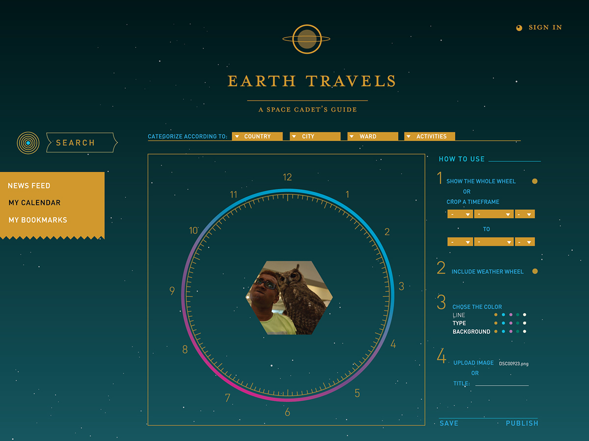
For example in the "Festivals & Events" page, I have developed a fun infographics wheel to represent the passing of 12 months like a clock, with festival dates indicated by the side(as yellow dots) so that users can see at a glance during which time of the year are festivals congregated at. Users can click on a specific option, where photographs and detailed information would be revealed.
The wheel also indicates the temperate of that country so that travellers can take into account the weather during the time of their intended travel

Elegant infographics are also used to break down text-heavy travel information like the country's history and background info, as shown in the History Timeline Infographic displayed below:

There is also a "News Feed" page as a public forum to share and comment on other users' recommendations.

Customize your own calender by marking down the dates, venue and information of your travel schedule.
It also offers a personal calendar, presented in the form of an infographic, where users can simply bookmark any information they've found on the website's database, or any other notes on the calendar itself. This allows for a easy referencing to schedule their holiday (E.g. 24th July--Museum A's article, Restaurant B's review article).
It also offers a personal calendar, presented in the form of an infographic, where users can simply bookmark any information they've found on the website's database, or any other notes on the calendar itself. This allows for a easy referencing to schedule their holiday (E.g. 24th July--Museum A's article, Restaurant B's review article).
Below shown: Categorize the bookmarks that you have saved, under a specified date.

Stylize the schedule acording to your preference.


Sketches for the design of the pictogram:


