Client
Zarela is a p2p data platform, so it will deliver a less time consuming procedure for researchers by making access to many more participants and involving several data collection centers instead of just one.
Zarela is a p2p data platform, so it will deliver a less time consuming procedure for researchers by making access to many more participants and involving several data collection centers instead of just one.
people are more than happy to participate. They will get paid by the mage, they’ll also get a reward from the platform, and they help mage to build a better world!
they have also a token called Biobit. the Biobit token will gain more value through time so Angles, Hubs or investors that hold Biobit tokens, will profit multiple times more than if they sell their tokens.
Story
The Zarla project had already been launched before my arrival. Despite the fact that the procedures had not yet been completed, the logo and other preparations had already been completed. It was a challenge for me to define a space that matches the spirit of a revolutionary environment such as the blockchain environment. During different meetings, a lot of information was gathered, such as the history of the founders as well as their visions and opinions about Zarela’s future. As we progressed, we developed a unique framework for Zarla based on the archetypes of the brand. It took two months to redesign the brand. My lovely college and friends advised me throughout this process, which I am extremely thankful for.
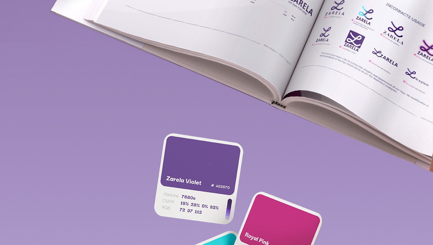
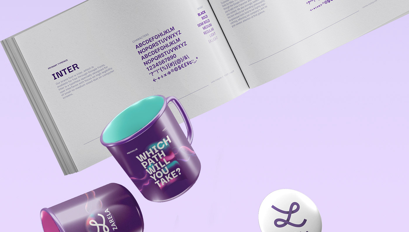
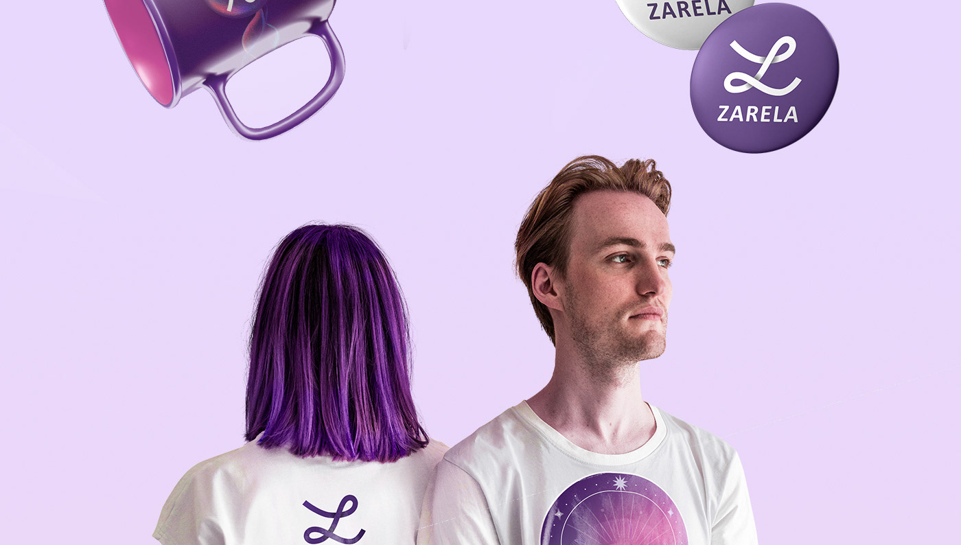
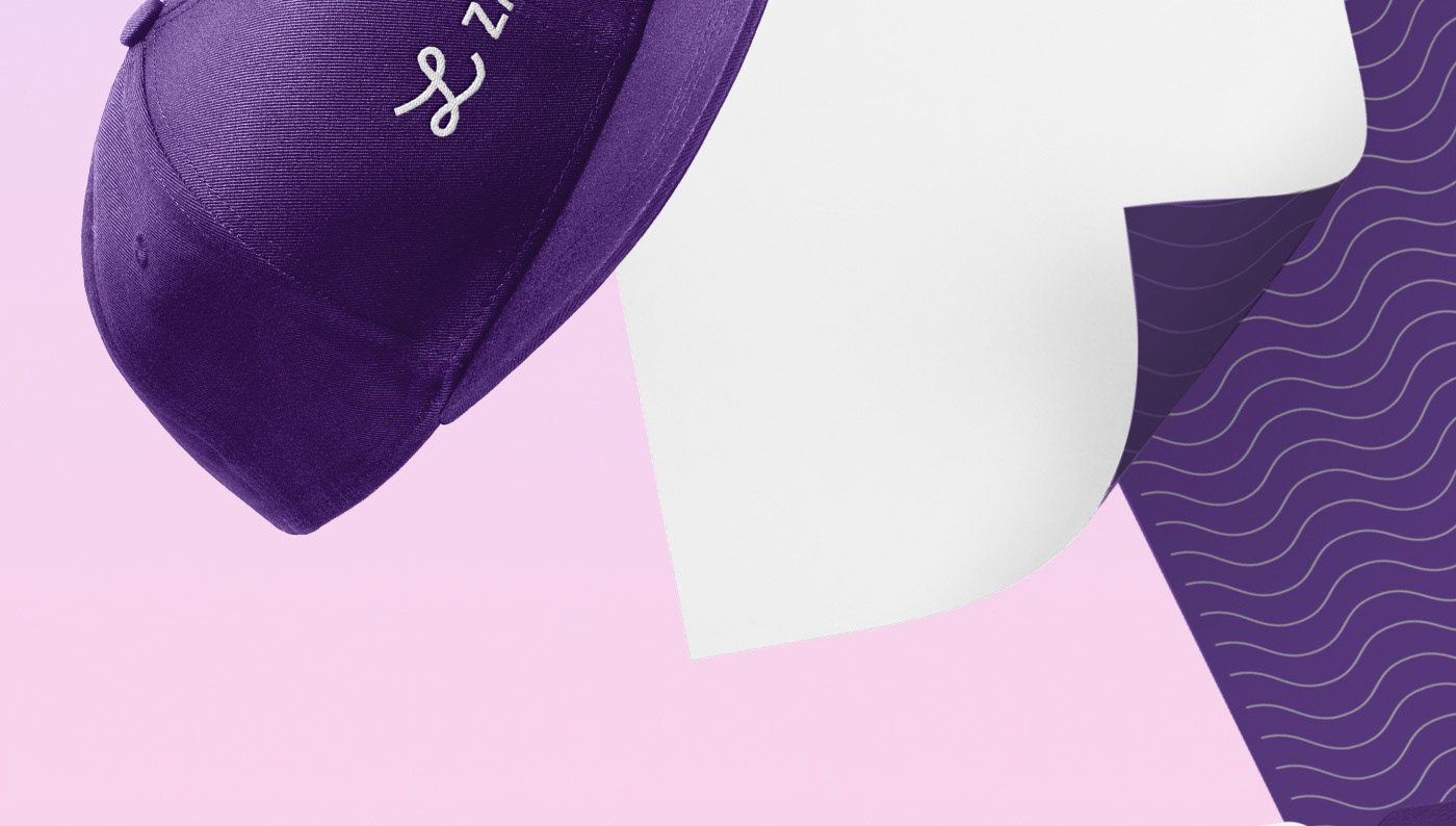
My Roles: Logo design, Art direction, Identity Design, Motion desgin
Dates: Feb 2022


Zarela embodies the essence of a nurturing guide, like a princess safeguarding her realm. In the spirit of Sara, Zarela stands as a beacon of serenity and progress, ushering in an era where the future unfolds now. The emblem fuses timeless infinity with dynamic waves, signaling connection and forward momentum. It encapsulates a vision of boundless potential, with each symbol—the open book, the ticking clock, the gentle wizard—inviting us on a transformative quest toward a utopian horizon.