SAMURA SPORTSWEAR
I was approached by people from the PARES RELATIONS,
an advertisement agency from Moldova, and asked
to come up with a bold and modern visual identity
for a sportswear brand specialized in martial arts called
SAMURA.

Inspiration for this project came from Far East obviously.
Japan with its traditional arts, history and myths.
Japan with its traditional arts, history and myths.
(I am not owner of the images used in the following collages)
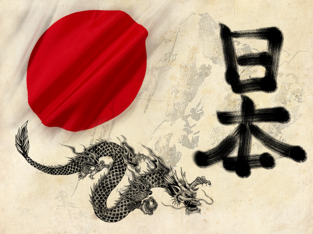

RED, WHITE, SILVER, BLACK
National flag, blade of the katana sword or the art of traditional calligraphy
are the source of the used color scheme.

Wordmark letterforms are also inspired by
Japanese typography and characters.

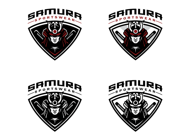
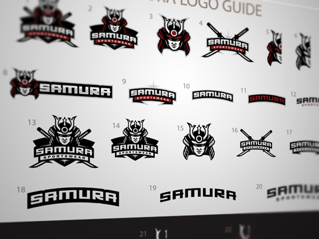
LOGOS

"S" shaped dragon is also part of the SAMURA identity.


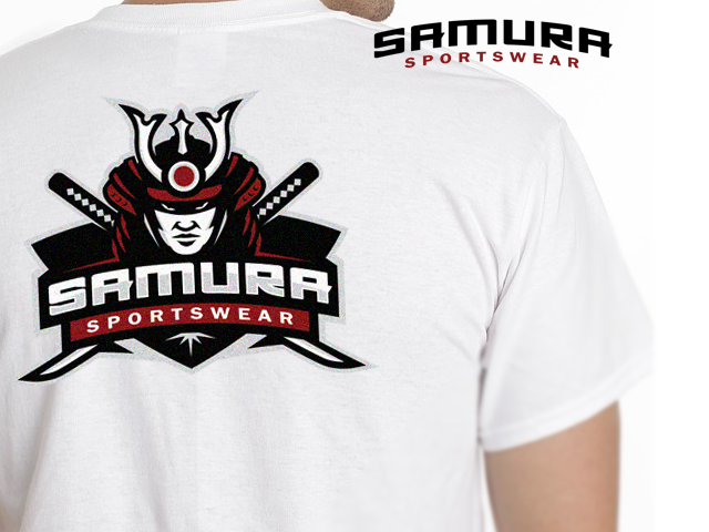
APPLICATIONS


THANK YOU FOR VIEWING!
ALL THE APPRECIATIONS ARE HIGHLY APPRECIATED!

