

Truly sustainable construction
Brand Identity, Editorial
GreeCo is a startup focused on sustainable building. In an industry that tends to be static, characterized by a low propensity for change and innovation, the project wants to be the bearer of a new approach to urbanism, based on respect for context instead of prevarication.
An important statement of intent, in discontinuity with the competition, but one that was not reflected in the brand's old guise. DilloStudio was tasked with restyling the brand and drafting a brand manual that was clear, concise, and complete with all the necessary guidelines for implementing the new corporate image.


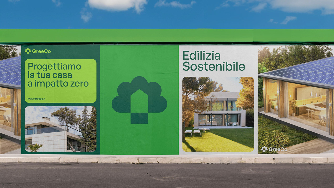
The new logo, resulting from the intersection of an upward-pointing arrow and the silhouette of a tree, carries a double meaning: on the one hand, it represents the respect that every building should show to its surrounding environment, as evidenced by the house set in a natural environment; on the other hand, it symbolizes the relentless progress of modern construction, which requires constant innovation in materials, processes and construction techniques.
The previous green color has been replaced by three more vibrant shades, the various combinations of which contribute to a fresh, dynamic and forward-looking image. This same direction was followed in the typographic choice, which fell on General Sans, a sans serif font that combines rigorous design with softer, more rounded forms.


In all graphic designs, the various types of content, such as text, photographs, illustrations and graphics, are enclosed in rounded rectangles, shaped to fit precisely into the available space. This aesthetic choice evokes both the essence of construction itself, which can be succinctly interpreted as an orderly organization of different blocks, and the personalized approach guaranteed to each client by GreeCo.
If in the past the logo was the only distinguishing element of the company, today it is the entire communication system that speaks, consisting of shapes, colors, fonts and images, in accordance with the guidelines given in the brand manual. Indeed, the primary goal of this project was precisely to equip the company not only with a new image, but rather with the necessary tools to apply it uniformly and independently over time.


