Estúdio Cone | Branding
PT\BR
Somos um estúdio criativo que colabora no desenvolvimento de projetos by cash & by knowledge, com o objetivo de aprender e colocar ideias ou marcas para o mundo. No estúdio, criativos e criativas a fora podem trazer parcerias em projetos ou até mesmo ideias mirabolantes. Porque a gente nunca deixa de ser o que é.
No nosso caso, somos um cone que está sempre em movimento.
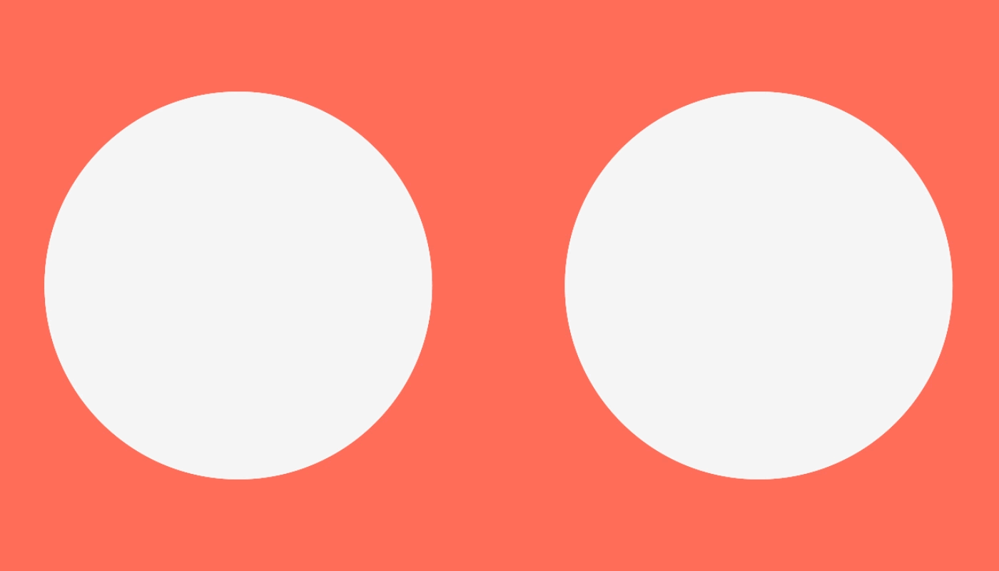
Na construção da marca focamos em simplicidade, buscando uma conexão amigável e conectada com o público, referenciando o i(cône)co de trânsito. Ao pensarmos na identidade, consideramos a possibilidade de aplicações independentes, permitindo que o símbolo seja destacado do logo, oferecendo versatilidade e adaptabilidade.
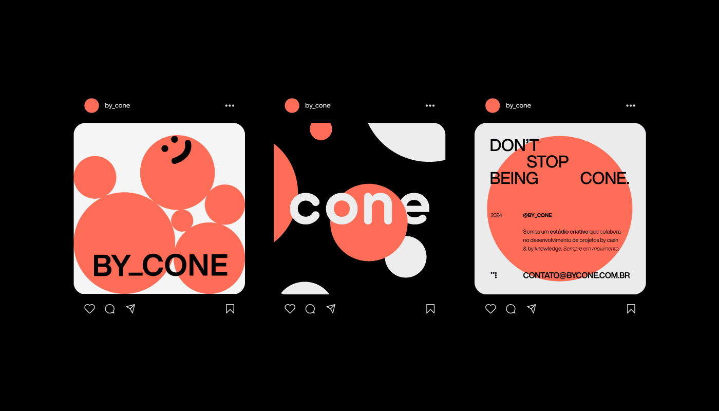
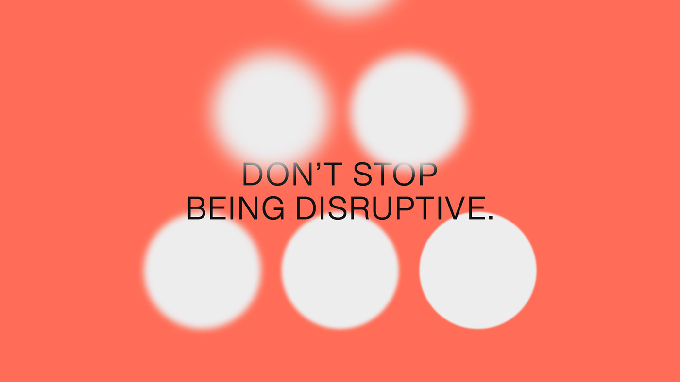
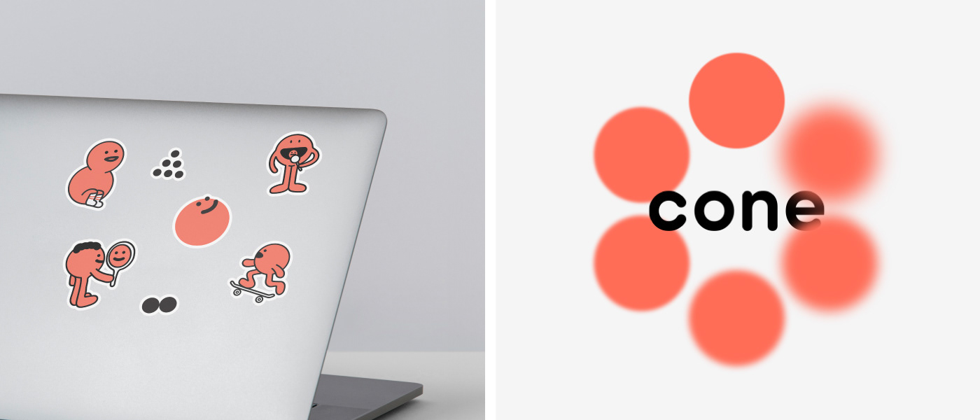
No processo de construção do símbolo e logotipo, trouxemos os con's, que incorporam valores de arquétipos conhecidos, como Simples, Disruptivo, Divertido, Cuidador, Jovem e Explorador. A partir deles, é construído as seis elipses que compõem o símbolo e se fazem presente no logotipo, nas letras C, N e E. Nas aplicações, mantemos essa coerência visual.
O objetivo da cor é transmitir criatividade e vitalidade de forma natural, tornando uma cor de fácil reconhecimento, ao mesmo tempo em que diferencia-se em tons do laranja clássico de um cone. Essa energia vital é complementada pela sobriedade do preto e cinza-claro, que realça a atenção em cada detalhe.
EN
We are a creative studio that collaborates in the development of projects by cash & by knowledge, with the goal of learning and bringing ideas or brands to the world. In the studio, creatives from all walks of life can bring partnerships in projects or even wild ideas. Because we never stop being who we are. In our case, we are a cone that is always in motion.
In building the brand, we focus on simplicity, seeking a friendly and connected connection with the audience, referencing the traffic i(cone)c symbol. When thinking about the identity, we consider the possibility of independent applications, allowing the symbol to be highlighted from the logo, offering versatility and adaptability.
In the process of building the symbol and logo, we brought in the "con's," which incorporate values of known archetypes, such as Simple, Disruptive, Fun, Caring, Youthful, and Explorer. From them, the six ellipses that compose the symbol are constructed and are present in the logo, in the letters C, N, and E. In applications, we maintain this visual coherence.
The goal of the color is to convey creativity and vitality in a natural way, making it a color easily recognizable, while differentiating itself in shades from the classic orange of the traffic cone. This vital energy is complemented by the sobriety of black and light gray, which enhances attention to every detail.
Client — Estúdio Cone, Brasil
Work — Branding
Design & Illustration — Ricardo Toillier
Design & Illustration — Ricardo Toillier
Concept & Motion — Eduardo Figueiredo
Photography — Felipe Araújo