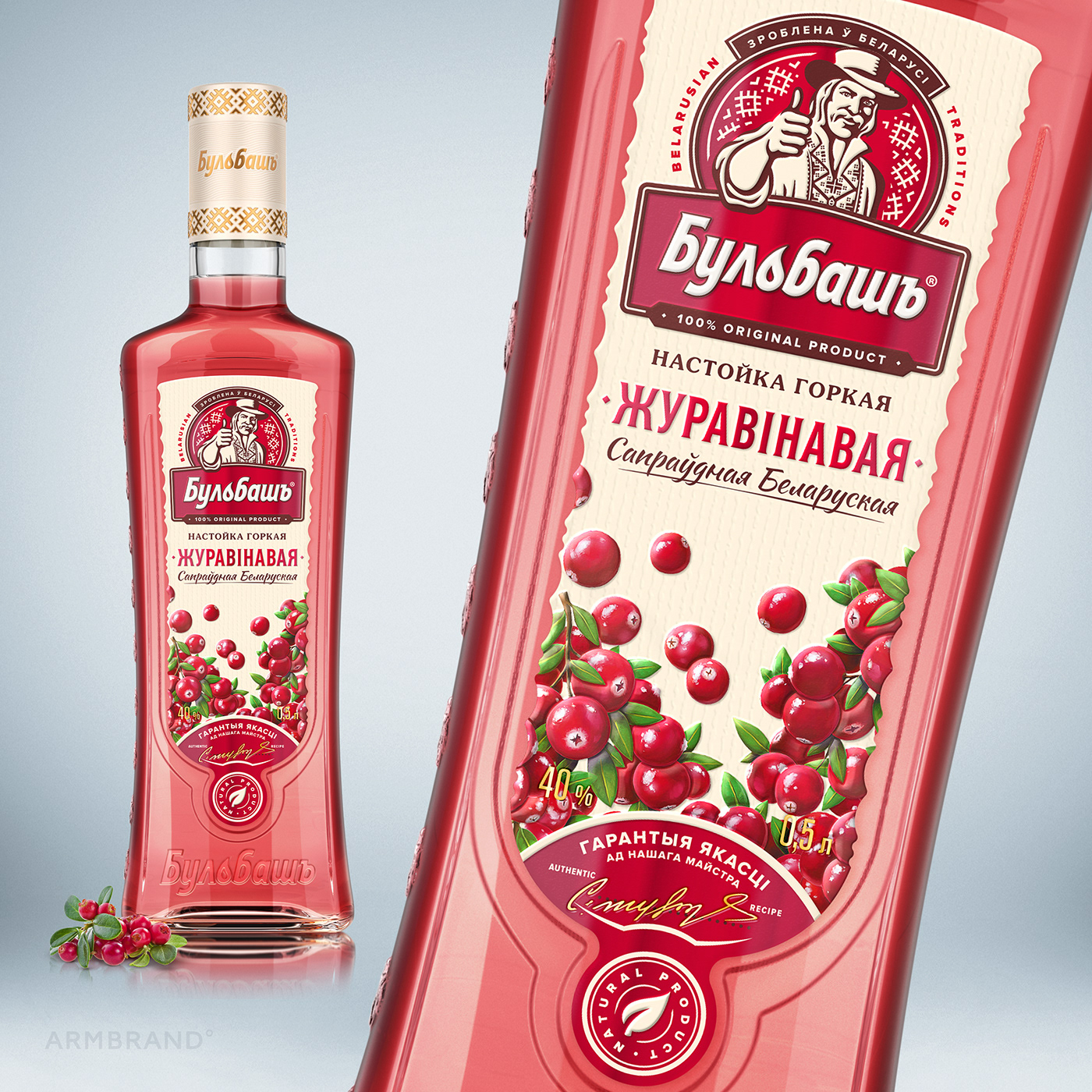
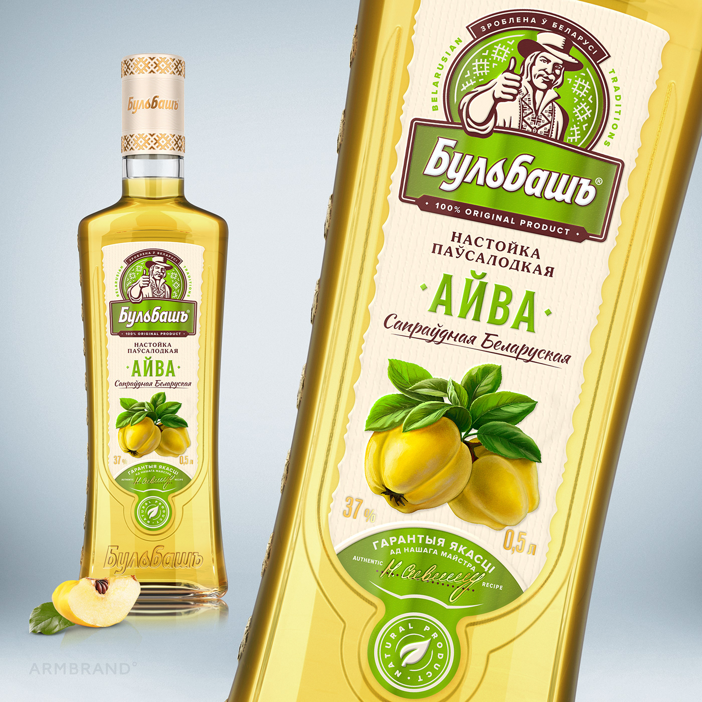
Redesign of Bulbash bitters. Version 2.0.
In this work, we returned to our own design, which made ten years ago the line of liqueurs highlighting and recognizable.
Every detail has been improved.
The ivory colour personal cap, gold embossed, fits the label and creates the elite product image. The upgraded block with brand icon and logo has become more contrasting and modern. A lace-cut label and imitation of textured paper added authenticity and perceived value. The typography has become more readable and alcoholic. The unique high-quality illustrations in a common style attract attention. The label footer shows the quality and naturalness of the product.