Casa Loona: home textile & decor
Casa Loona is a brand of home textiles and decor, approaching capsule collections for kitchen, dining room, bedroom, and bathroom. The brand's product range is classic, functional, and timeless, but with a twist that needs to be reflected in the brand's corporate identity and packaging.

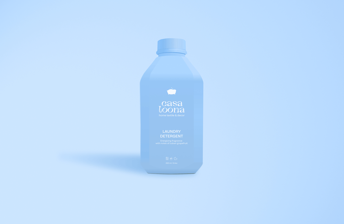
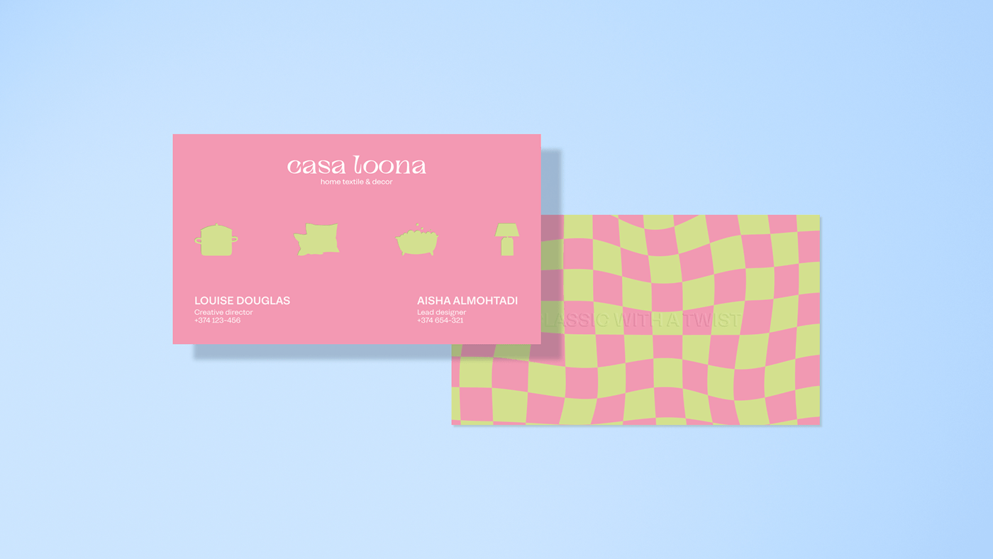
The «twist» in the classic approach of the brand was reflected in the logo with the help of sharp, dynamic, but smooth serif. This combination of soft and angular shapes in the font logo accurately conveys the contrasts of the brand's character: classic, but timeless; cozy, but stylish; elegant, but affordable.
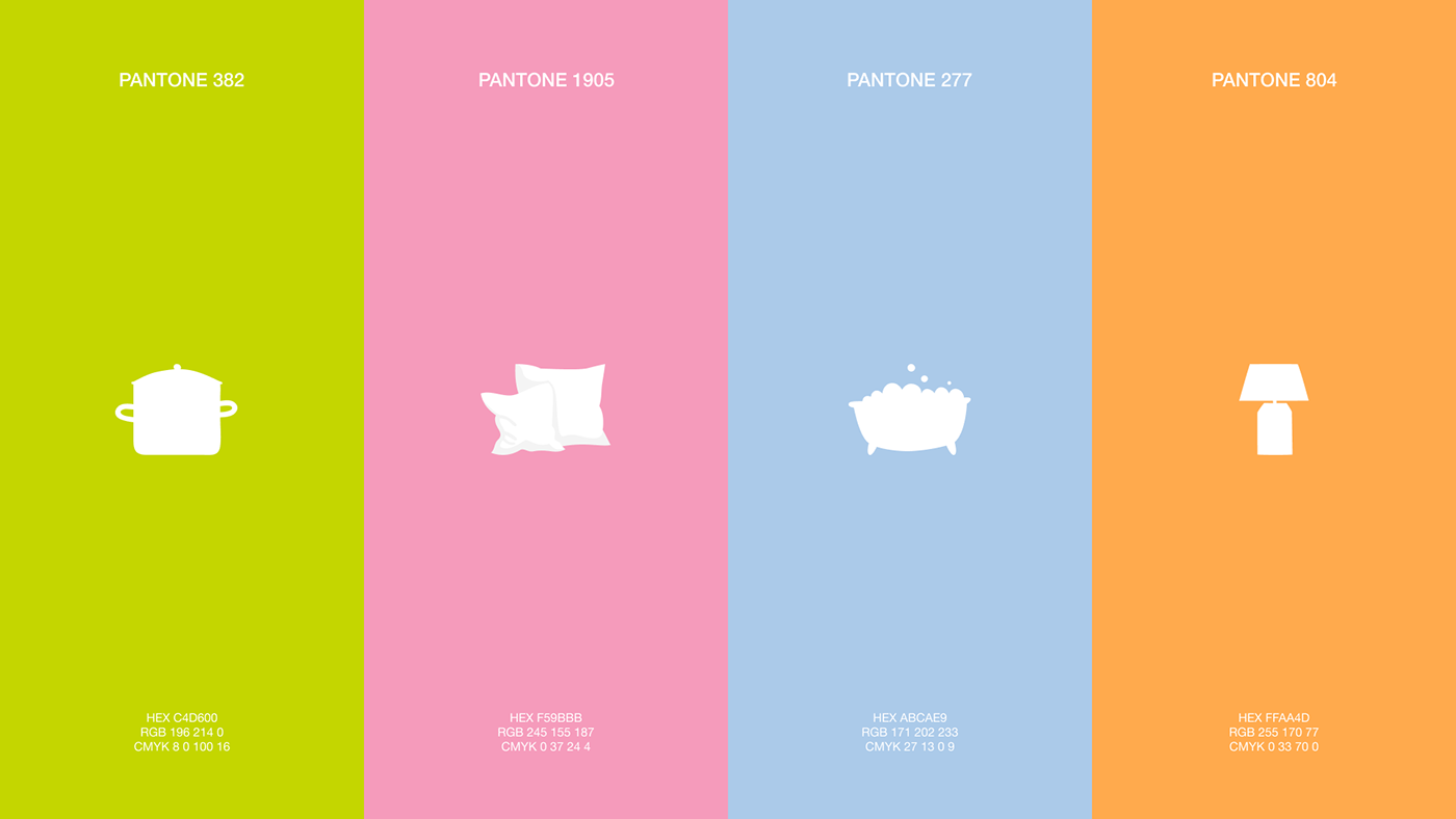
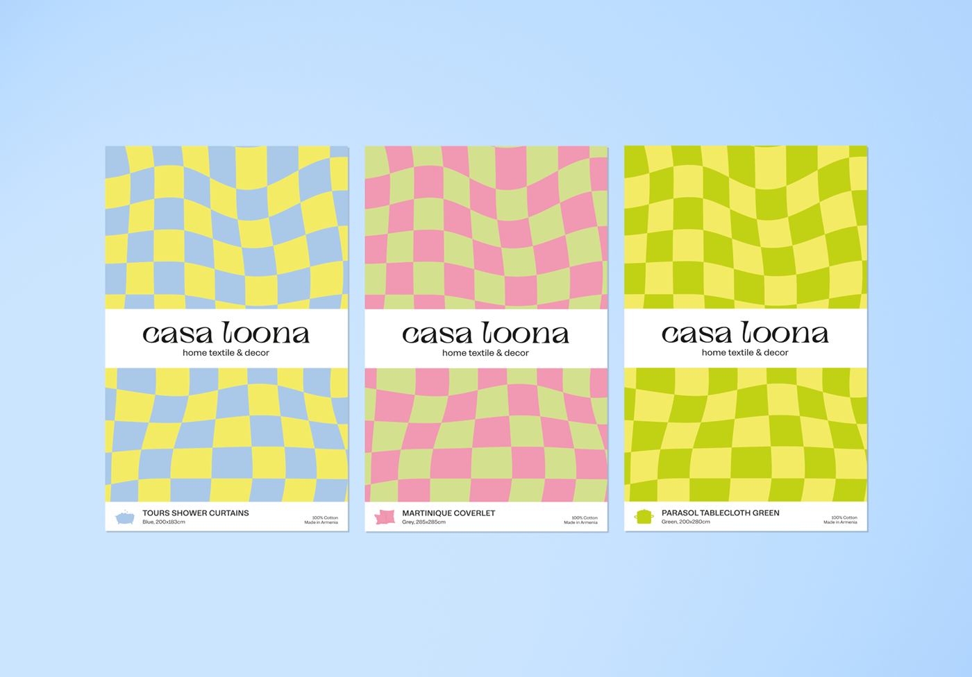
The color palette choice for the brand was inspired by the motifs of the Tuscan landscapes: cotton candy sunsets, juicy lemons and olive groves.
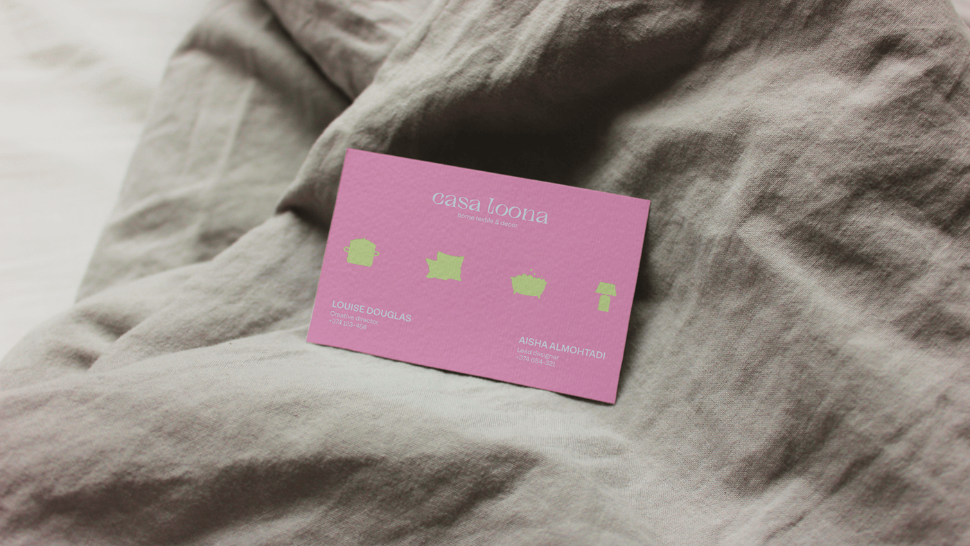
The competitive advantage of the brand is a textile constructor when all brand attributes can be combined and new color combinations can be created. This is how we came up with a key color pair: pastel pink, that gives the collection tenderness and femininity, comfort and warmth, and olive green, associated with freshness and nature's grace.
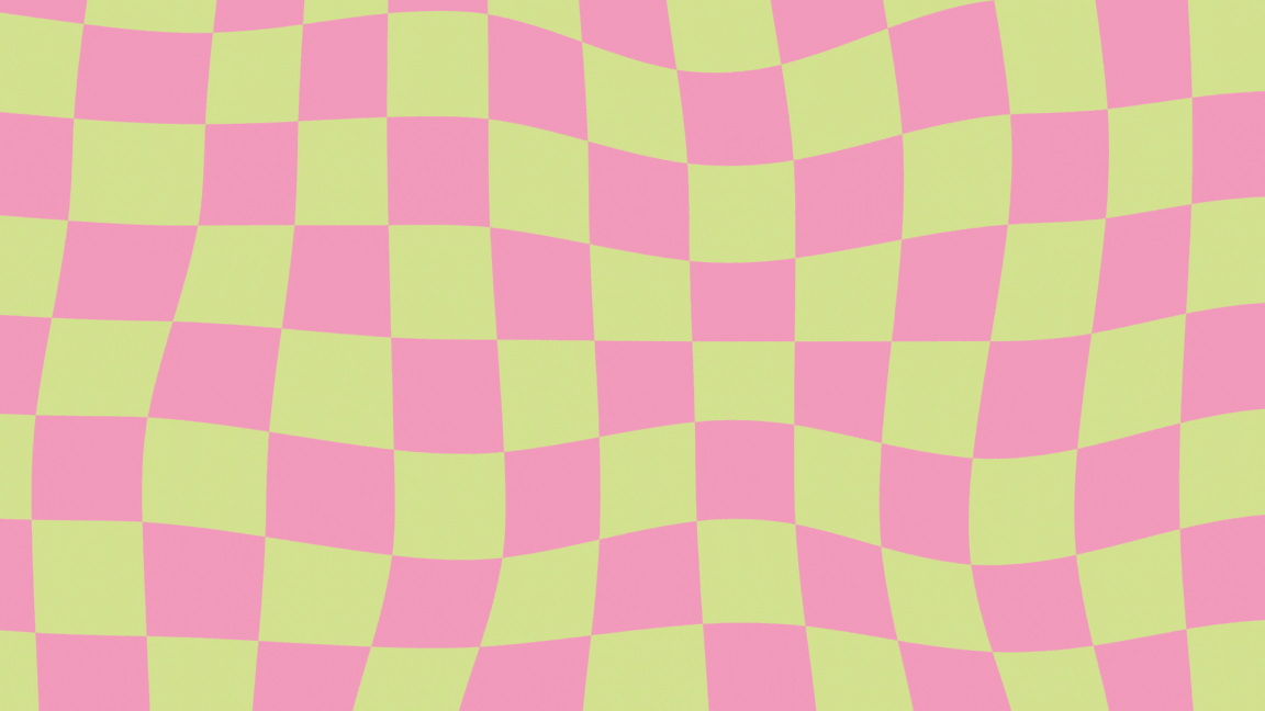
The chessboard in the brand's pattern is a subtle reference to the classics and elegance of the project, but in order to meet the philosophy of “classic with a twist”, we deliberately distorted the geometry. This technique allowed us to reflect the founders' non-trivial view of home textiles and home decor, dynamism and freshness of ideas.


A box for potholders and coasters
The wow effect of the packaging is present in every brand asset, and we showed the very highlight of the brand through their “inner world”: the outside of the box is painted in the solid green color while inside the pattern reveals a wonderful, unusual universe, in which deviations from traditions, shapes and patterns help to look at shopping for home with new eyes.

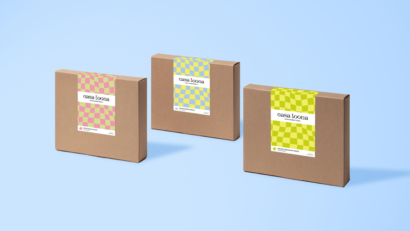
For a simple but effective customization of shipping boxes, we have developed stickers based on a pattern,
an illustration sending the customer to the brand’s capsule, and brief information about the contents.
an illustration sending the customer to the brand’s capsule, and brief information about the contents.

A box for tablecloths, runners, and aprons
Each capsule of the brand has a simple illustration and its own color, and for better customer navigation, we used these techniques in labeling products. So, the image of a pot cut down in the top of the box suggests that there is a supply for the kitchen inside, while the information on the lid and spine informs about the purpose of the product, its characteristics and size.

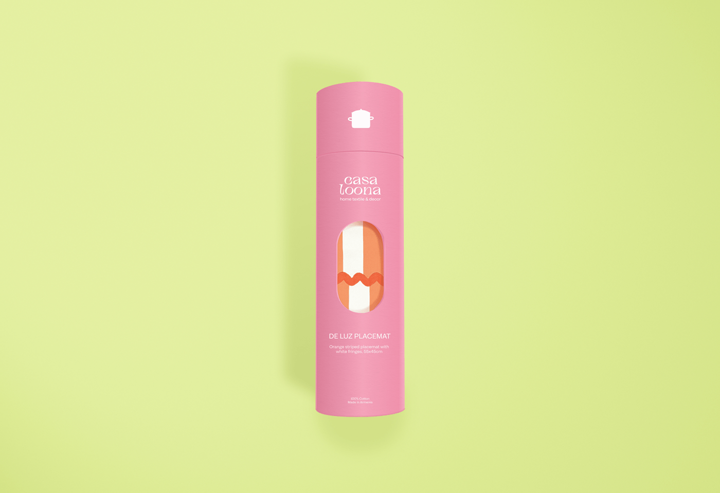
Tube for placemats and aprons
Thanks to the slot in the package, one can easily understand the texture of the fabric and see its color, while the color of the box, the information on the outside and the capsule designation will inform the buyer about the purpose of the contents.


casa loona brand identity
case study, 2023
graphic designer x Arina Ignatova
© photography and content: Bongusta, Roundhouse,
Serena & Lily, Trouva, Kassatex
Serena & Lily, Trouva, Kassatex


