My friend who I have done previous work for was showing me his logo for his recording studio. I immediately told him I didn't like it and in that moment I decided that I desperately needed to redesign his logo. He is an up-and-coming rapper and studio engineer, so I wanted his brand to appear as established as it is with a well designed logo.

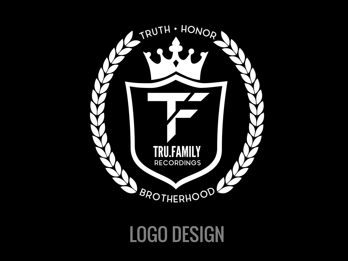
My solution was to simplify the original logo and draw attention to elements that were the most important to the TRU.Family brand. The first things I noticed were the shield and crown. I decided to make those to elements the focal point of the solution. The wording "Truth, Honor, Brotherhood" also helped reinforce this decision. I placed the word "Brotherhood" at the bottom because it is the foundation of TRU.Family and placed "Truth" and "Honor" because they are above all else. The overall feel of the brand is knights in a kingdom and I wanted that to be evident immediately. My solution stripped away the banner, which cluttered the design and was unnecessary. I am keeping the logo circular, using implied lines instead of physical lines. The "TF" in the old logo just fell flat. My solution added a touch of flair and direction. I slanted the ends of the T and F to suggest forward, positive movement. The previous logo was grey and white, but the new logo being black and white makes it more modern.
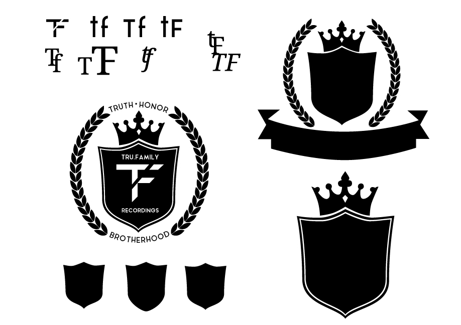
During my design process I explored a variety of shapes for the shield and font types. My solution features a modified version of the "Aqua" typeface by Laura Pol.

Black and white versions.

Merchandise example.


