
This project aims to explore the use of different types of digital media to enhance the experience of visitors in museum exhibitions with historical content. To that end, a scale model was created to illustrate how to enrich the physical environment with digital media and interventions.
This project was created as the Master project in the Digital Media Design program at the University of Arts Bremen, Germany. Presented in April 2013.
Goals
To propose different ways in which digital media can be used as a tool in museum exhibitions. To document this process in written and visual forms.
This project aims to explore the use of digital media in the context of historical museum permanent exhibitions. To achieve that, I designed a concept of an exhibition focused on the visual government propaganda of several countries, of different political alignments, during the second world war.
My main interest in the project is to find effective ways to add a digital layer to historical information, making the museum experience richer to the visitors, whether they are familiar with the theme or not. The goal is not the actual historical data, so this has been manipulated or changed when necessary, in particular on the case of the "data visualization" installation. All posters, videos and other visual materials used are accurate reproductions of the historical material.
The theme of propaganda came up based on a small part of the permanent exhibition of the Deutsch-Russisches Museum, which focuses on the relationship between Nazi Germany and Soviet Russia. After a bit of research on this theme, it became clear that the propaganda visual style and approach of both regimes was very similar. Thus, comparing the specific posters and imagery became the starting point of the project. A further dive into propaganda from the 30s and 40s showed that even countries with very different cultures, such as China and Japan, also used similar visual communication elements to fight the propaganda side of the second world war.
The comparison should help visitors to see how similar the arguments were of totalitarian and democratic regimes, then expanding to allowing the visitors to immerse themselves in both exaggerated and dramatized perspectives. The constant message of hate, the demonization of the enemy, the exploitation of fear, all of those are constant themes of this visual material, used very effectively to often incite panic in the civilian populations and hatred on the soldiers.
I focused on propaganda posters and add digital layers of information to them. The overarching theme of the exhibition is to show the similarities of manipulative political propaganda leading to intolerance and hatred between nations.
The installations
The exhibition includes four different installations about the theme, with different approaches. These are:
The exhibition includes four different installations about the theme, with different approaches. These are:

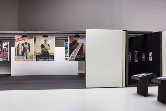
Informational: Explore what's behind the posters and learn more about the realities of both countries in that period of time. That means having poster reproductions hang from the ceiling in pairs, always from opposing historical sides, but with extremely similar content and message. These posters will have an OLED layer in front of them, which will gradually provide extra information on the posters according to the visitors foot movements.

The longer a visitor stands in front of a pair of posters, the more information is shown, in a sequence. Once the visitor walks away, the information vanishes from the poster/screen. This installation has a discovery aspect, as visitors will not be instructed as to how it works. The first layer of information will appear when the visitor has been standing in front of the posters for 5 seconds. Then the next round of information will appear every 15 seconds that the visitor stands there. Each layer of information will be a short sentence, telling a story.

This will be done with OLED transparent screens. To be able to compare, visitors will be able to learn more about individual aspects of the posters and learn through them. Not only about the graphic aspects of the posters, but the story behind them. The comparison will try to answer these questions:
Where were the posters originally hanging? When were they created? Why that poster at that time? How many of them were printed? Who created them?
Who was the target audience of these posters?
Why was this kind of propaganda necessary/important?
How was the message perceived by the population?
Why do the posters use drawings instead of photos?
Why these colors?
Why these specific animals/mix of humans and animals? Why the snake is the enemy?
Why these fonts?
Why are the people who are depicted in the posters presented as they are? Did people in these countries at that time look like that? Who were the models?
What was the average person like at that period?
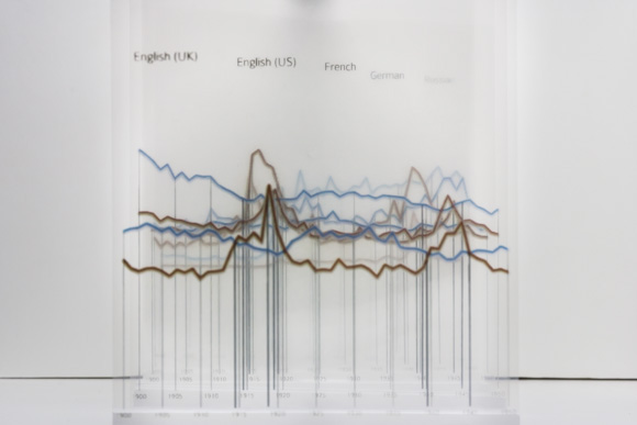
Data visualization: Based on Google Ngram searches of the words "friend" and "enemy" in the following languages: English (UK), English (US), French, German and Russian. The results are shown in large transparent, room-sized graphs that show he rise and fall of use o both words from 1900 to 1950.

The periods of both World Wars are highlighted on the chart. The visitor can stand in front of the transparent graphs and see them superimposed, to be able to compare how different cultures were influenced by historical events. The objective here is to show how words of hate and enmity grew during times of war.
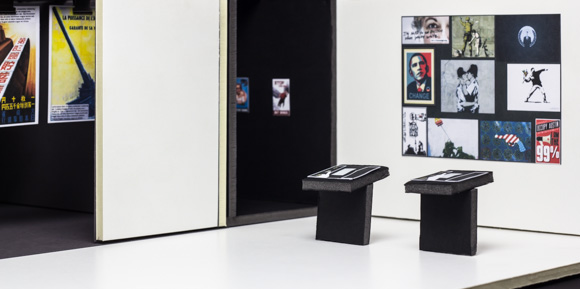
Experimental: Visitors will be able to experience political propaganda in a different way by being prompted to create their own propaganda posters. Two terminals would allow the users to select visual elements, such as "people", "flags", "weapons" among others, add layers of text and create a digital poster, which would then be projected on the wall of the museum.
As an inspiration for visitors, different types of contemporary political propaganda would be displayed in the beginning of the show: from election campaign posters (like the "Obama Change") to graffiti from Banksy. The elements to create posters would be also contemporary, bringing the thought of political propaganda to the present day.
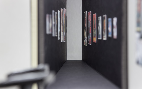
Emotional: Visitors can experience the feeling of being a target of hateful political propaganda by walking through a dark corridor that gets more narrow with each step. On the walls, you see agressive posters, at first printed in small size, then progressively becoming bigger and bigger, while the corridor on which they hang gets narrower and narrower. Visitors must walk through it to be able to leave the exhibition.

This was designed to create an oppressive, menacing feeling in visitors. As the corridor gets smaller and posters get bigger, there is the feeling of being the target of the aggressive messages. Posters were selected from different ideologies and showing a very negative image of their oponents.

