


Client
Protea is a series of wines from Anthonij Rupert Wyne. Inspired by South Africa’s national flower, which is beautiful and diverse, Protea wines are fruit-driven, easy to drink, and bottled in beautifully designed bottles.
Project details
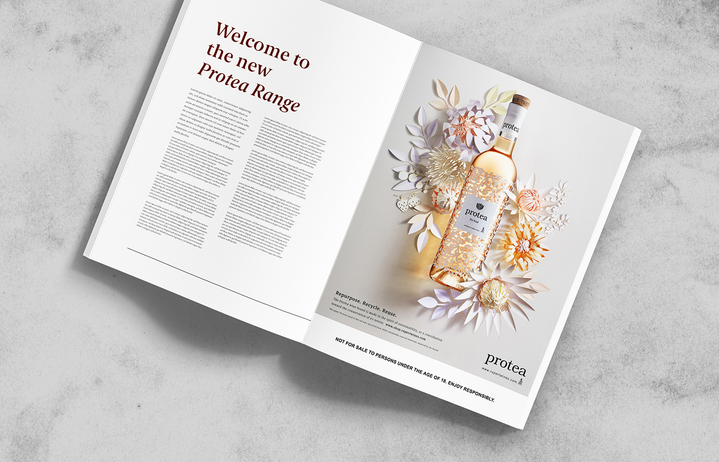
We were asked to create a print advertisement for the Dry Rose. The bottles were designed by an award-winning fashion designer, using a state of the art ink and glass fusion process. The bottles are a great green product. The ink used is heavy-metal free and the label can be easily removed, making these bottles perfect for re-using/up-cycling. We wanted to carry this eco-friendly sentiment through in the art direction by crafting a series of hand-made protea flowers from recycled, acid-free papers, to frame the bottle in a symmetrical composition that highlights the bottles design. It was important for us to only use real elements, made with real paper, to give this ad an authentic look & feel.


AGENCY SuperElastic Studio
DATE 2019


