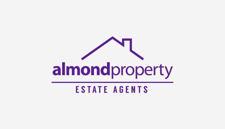
I was approached by a local start up estate agent to re-design their logo, brand identity and stationery, and although this wasn't the concept used, I am pleased with this variant.
The existing logo uses a text-based mark, in a calligraphy style typeface, and this is something I wanted to deviate from. I wanted the logo to be modern and elegant, as the business has a high profile client base, and I wanted to reflect this in the design.
To achieve this, I used a minimal, abstract roof which symbolises the role of an estate agent, with two clean typefaces to give a modern appearance. Along with the logo design, various pieces of stationery were designed as well, which also reflect the professionalism of the business.


