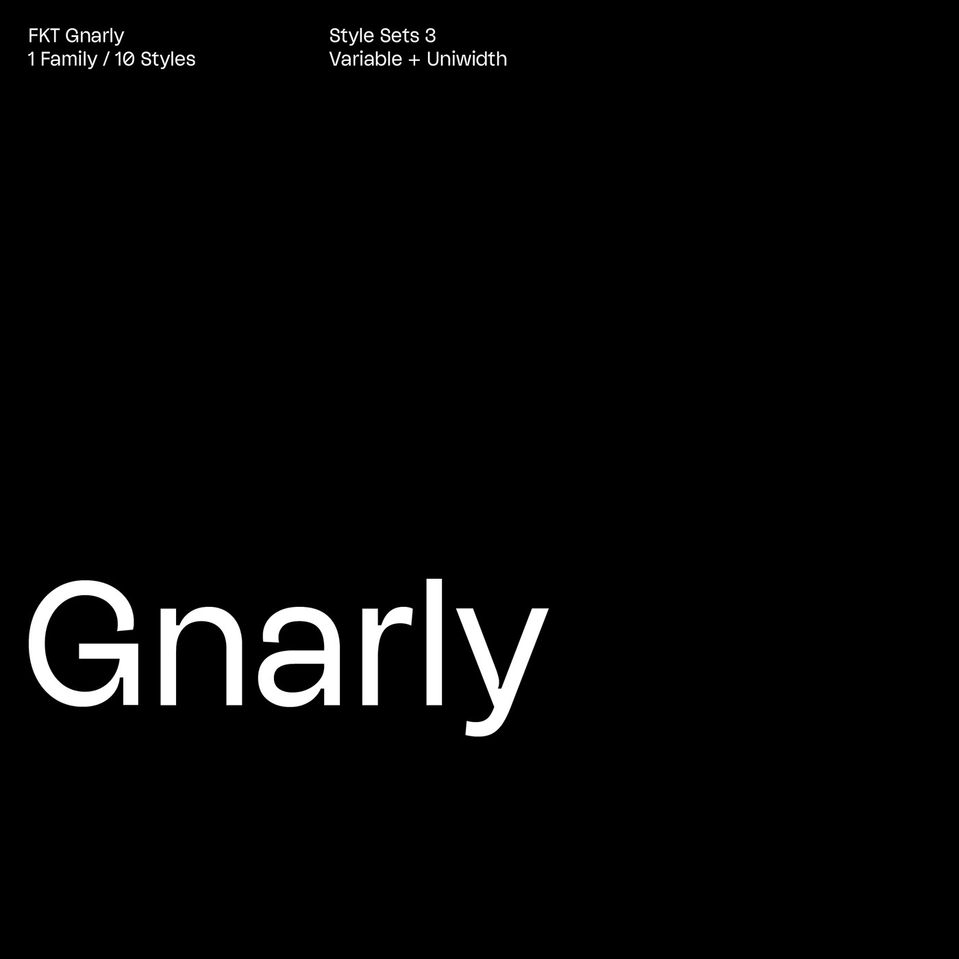
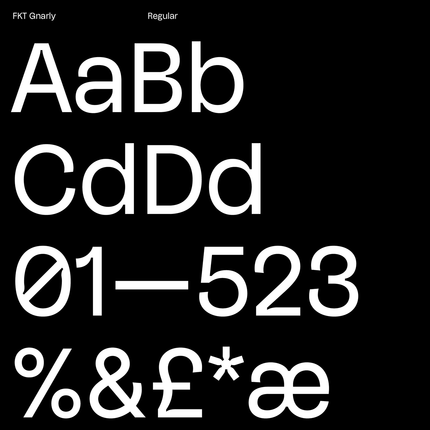
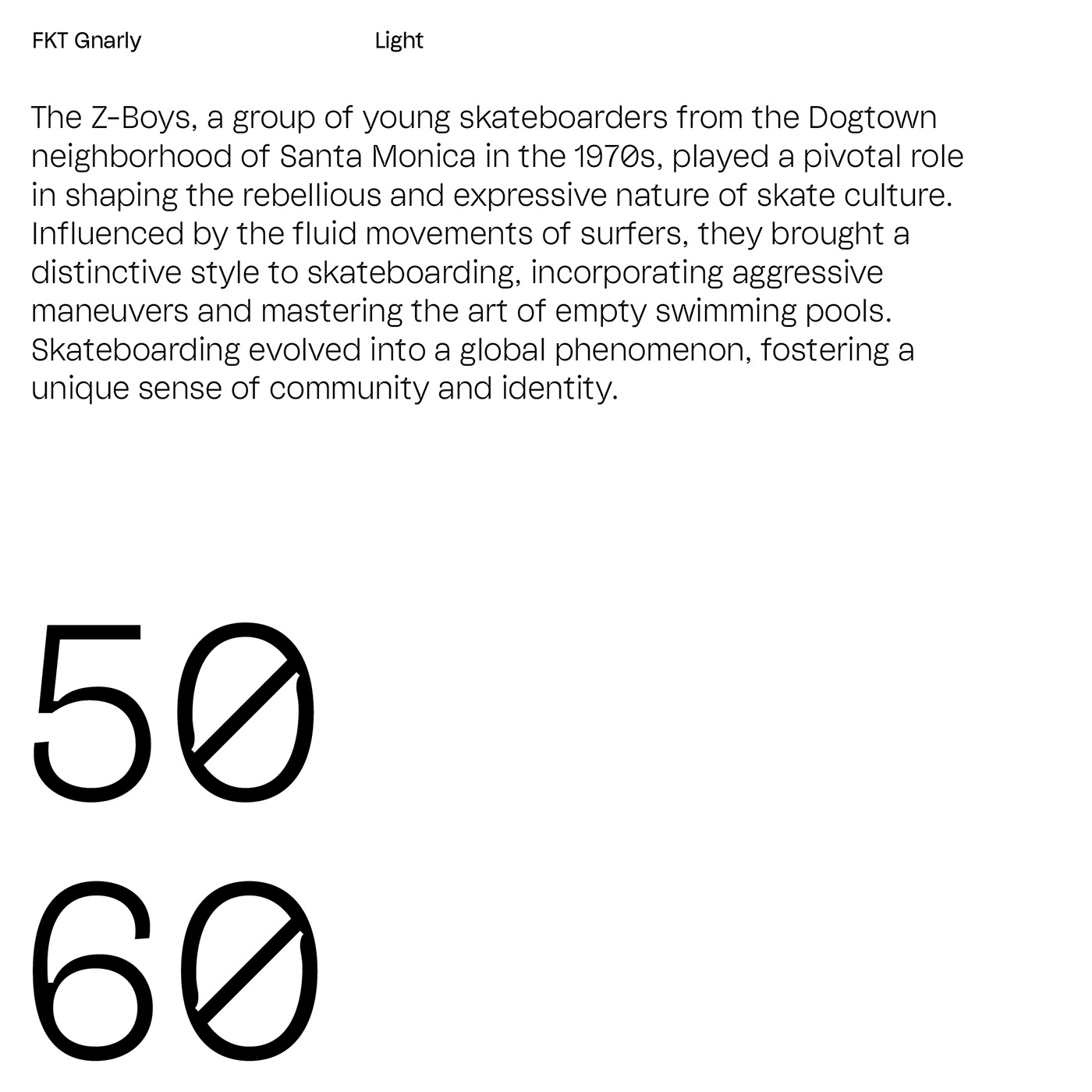
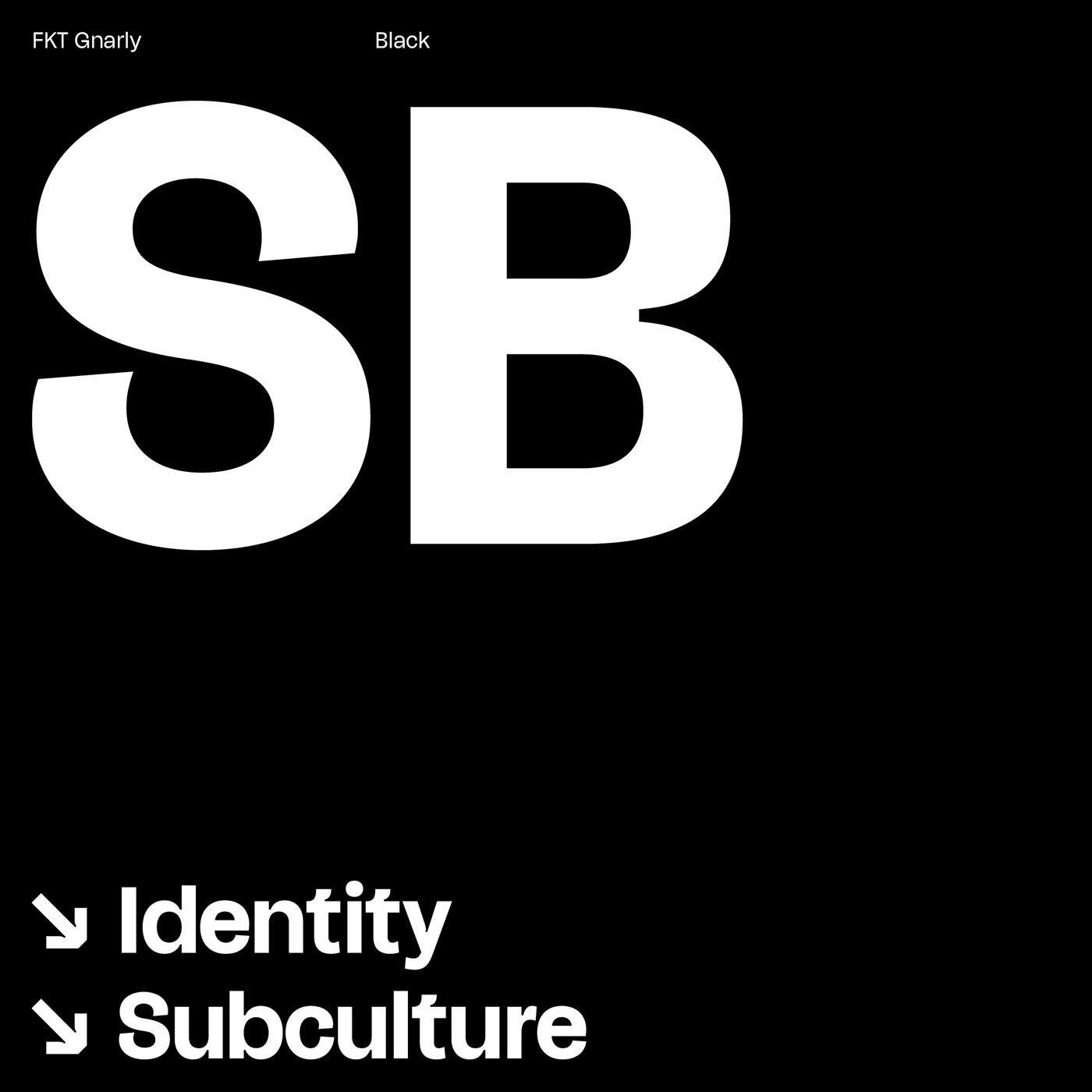
FKT Gnarly is a modern Grotesque offering five upright weights with matching italics, suitable for both text and display. Across all weights and styles, characters maintain a consistent advance width (uniwidth), ensuring no impact on line length or text flow when swapping, for example, the Black for the Light weight. Departing from tradition, this typeface features extended terminals reminiscent of 19th-century Grotesques and exaggerated ink traps, making a bold stylistic statement. Stylistic alternates, such as the single-storey 'a' and 'g,' allow for control over the text tone.
Sans • Grotesque • Uniwidth • Variable • 9 Weights • Italics
96 Languages • 523 Glyphs • Text + Display
formerly-known.com
96 Languages • 523 Glyphs • Text + Display
formerly-known.com