Dr. to Dr.
An academy where a doctor learns from another doctor. That’s the philosophy of Dr. to Dr., an e-learning platform focused on raising the standard of aesthetic medicine through high-quality courses taught by industry experts.
It is all about science, beauty and cell regeneration. And so our branding.
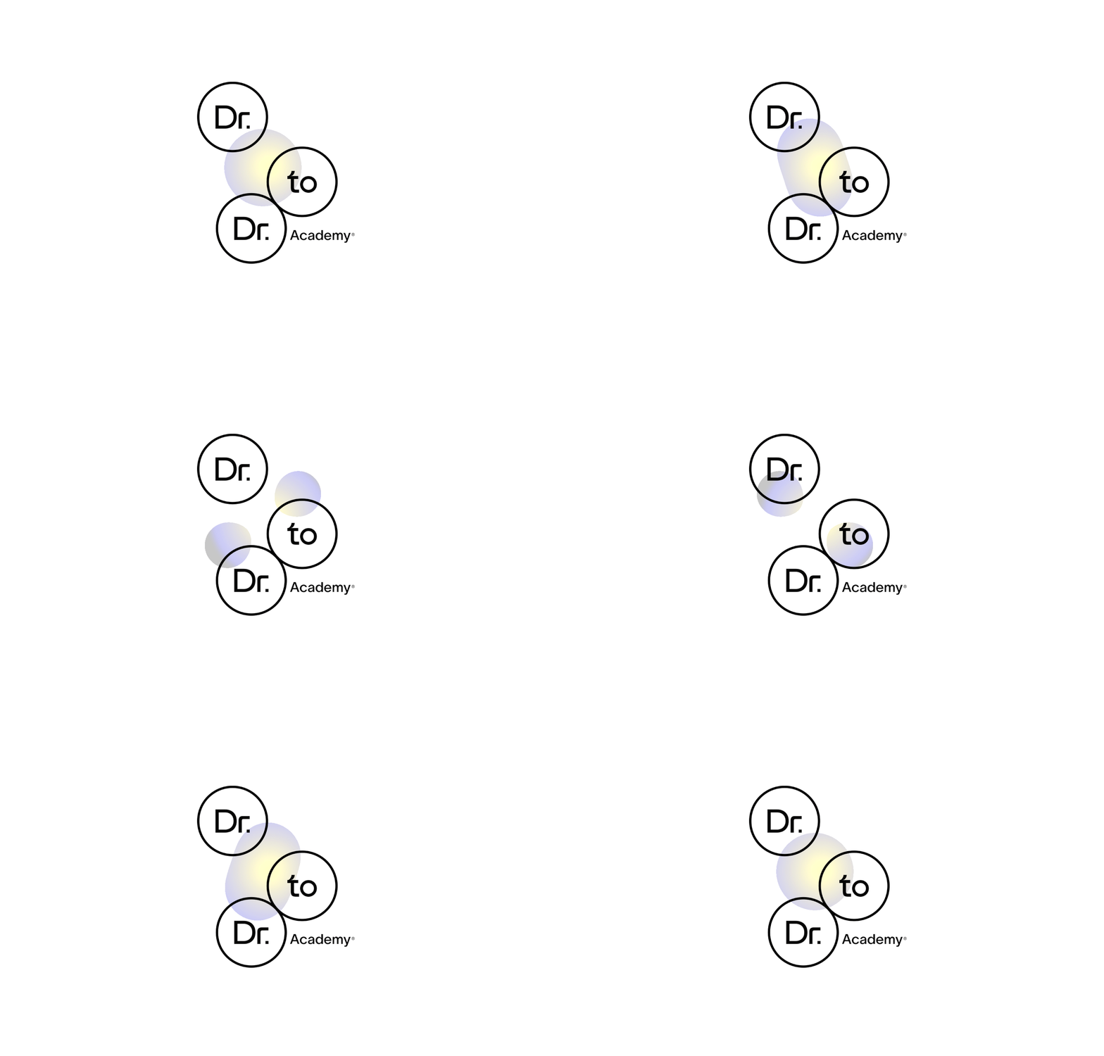
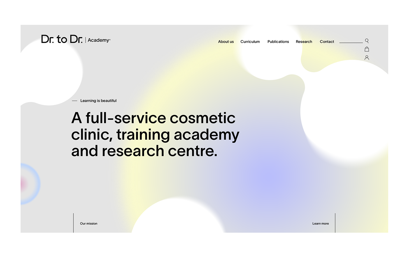
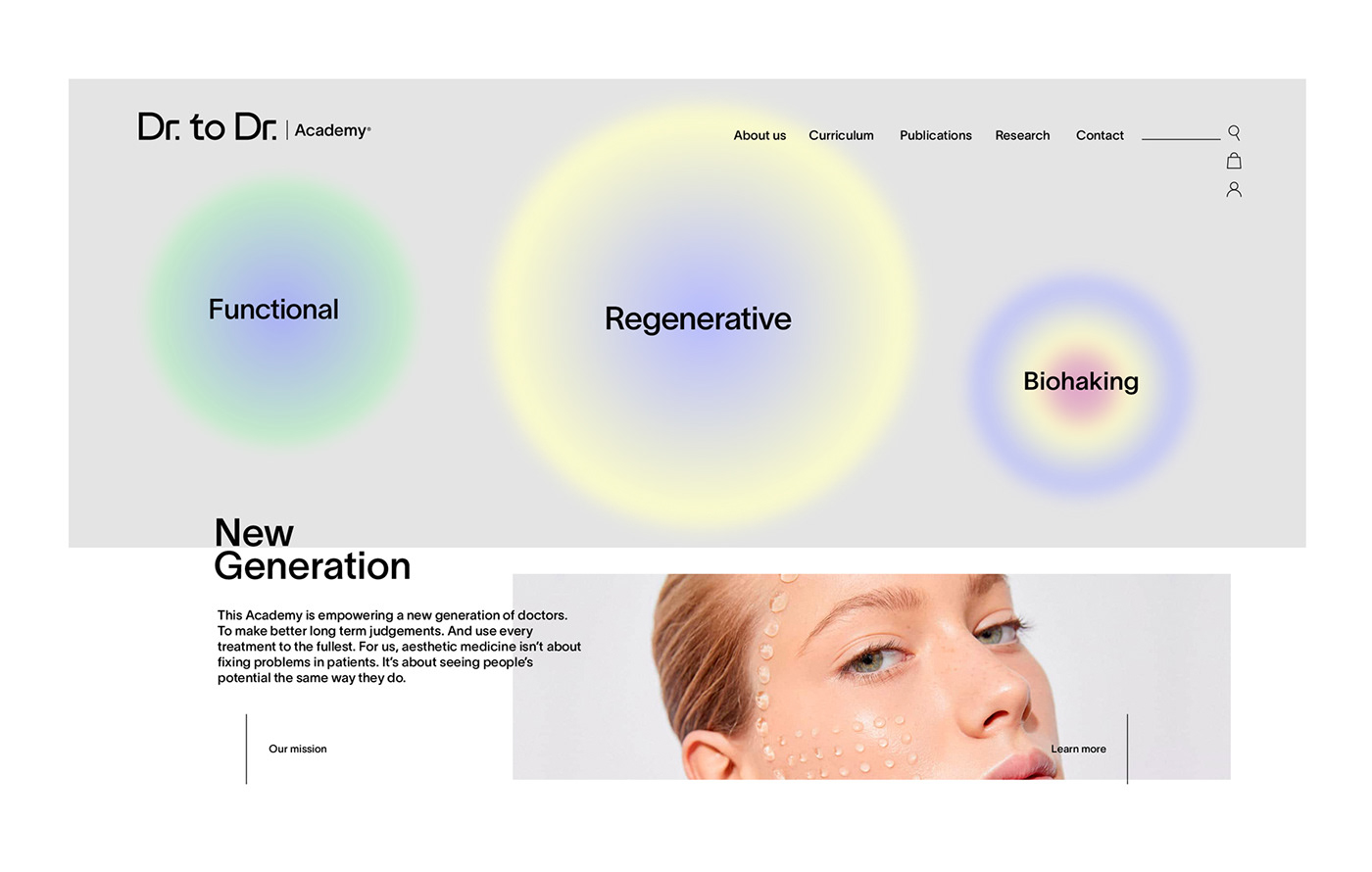
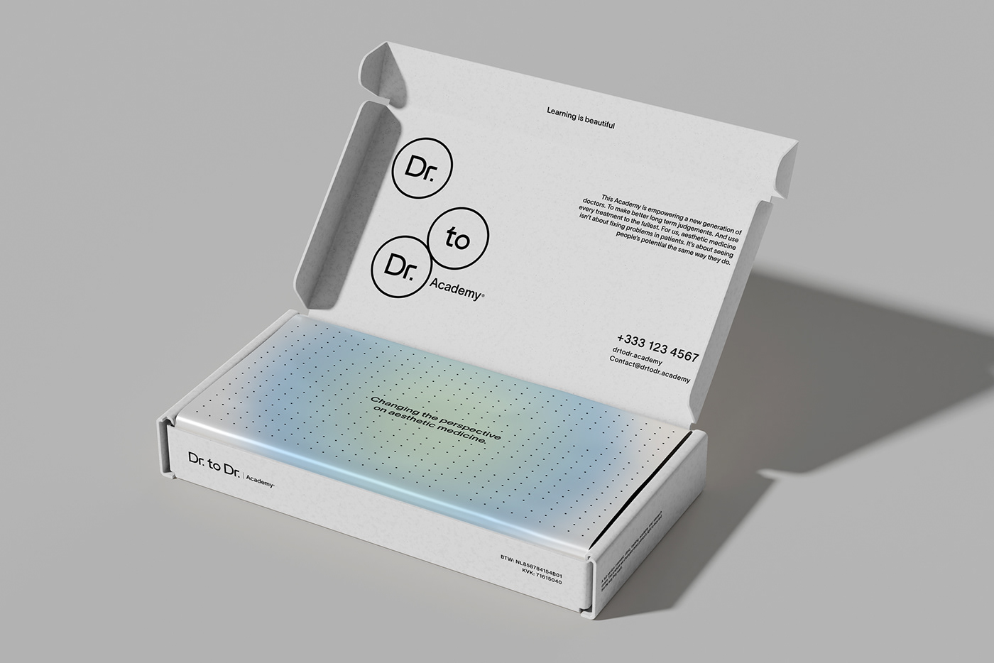
We encapsulate the brand's essence and create a visual metaphor that represents renewal and transformation. Circular figures symbolize the continuous cycle of cells during mitosis. The organic, soft, and curved shapes remind us of cellular structures and the morphology of biological tissues.
The logo has a simple and easy yet technological sense. If cell regeneration is related to scientific advances, we consider elements regarding technology and progress, such as dynamic lines and modern geometric shapes. The color palette is pure innovation. Vitality and rejuvenation, too.
_
Mexico City franca-st.com
hola@franca-st.com


