


Project Description
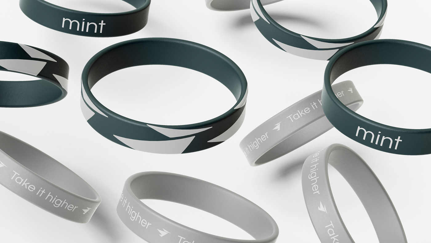
"mint" is a Russian manufacturer of portable devices.
This collection includes user-friendly devices such as smartphones, bluetooth speakers, headphones, and smartwatches.
This collection includes user-friendly devices such as smartphones, bluetooth speakers, headphones, and smartwatches.
"mint" is about the joy of opening something brand new, the feeling of experiencing its features as advertised.
The target audience is young people (~ 25 y.o.) who value mobility and speed due to frequent travel and work.

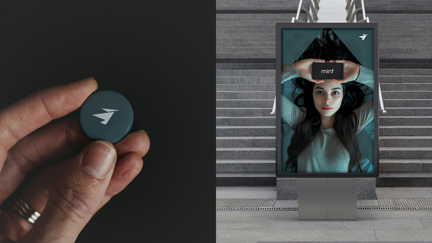
Introducing the logo of Mint — a sleek bird symbolizing the tech prowess and a relentless pursuit of progress. This emblem captures the thrill of flight, embodying freedom and the drive to reach new heights.
Tailored for the on-the-go youth, this logo inspires constant motion and a forward-thinking mindset. The bird's dynamic silhouette represents agility and openness, encouraging individuals to explore beyond limits.
Designed for those who seek breakthroughs, mint logo embodies adaptability and speed, resonating with a dynamic audience ready to embrace the future.


Thank You for Your attention & support!
It provides additional motivation for improving the quality of the shared works.
It provides additional motivation for improving the quality of the shared works.


