
Who’s Madam G?
That’s a secret we can’t reveal.
But for now, here’s a little more than a peek. Our clients knew this project couldn’t be any old, been there, done that restaurant. It had to be proudly Indian yet perfectly global. And so, Madam G was born.
Somewhere between classic and contemporary, Madam G’s visual identity is rooted in giving that nostalgic feel-good feeling, a new look-good story. We crafted the identity, brand story, and packaging collaterals in tune with our suave protagonist, personifying a lingering sense of curiosity.


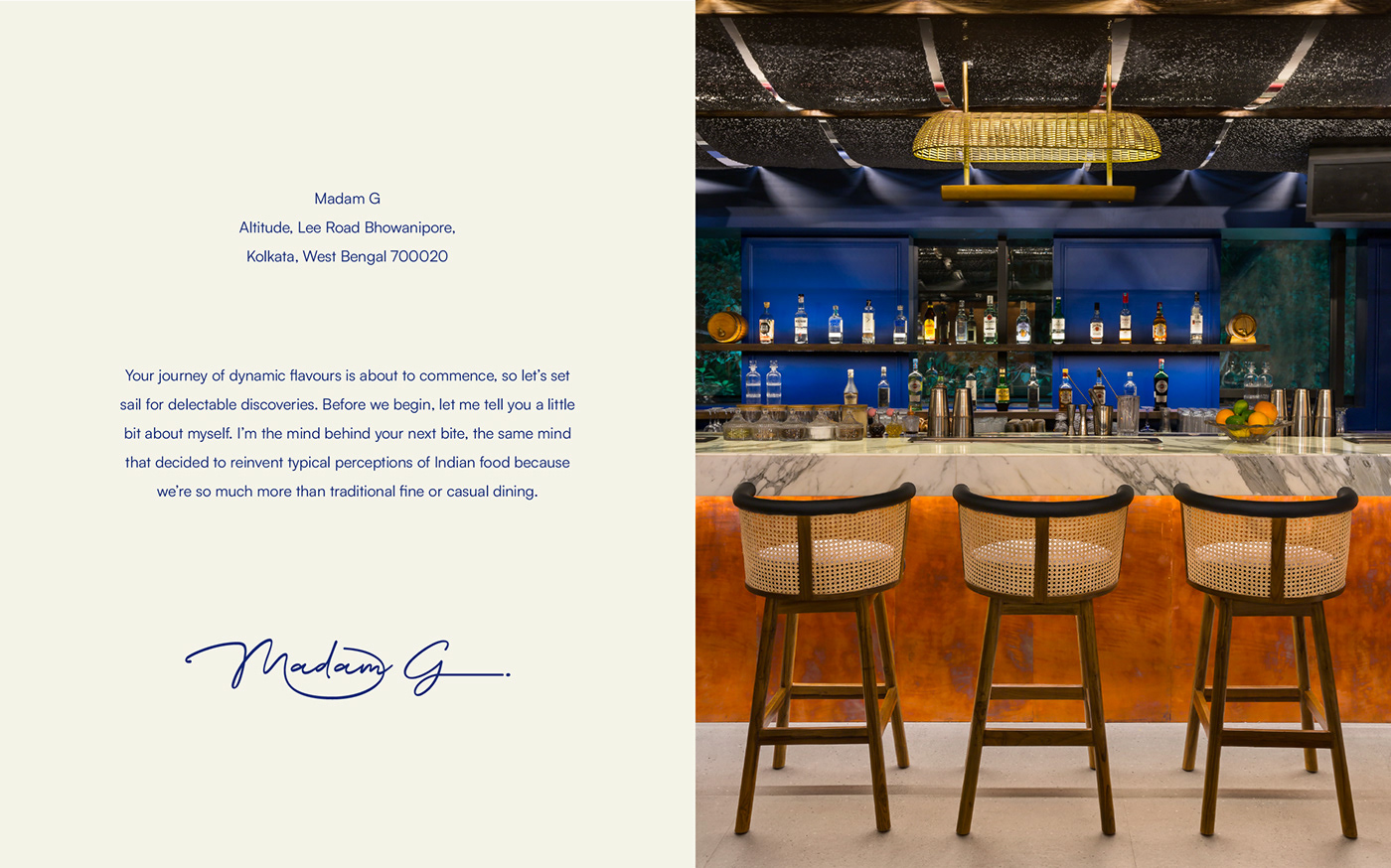
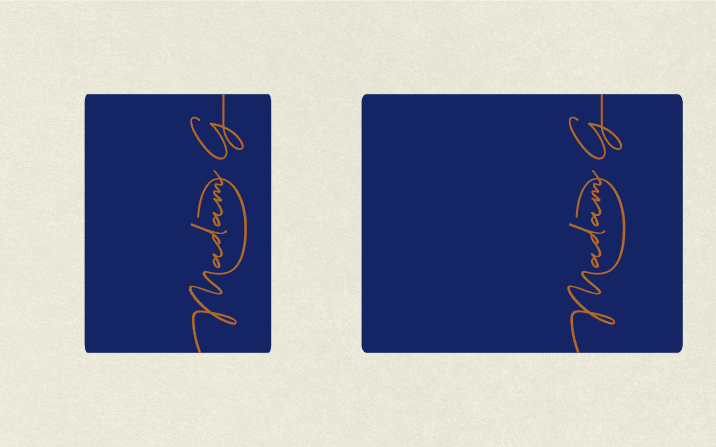


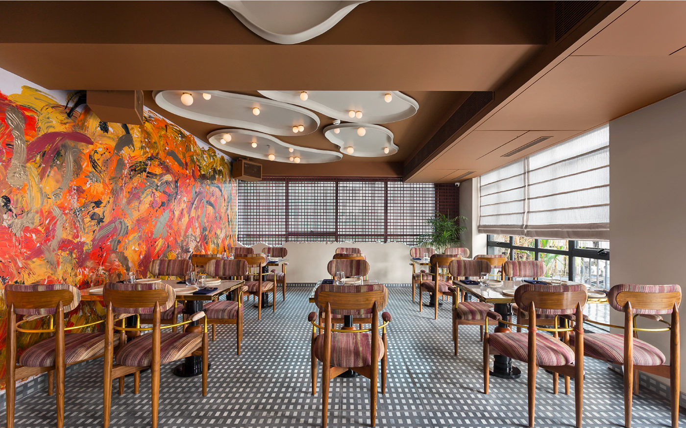


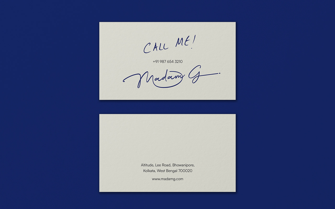
We skipped on the gimmicks and stayed true to the basics with an unmistakably royal ink blue paired with an edge of copper detailing for a timeless appeal. This modern design route blended heritage recipes and artistic renditions, familiar flavours and new expeditions.
To strike a chord with one and all, Madam G’s enigmatic spirit had to really shine through. We heroed this with key elements of a handwritten-esque font, direct quotes she’d say, and a story of her culinary travels and learnings. A team favourite deliverable was city-centric sweet tins colour-coded to match their individual attractions and tastes. These were used as a focal point within the decor as an ode to our vast subcontinent. After all, the sweet little things in life happen to make the biggest impact.


In the heart of the capital city of Bengal, you’ll find a little piece of us – characterised and celebrated through a tale narrated by the tantalising Madam G. We’ll leave you here to ponder with a little something she’s known to say…
Embrace the enigma, live the mystery, and relish the story.


