


Burning Man is an annual event in the Nevada desert. It is a temporary city where participants transcend accepted societal norms and create a vibrant and immersive experience that blurs the boundaries between artist and audience. Burning Man
is a community that evolves on the principles of inclusivity and openness.
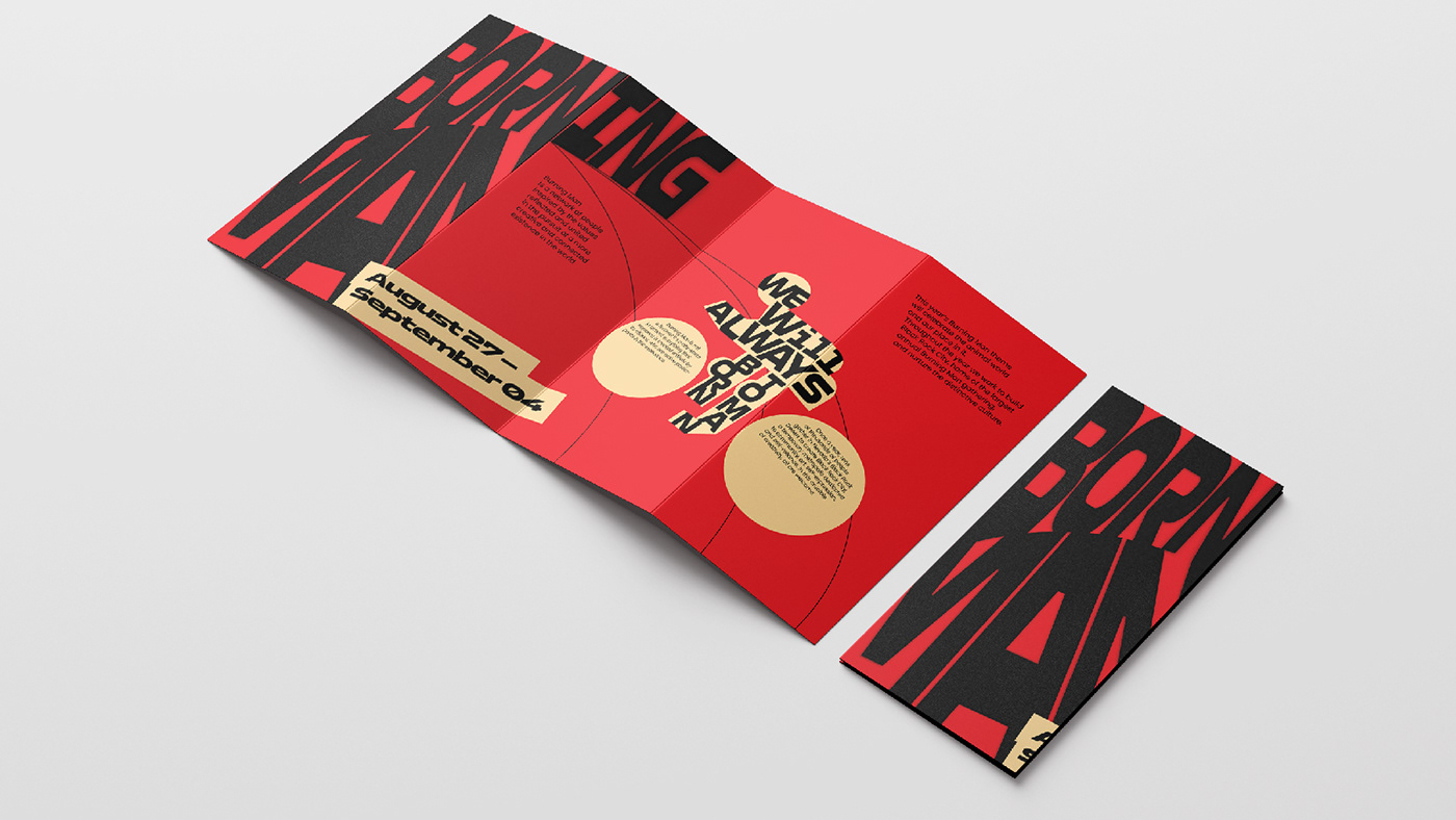
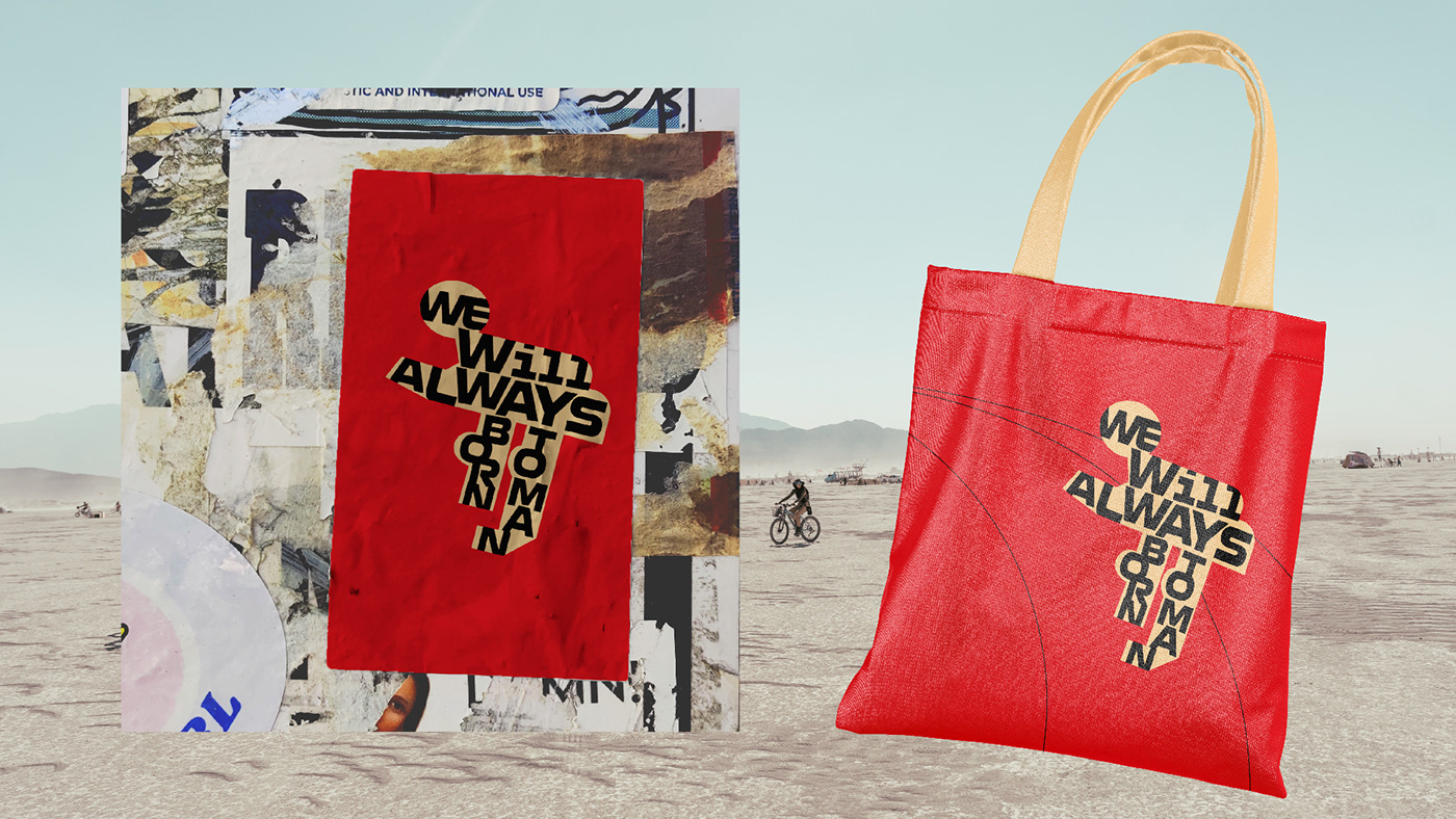
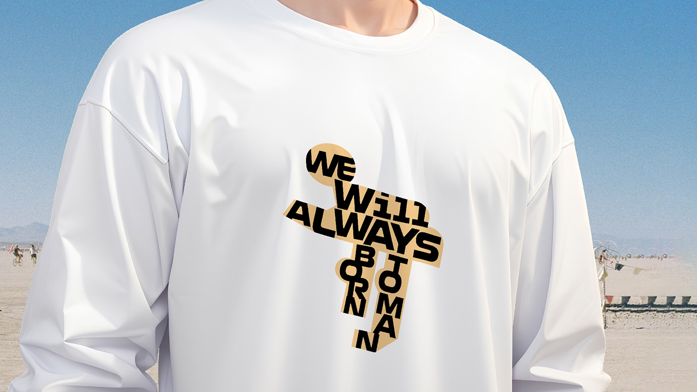
My concept is based on the dynamic interplay of typography and color. By using
the color red, I want to convey the energy and passion that defines Burning Man.
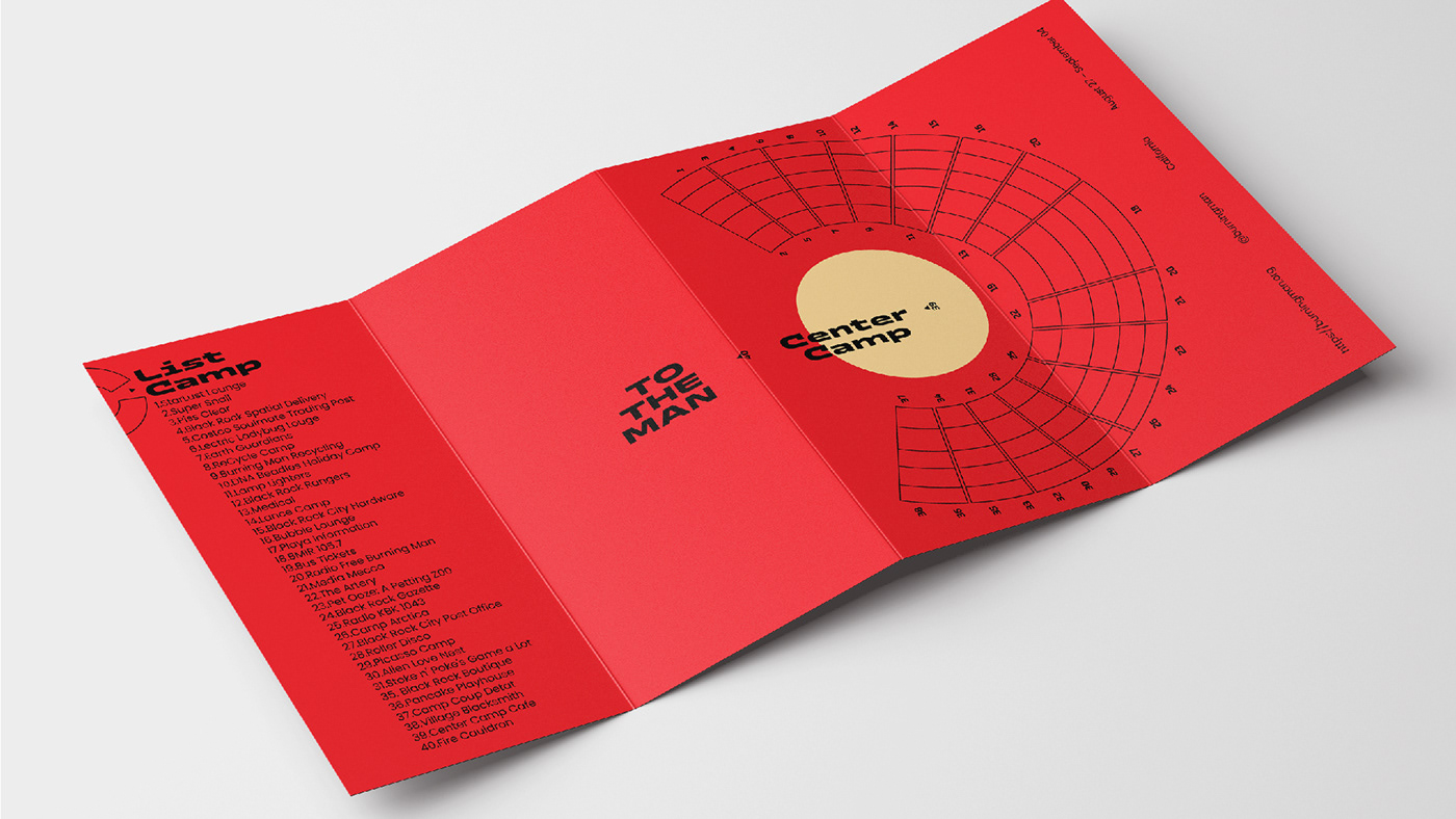
The typography is intentionally minimalistic, but effectively reflects the festival's commitment to simplicity and authenticity. The back of the leaflet with the outline map and cyclist on the front becomes a metaphor for the journey of self-discovery at Burning Man.