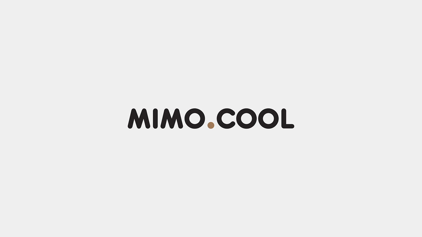
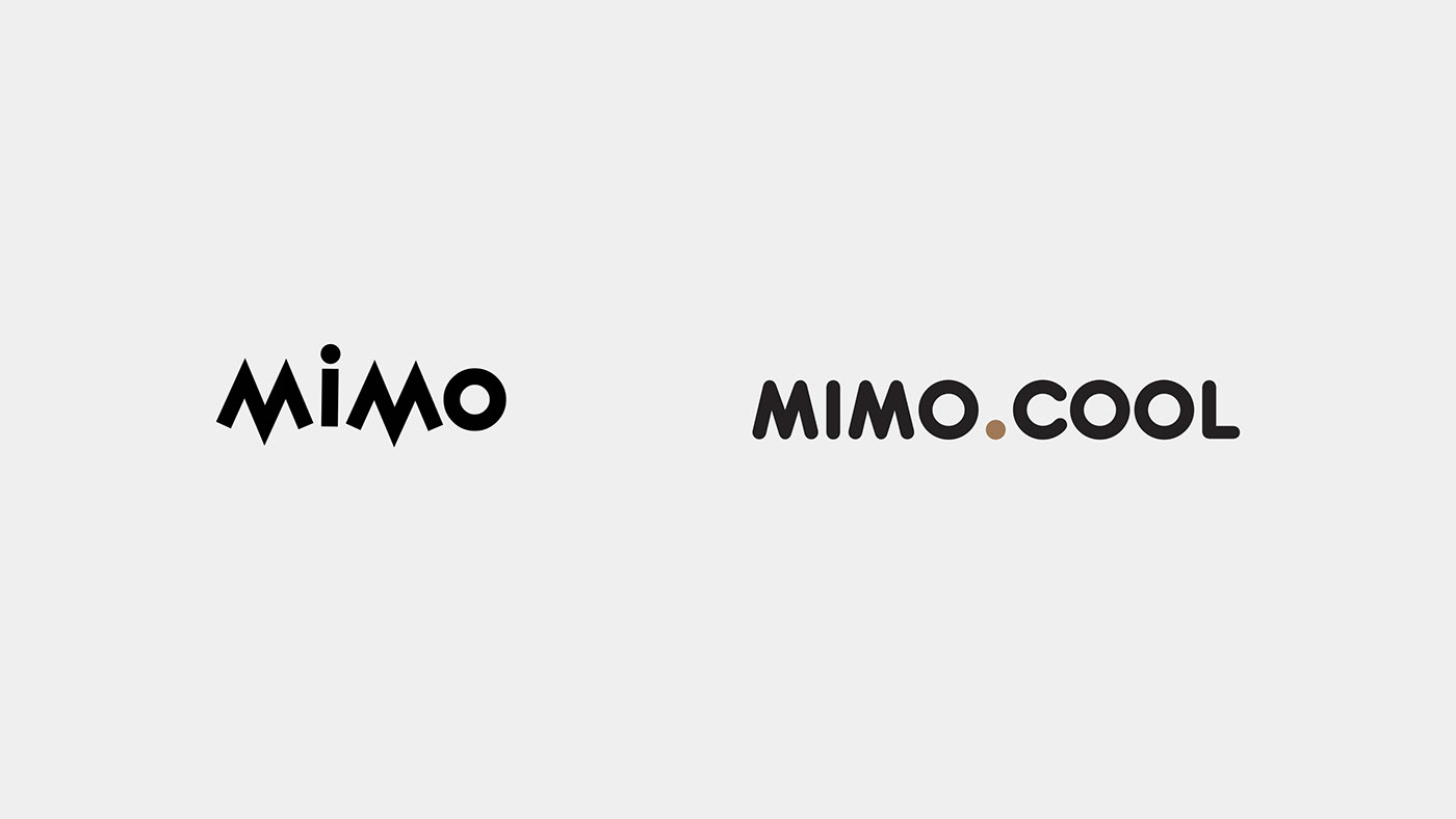
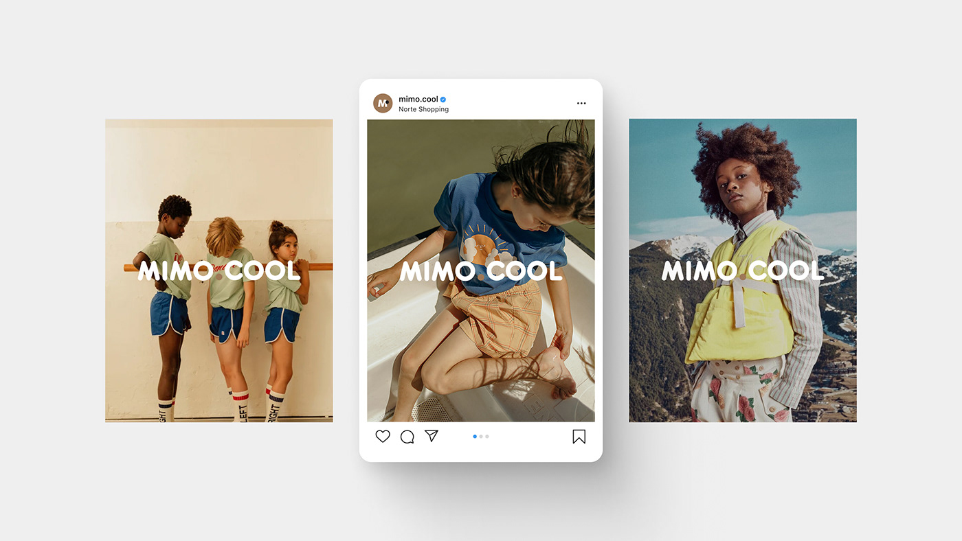
We're happy to show the rebranding for Mimo.Cool. The new visual identity combines the brand's heritage with a contemporary touch, reflecting it’s the continuous dedication to children's fashion.
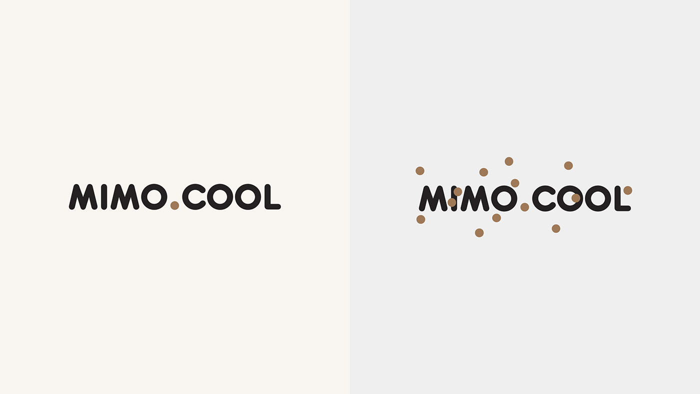
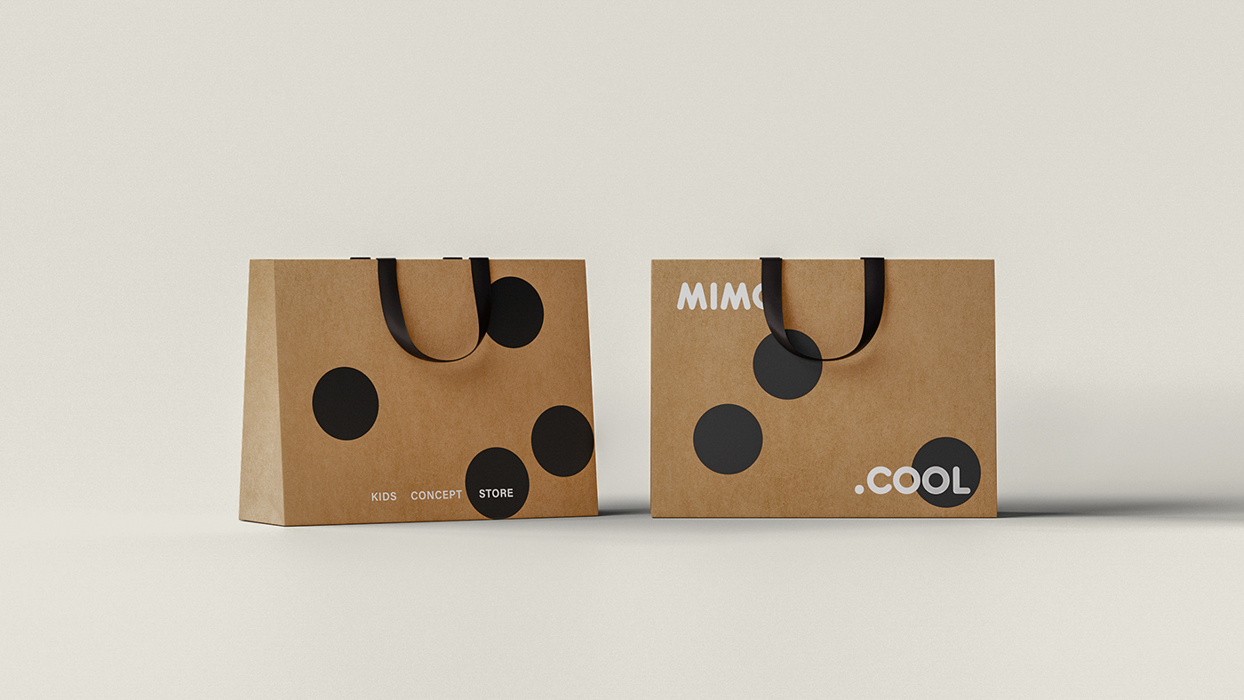
At the foundation of the design, the spheres emerge as crucial elements. They not only connect the words 'mimo' and 'cool' in the new logo but also establish themselves as a central symbol of the visual language. They represent the playfulness, joy, and the simplicity of childhood.
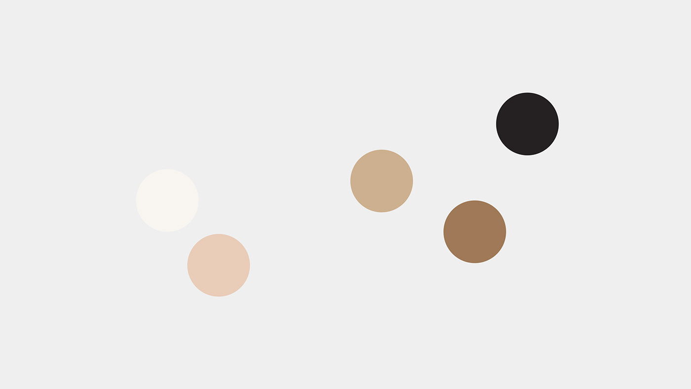
The color palette, with shades of brown and beige, was carefully chosen to reflect the brands values where the earthy tones symbolize the commitment to sustainability and respect for the environment.
Each piece of clothing and toy is a step for a brighter future for the coming generations. Affirming the mission of offering conscious and responsible children's fashion.