ES
Inxto se dedica a diseñar peregrinaciones personalizadas que trascienden lo convencional. Su enfoque consiste en crear vivencias únicas en los lugares más sagrados del mundo, con el propósito de brindar a los peregrinos la oportunidad de nutrir y fortalecer su fe, fomentar la comunión y disfrutar de la compañía de guías turísticos locales expertos. Inxto va más allá al ofrecer programas completos que permiten a los participantes sumergirse plenamente en la tierra que presenció la vida de Jesús, asegurando una experiencia enriquecedora al 100% y de manera integral. El nombre "Inxto" adquiere un significado profundo al traducirse literalmente como "en Cristo", encapsulando la esencia espiritual que impulsa cada uno de sus viajes.
EN
Inxto is dedicated to crafting personalized pilgrimages that go beyond the conventional. Their approach involves creating unique experiences in the world's most sacred places, aiming to provide pilgrims with the opportunity to nurture and strengthen their faith, foster communion, and enjoy the company of expert local tour guides. Inxto goes above and beyond by offering comprehensive programs that allow participants to fully immerse themselves in the land that witnessed the life of Jesus, ensuring a 100% enriching and holistic experience. The name "Inxto" takes on a profound meaning, translating literally to "in Christ," encapsulating the spiritual essence that drives each of their journeys.
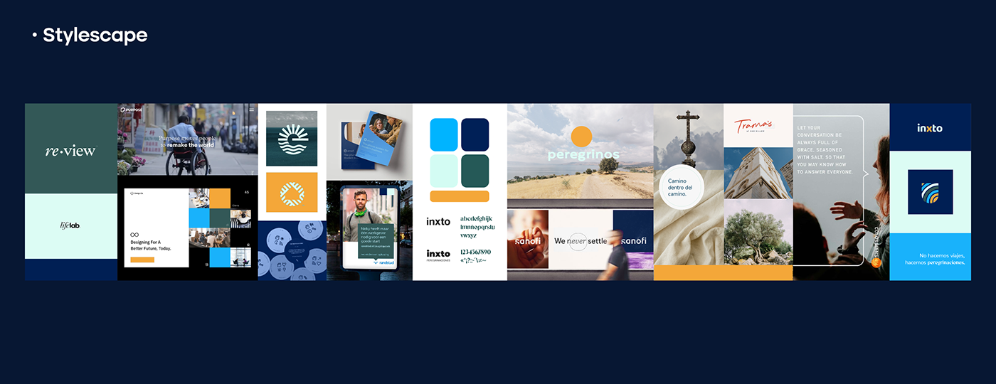
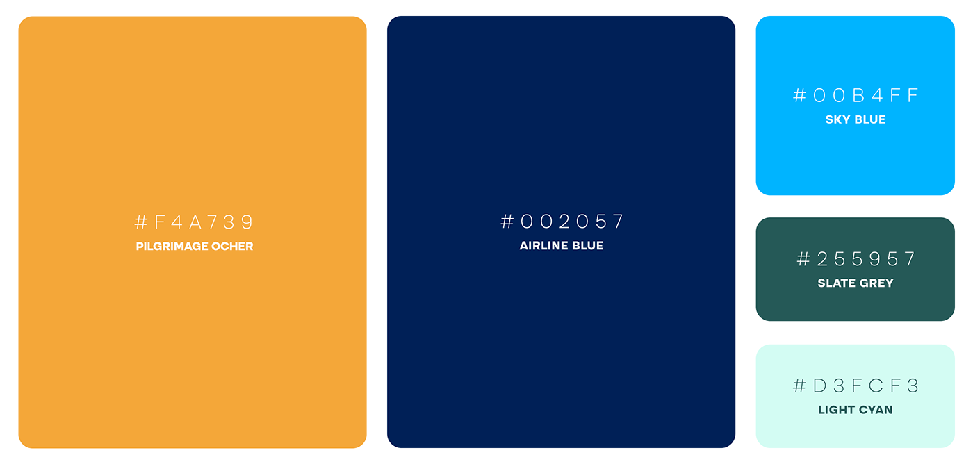
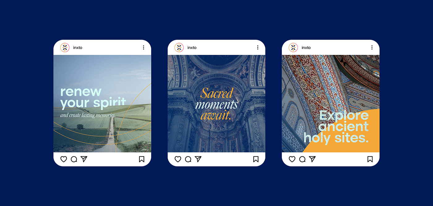
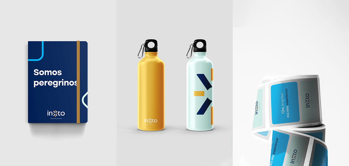
For Inxto's stylescape, we sought modern elements that conveyed a contemporary essence and represented solidity. We used colors in the blue spectrum and added ocher as a distinctive color representing the Middle East. This aimed to differentiate the brand. We wanted to transmit the experience while maintaining the closeness and unique identity of the brand: a communal pilgrimage.
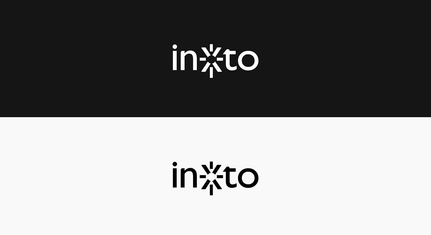
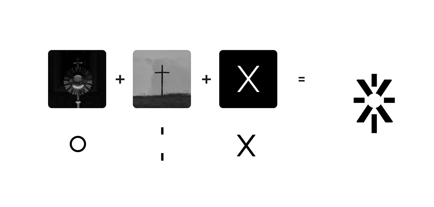
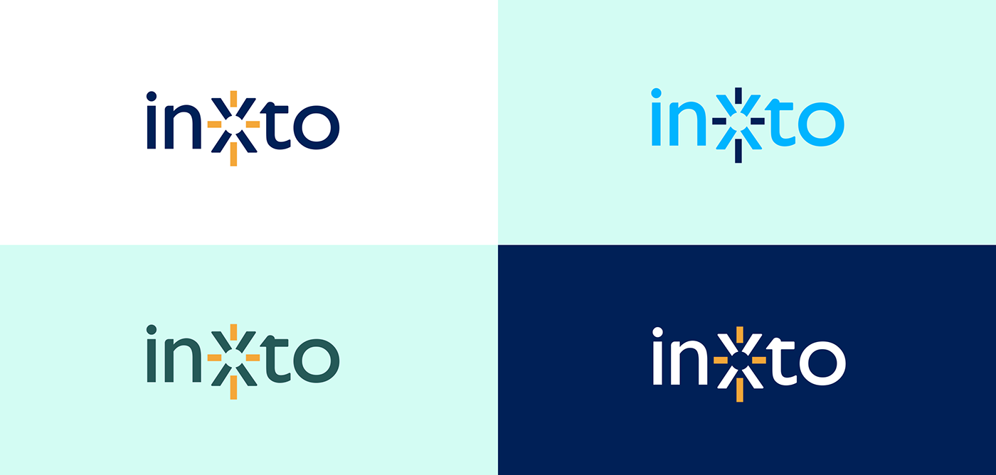
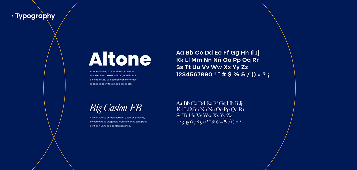
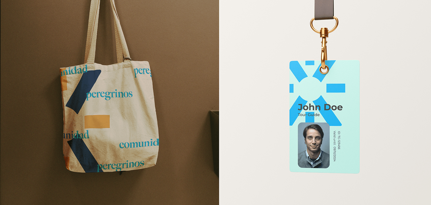
For the logo, we delved into the essence of the name: Inxto, derived from Latin meaning 'in Christ.' We focused on the central letter of the word, the 'X,' symbolizing Christ as the core. Placing a cross within the 'X' and incorporating the Eucharist, we conveyed the central message of Christianity. This approach resulted in a versatile brand that can be used both within and outside the logo. The typography underwent subtle modifications as softening the edges and avoiding overly sharp terminations.