


LIS ANDREOTTI | CORRETORA LOGOTIPO
______________________________________________________________________
Sobre PT | BR
|
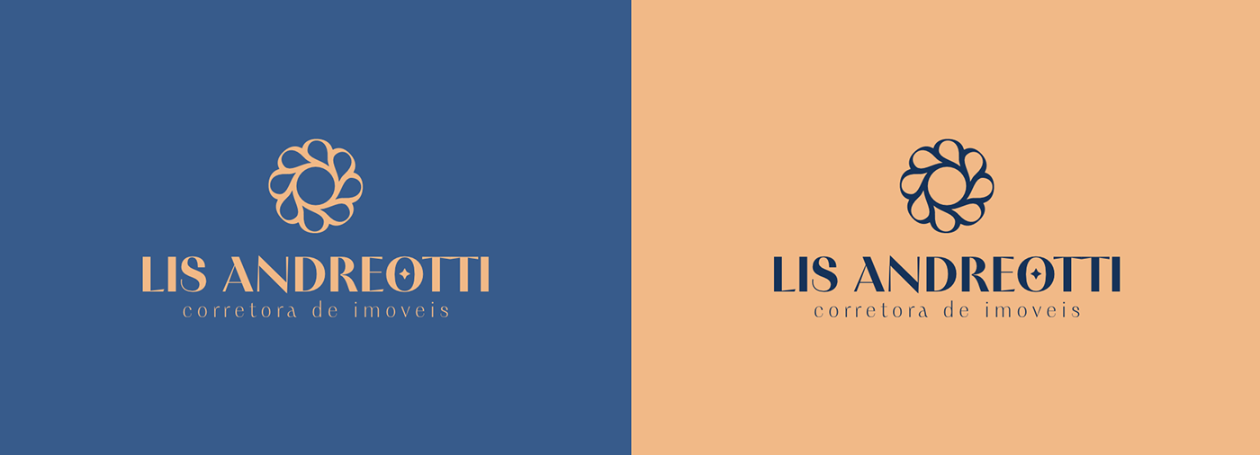
Elegância, sofisticação & comodidade. Esses são os alicerces que sustentam cada nova negociação da corretora de imóveis LIS ANDREOTTI, e que acredita no valor particular de cada venda, pois uma casa não é apenas um espaço para residir, mas um local criar memórias e chamar de lar.
O desafio do projeto, foi criar um logotipo para o ramo imobiliário que fugisse do padrão de elementos repetitivos (como casas, prédios e formas retas), e criasse algo mais personalizado e identitário, que transmitisse o alto padrão dos imóveis negociados.
About
|
Elegance, sophistication & comfort. These are the pillars that uphold every new negotiation at the real estate brokerage LIS ANDREOTTI, which believes in the unique value of each sale. A home is not just a living space, but a place to create memories and call home.
The challenge of the project was to create a logo for the real estate sector that deviates from the standard repetitive elements (such as houses, buildings, and straight lines), and develops something more personalized and distinctive, conveying the high standard of the properties negotiated.
____
Cliente - LIS ANDREOTTI
Designer - Paulo Sá
Agência - PAULOSA.STUDIO


conceito do logotipo - PT
Como o objetivo do logotipo era fugir dos elementos genericos do ramo imobiiario, decidi criar um símbolo mais subjetivo, que estivesse mais atrelado aos atributos da marca do que com o segmento em si.
E assim surgiu um símbolo que une a sutileza de uma flor (realçando a feminilidade da corretora) com a vivacidade e brilhantismo de um sol que simboliza o nascimento de novas esperança e oportunidades.
Logo Concept - EN
As the aim of the logo was to depart from the generic elements of the real estate sector, I decided to create a more subjective symbol, one that was more closely linked to the brand's attributes than to the segment itself.
Hence emerged a symbol that combines the subtlety of a flower (highlighting the femininity of the brokerage) with the vibrancy and brilliance of a sun that symbolizes the birth of new hopes and opportunities.


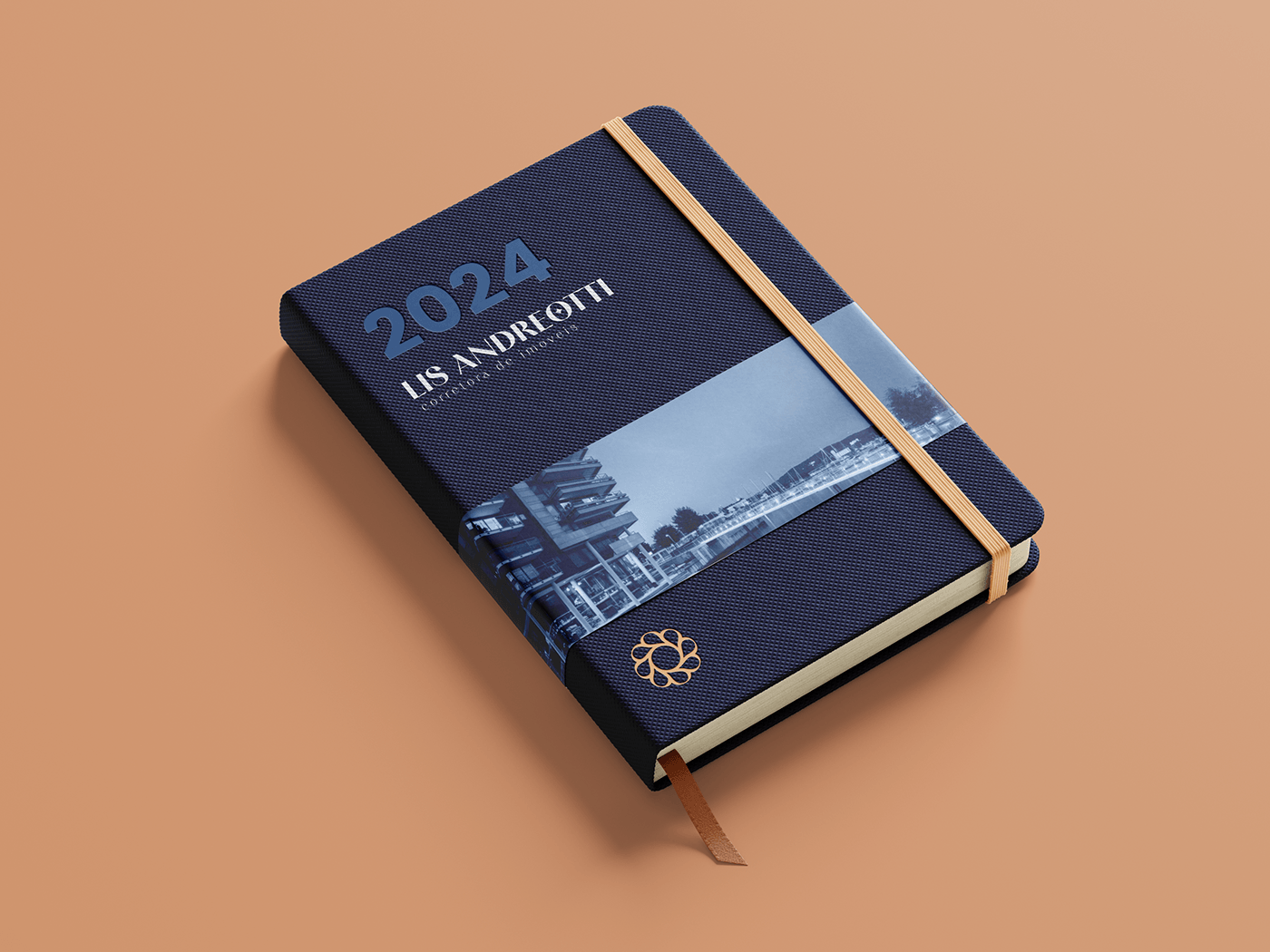

Lis Andreotti | Corretora ©
Projeto de logotipo feito em 2023 pela paulosa.studio
Segmento: Imobiliario | Real State
Designer: Paulo Sá
All rights reserved © Paulosa.studio
Follow me on Instagram


