


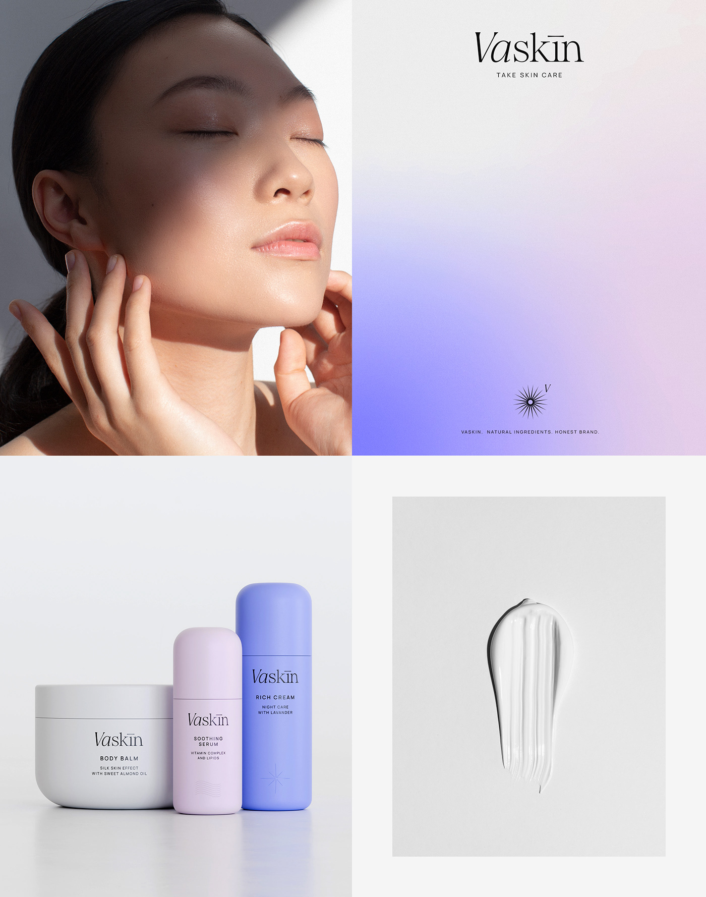
T A K E S K I N C A R E ©
V A S K I N .
N A T U R A L I N G R E D I E N T S .
H O N E S T B R A N D .
Vaskin, an embodiment of sophistication and simplicity, endeavors to redefine the essence of beauty.
With a design philosophy rooted in minimalism, our cosmetic brand aspires to offer uncomplicated yet effective solutions to enhance natural beauty. We believe in the power of pure intentions, crafting products that harmonize seamlessly with daily routines while maintaining a focus on quality and efficacy. At Vaskin, simplicity isn't just an aesthetic, it's a commitment to providing skincare and beauty solutions that resonate deeply with purity and grace.
Take skin care!
Branding concept | All rights reserved ® | 2024


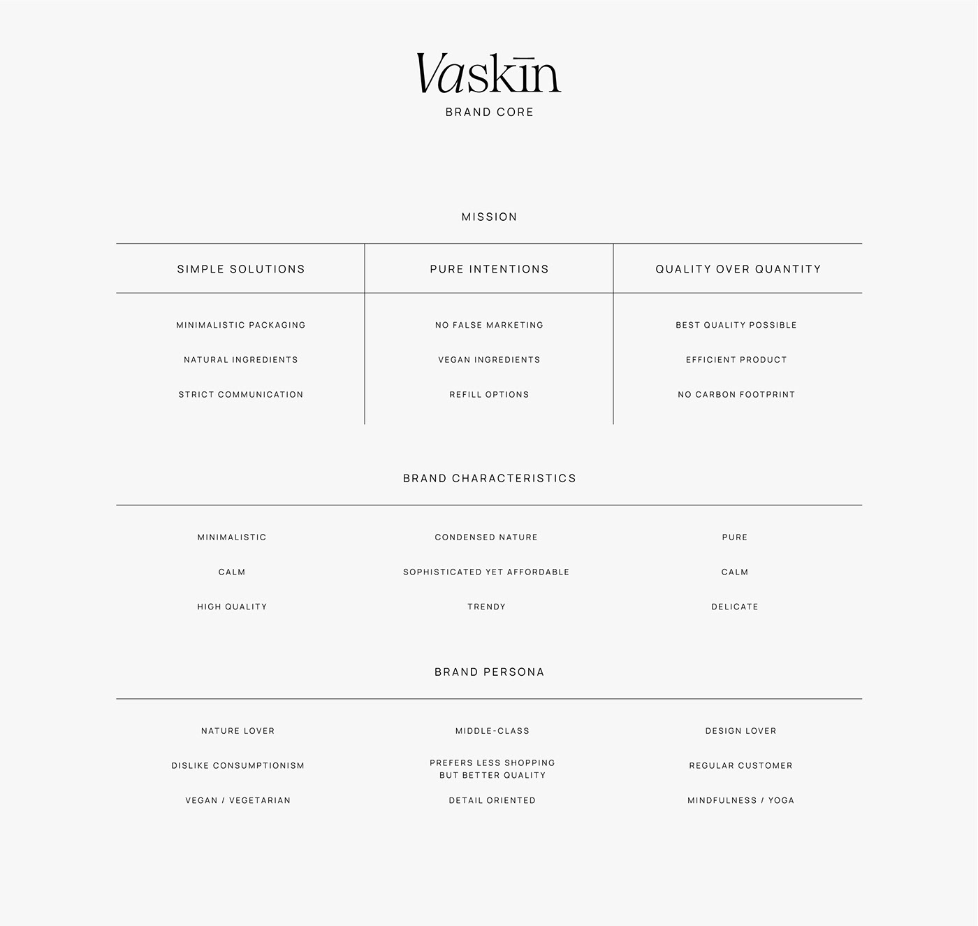
B R A N D C O N C E P T
The Vaskin brand concept represents a fusion of modernity and elegance, underpinned by a commitment to quality, transparency, and ethical practices. It aims to resonate strongly with conscientious consumers seeking top-tier skincare products while aligning with their values of transparency, quality, and ethical responsibility. It's committed to catering to a discerning and conscientious consumer base, providing exceptional skincare products that meet the highest standards of quality without compromising on ethics or transparency.

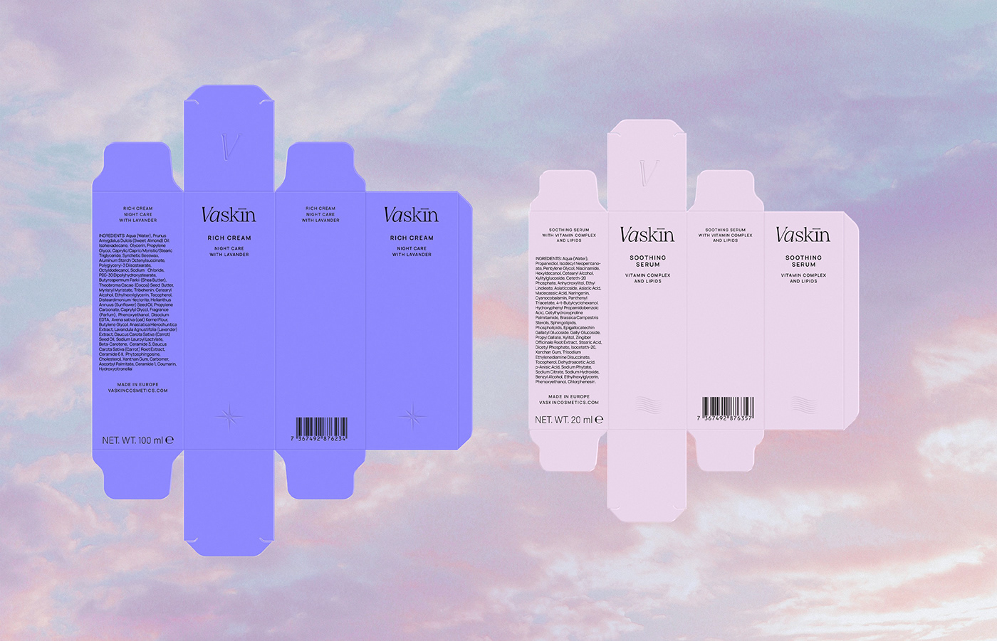
P A C K A G I N G D E S I G N
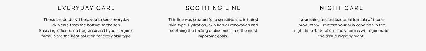
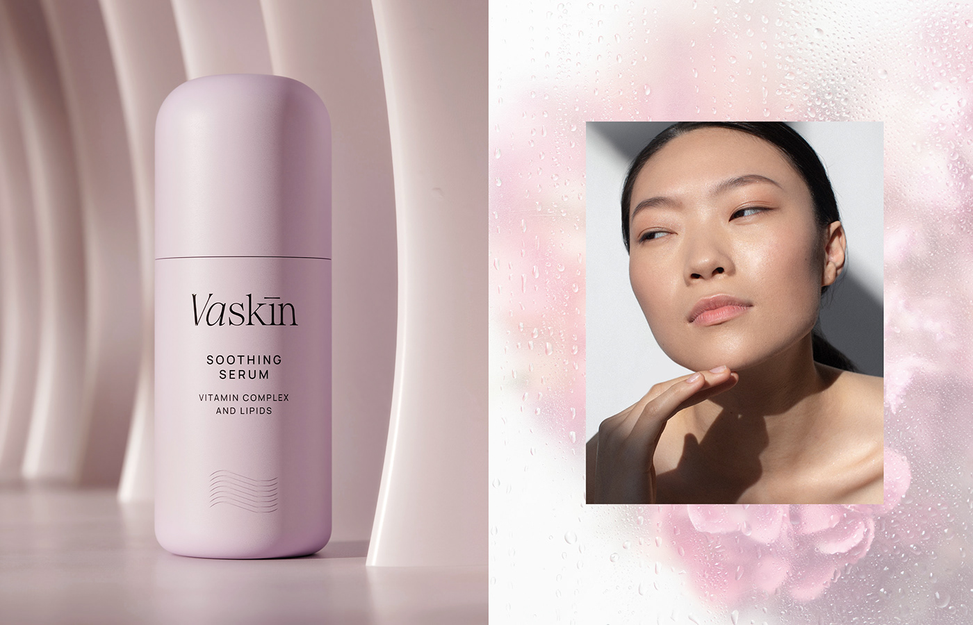
The packaging design for Vaskin skincare brand embodies elegance and simplicity. It achieves a delicate balance between minimalism and functionality, effectively differentiating the product variants through color while maintaining a cohesive and sophisticated brand identity. The design not only captivates the attention of the conscious consumer but also reflects the brand's commitment to quality and aesthetic excellence.


K E Y V I S U A L
The key visual composition weaves together floral imagery, portraits, and gradient backgrounds to create a captivating representation of the brand's values and the emotions evoked by the beauty of dawn and dusk. It visually communicates the brand's commitment to skincare, natural beauty, and the gentle transition of light, resonating with the conscious consumer seeking quality and serenity in their skincare routine.

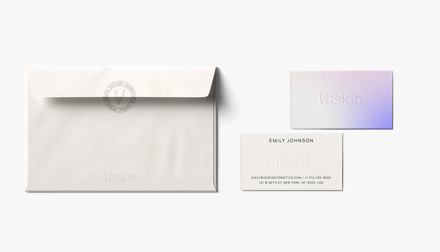
S T A T I O N E R Y D E S I G N
The key visual elements—flowers, portraits, and gradient backgrounds inspired by dusk and dawn—are elegantly incorporated into the stationery design. These elements are delicately imprinted or subtly integrated into the stationery layout, enhancing its visual appeal and providing a cohesive brand identity across all materials. The design elements harmoniously reflect the brand's ethos of natural beauty, quality, and sustainability, appealing to the conscious consumer's appreciation for both aesthetic and ethical values.


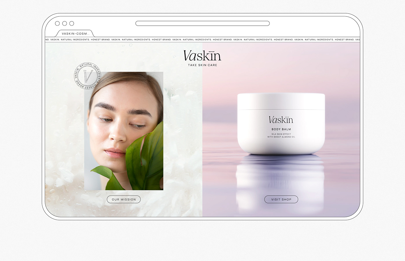
W E B & S M D E S I G N
Vaskin's web and social media design breathe life into the brand's identity. It's not just about cosmetics; it's a visual celebration of simplicity, elegance, and the boundless beauty found in the colors of the sky.
Consistency is key in social media design, with each post echoing the brand's identity. Whether it's a product reveal, beauty tips, or behind-the-scenes glimpses, the Vaskin social media presence is a reflection of our commitment to simplicity, aesthetics, and the transformative power of cosmetics.


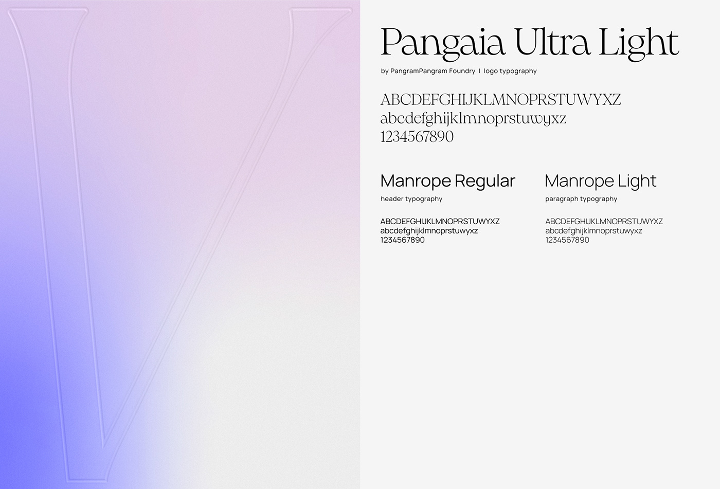
T Y P O G R A P H Y
Despite the classic connotations, the serif font in the logo was chosen and customized to have a contemporary twist.
This was achieved through slight modifications like subtle stylization to infuse a modern touch while preserving the font's inherent elegance. Sans-serif fonts - here used in paragraphs - are known for their clean, modern, and minimalist appearance. They offer readability and a sense of simplicity, making them an excellent choice for other textual elements like product descriptions, website content, packaging information, and promotional materials. This font choice complements the classic serif font in the logo by providing a contemporary feel and ensuring clear communication of information.
C O L O R P A L E T T E
Vaskin's color palette effectively captures the essence of the natural light spectrum from dawn to dusk, aligning with the brand's products - day cream / night cream. The use of these colors not only creates an aesthetic appeal but also communicates the intended emotions, connecting consumers with the brand's promise of skincare that nurtures and revitalizes during different moments of the day.


Branding & visual identity: Asia Kamosz
3D renders: Dawid Bernat
Logo typography: Pangaia by PangramPangram Foundy
Photos & videos: Unsplash / Freepik


