The Bridge case study is my first research project, between, 2019 -2022 Costa Rica - USA.
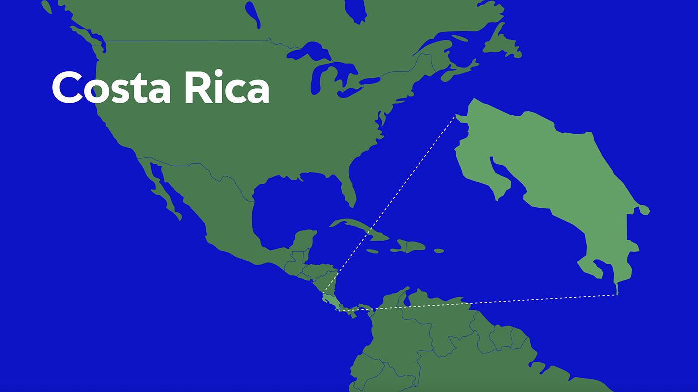
Context. Costa Rica is a small country in Central America. Boders with Nicaragua in the North and Panama in the South.
Costa Rica has unique characteristics that makes it an interesting place to visit or even to consider residing in.

For the case at hand, we will focus on how some of these characteristics contrast with those of Costa Rica's neighboring country, Nicaragua. This has led to a massive migration of Nicaraguans to Costa Rica for decades.

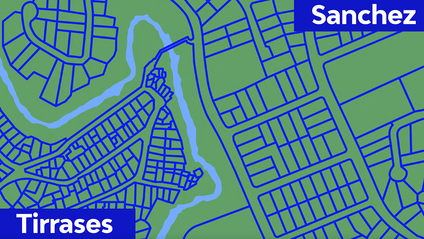
Our case takes place in a county in San José, where two neighboring districts, Sanchez and Tirrases are divided by the Tiribí River.

The two districts are very different from each other. I drew lines to divide the properties and the streets.

I drew lines to divide the properties and the streets, to compare the size of houses and streets in both sides of the Tiribí River (represented by the light blue thick line.) Tirrases houses are way smaller than Sanchez's, and Sanchez streets are wider than Tirrases'.
This is a Sanchez house. It may not be the typical Sanchez house, but it is not uncommon to find large, luxurious homes in this area.

Tirrases is a large neighborhood and not everyone lives in a low-income situation. The part where the lower income families live is very populated. This is a view from the side of Sánchez.

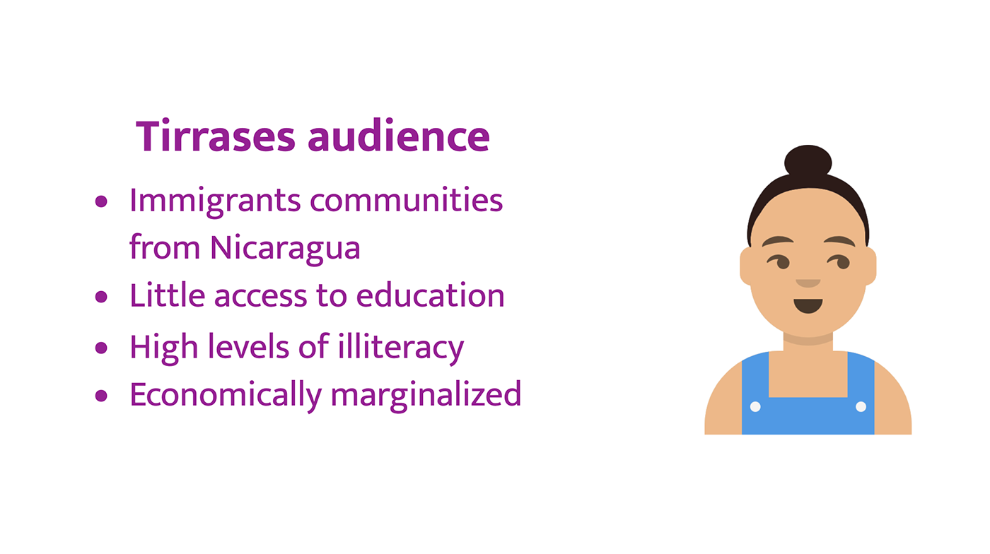
These were Tirrases characteristics.
These were Sanchez characteristics.

The brief from the meeting with the Community Center Director.
I stated tracing the map. As I was drawing it, I wanted to be sure the landmarks in the map were up to date. So I walked the course tracen on the map. Also, I observed the spot where the map was supposed to be installed. I observed the spot on several days at different times. I noticed almost any Sanchez resident walk by the sign. In the other hand, many residents of Tirrases passed by the sign. So, if the map's purpose was communicate something to Sanchez residents, the map might not be the best media.

I set a meeting with the director of the Community Center , to let him know my observations. I notices these things:
We debated about what to do, and the director came with these changes:
Now the project included Tirrases territory and its bus stops. I drew the map but I wanted to be sure if I was doing a good job, so I ask the woman who works in my sisters' homes for advice, since she's a Tirrases resident. She volunteered to do the complete ride on Tirrases' route bus, to show me the places.
when we rid on the bus she showed me the buildings and explained what were those places. When the bus was returning it passed in front of the Communtity Center. Mercedes asked me what was that building. I told her it was a Community Center, a place for the people of the community. She asked me if it was a chocolate factory. I told her not and asked her, why she asked. She said the building looks like a chololate factory.
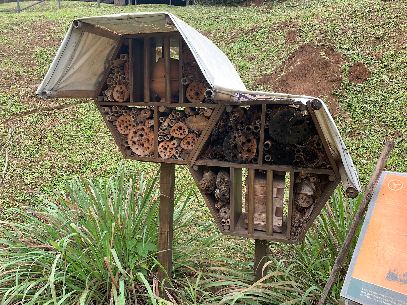
She said the building looks like a chololate factory because of the brown pannels in the facade, in addition, the bee hive cells suggest there's something sweet in the building. She reminded me she doesn't know how to read, so she got that lecture based upon the colors and the shapes of the building. She also told me she wasn't the only one who thought it was a chocolte factory. Many of her neighbors were impatient for the day "the factory" opens, because maybe they would give some candy away.

The beehive cell logo belongs to the municipality and it's a reference of the most succesful project of this municipality, Ciudad Dulce (Sweet City). This project was made to protect the bees and butterflies in the area and help them

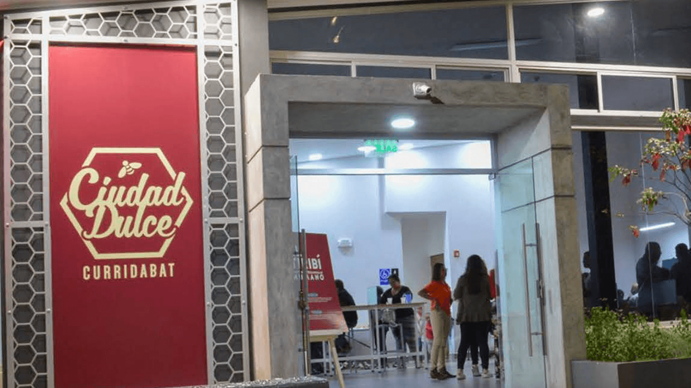
There are "bees hotels" in the parks of the county, as part of the program. The Community center have this one in its garden, too.
The beehive logo and the brown pannels are present in all the community centers all over the county, and apparently the confusion with a chocolate factory is also frecuent in some of them.
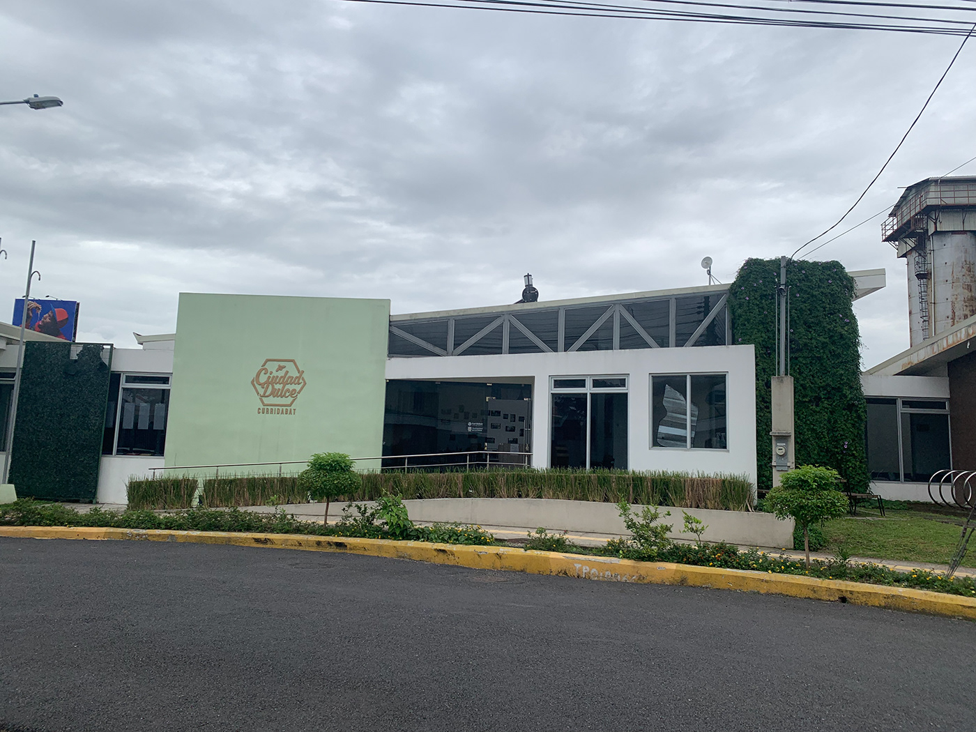
In some districts the Community Center is called The Candy Factory or The Chocolate Factory, as a term of endearment - or mockery- even when the people is aware they're not factory, but community centers, becasue of the aspect. Is important to remark in some of these districts many people, like Mercedes can't read the writen words. They read the signs, the shapes and the color, and their lecture tell them a different message than the one intended by the municipality, maybe because the design didn't took into consideration the people who couldn't read.

The differences between the two districts at the begining of our case are deeper. The bridge that now connect them has a story full of conflict and controversy. For years it was a bridge made out with pieces of wood the Tirrases neighbors join to build it, to go faster to their works, in the houses of Sanchez families. But residents of Sanchez opposed to the bridge, so they called the Police in order to destroy the fragile bridge. But Tirrases residents very quickly built another one.

Because of the risk to those crossing the fragile wooden bridge, the municipality ordered the construction of a concrete bridge. The residents of Tirrases request that it be a road bridge, but in the face of opposition from the residents of Sanchez, the municipality agrees to build a pedestrian bridge. The bridge is narrow and offers certain restrictions to transit.

Instead of offering easy access to walkers, a stopper is put in place, possibly to make it more difficult for bikes and motorcycles to access the site.

Even so, it has not stopped the passage of bicycles, motorcycles and carts. While the measure is reasonable and intended to protect pedestrians, it is a reminder that they are not very welcome in Sanchez's territory.

I finished the map, and delivered it. The director called a district councilor, and an engineer from the municipality's road department to formally present the map, made as a contribution of a member of the community. They were very interested and that was the first step of a project to mapping all the county. I showed the finished map to Mercedes, since she helped me in the process, and I showed her the places we visited. I tried to test the map to see if she could read it, but she couldn't get the same interpretation of symbols. For example, I represented parks with a tree pine. She could determine what could possibly be in that point. When I pusshed her a little, she said that "maybe a tree sale".

This is the timeline of my work with the municipality.
Months later, I moved to the United States to get my master's degree, and I continued talking to Mercedes, as part of the case study. When she was working at the house of one of my sister's house, I had Zoom calls with her. I wanted to know more about her interpretation of the symbols. I was wondering if we took for granted and universal the interpretation of symbols.

Possibly they are social conventions that we learn along the way since kids, as we learn to read and write. Since Mercedes didn't had that structured education, she was not familiar with all symbols. Anyway, when you're designing a map, sometimes you have to create ways to better communicate and even using a coding chart, to be sure all your readers are in the same page. Another possibility was, the a poor design of the figures, which certainly still is a possibility.

In the summer of 2022, I visited Costa Rica and I crossed the bridge for the first time. I talked about it, I wrote about it, but I had never actually crossed. I needed to see it with my own eyes.

People from Sanchez avoids crossing the bridge because of the high crime rate, and that was the main reason to oppose to building the bridge. They feared that Sanchez would experience an increase in the crime rate due to access from Tirrases. I was a little nervous, too. There was some men in the bridge and they were staring at me all the time.

People sell second hand stuff, taking advantage of the transit the bridge has. They had clothes, tools, and toys.

The sellers install their stands with things they bring from home.

Most (if not all) of the merchandise comes from Sanchez garbage.

There were rolls of wire on the floor, too. It's very common the electric wire theft.

A handwritten invitation to a group of Alcoholics Anonymous called Manos de Amistad (Hands of Friendship)

When the municipality built the bridge they also built a kiosk. The idea at the time was to make a small marketplace where neighbors could sell their stuff. But no one took over, and drug addicts used the place to stay the night, so the idea didn't succeed.

Actually the kiosk narrows the end of the bridge, which makes easier to delinquents who want to charge a toll for passing through. This is very common in this bridge, specially after hours. While I was there the two guys in the picture were quiet but were watching closely and it felt hostile. I was taking pictures, I didn't feel safe. It was a short but intense experience.

Later that year I presented my case in the American Institute of Graphic Arts, AIGA conference, in Seattle, 2022. My reflection here is we, as designers sometimes need to left the laptop and go to the real world, where things happen and where our design impact lives and see what is going on there, how people live, what do they think, what do they really need. Does our design make sense in this context? Did Tirrases residents need to be included in a map of the area? Maybe what they needed was to be welcome in Sanchez territory. Maybe that would've made a more significant impact than a map. The rich inhabitants of one area rejecting newcomers was problem between this two districts, but is also a problem between countries.

I could not continue diving in this case because I'm not in my country. But when I return, I will develop more in deep this subject. I think design could change this narrative to the better.

Thank you very much for watching!


