

Brand Identity Overview:
Logo:
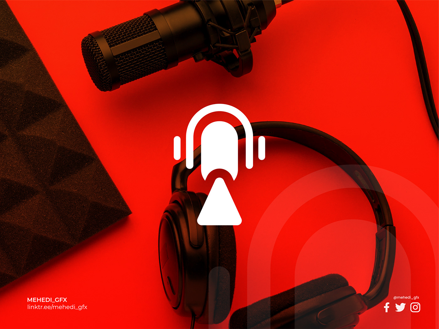
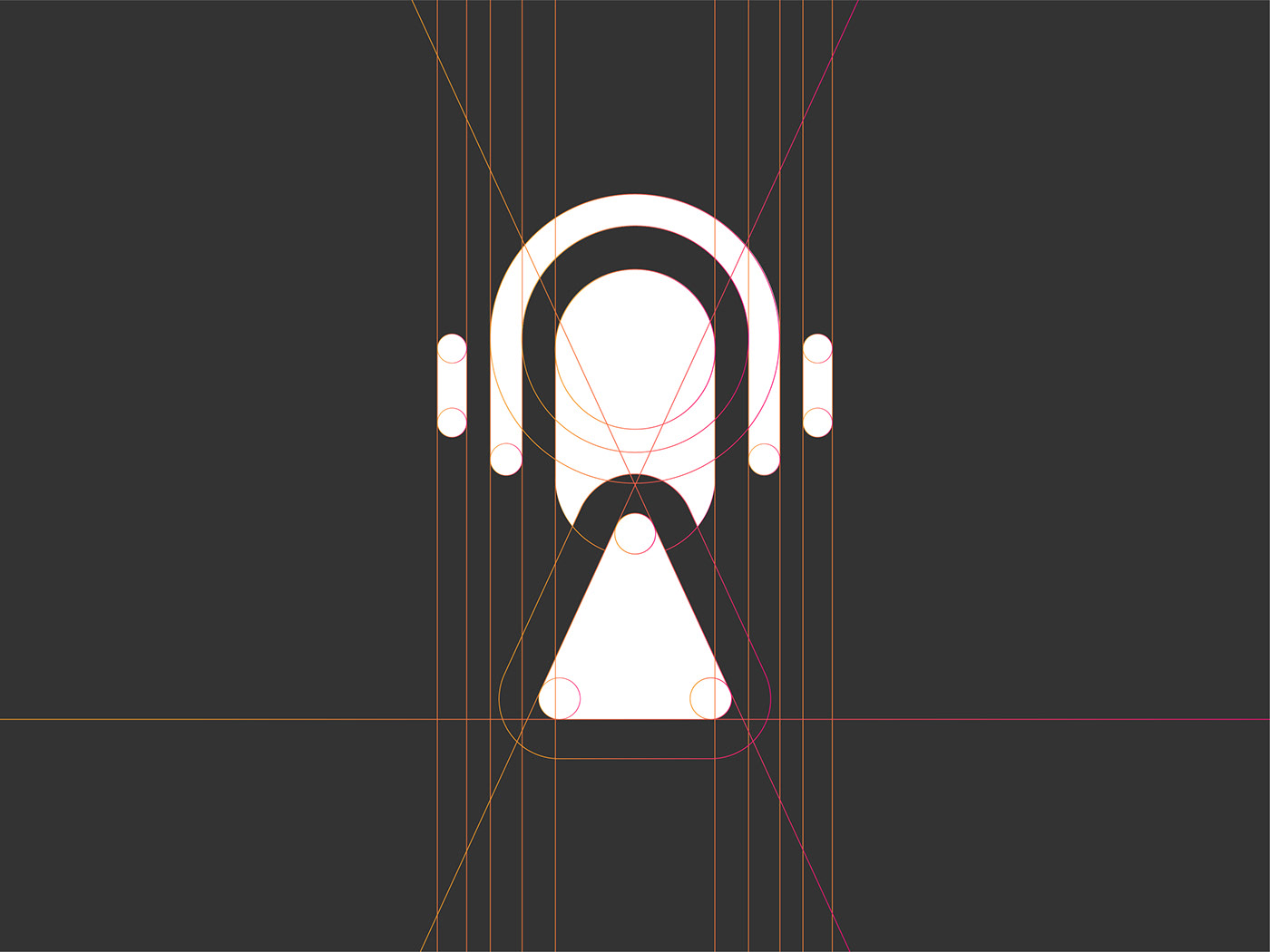
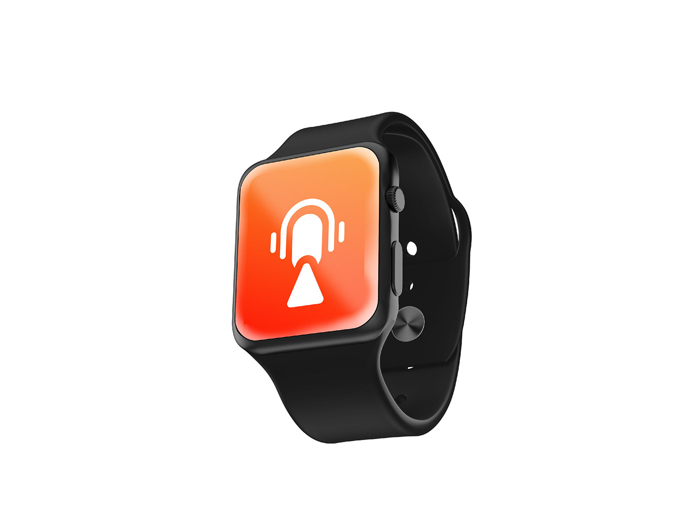
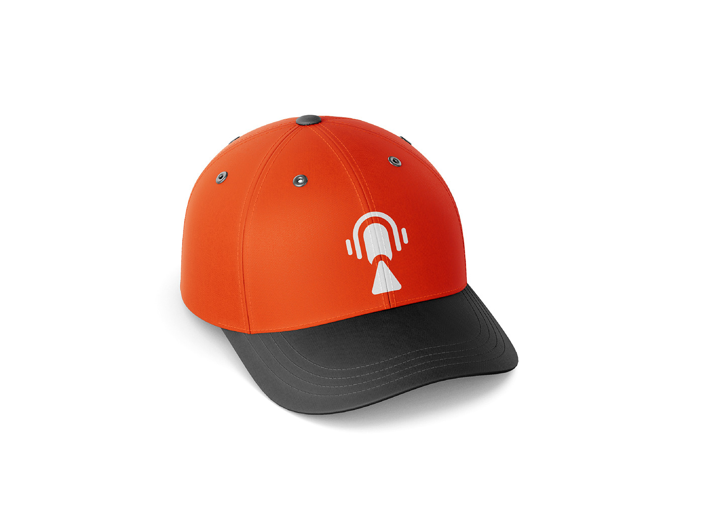
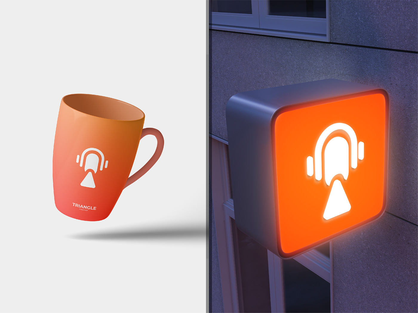
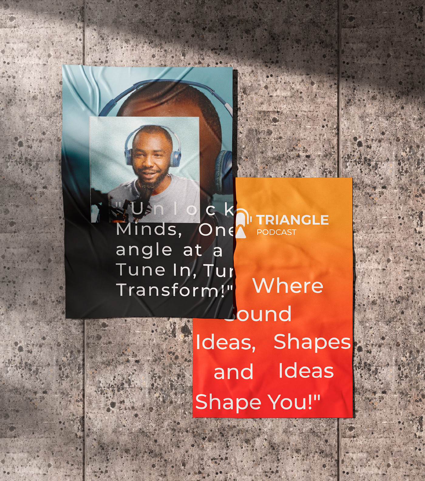
The logo for Triangle Podcast is a distinctive and modern representation of the podcast's identity. At the center of the logo is a sleek and stylized headphone shape, symbolizing the auditory nature of the podcast. Below the headphone, a microphone is cleverly integrated, resembling a human head. This dual representation signifies the fusion of technology and human connection through the art of podcasting. Adding a unique touch, a subtle triangle shape emerges from the mic, subtly alluding to the podcast's name while also representing the human body – a nod to the diverse and engaging content of the show.
The logo for Triangle Podcast is a distinctive and modern representation of the podcast's identity. At the center of the logo is a sleek and stylized headphone shape, symbolizing the auditory nature of the podcast. Below the headphone, a microphone is cleverly integrated, resembling a human head. This dual representation signifies the fusion of technology and human connection through the art of podcasting. Adding a unique touch, a subtle triangle shape emerges from the mic, subtly alluding to the podcast's name while also representing the human body – a nod to the diverse and engaging content of the show.
Typography:
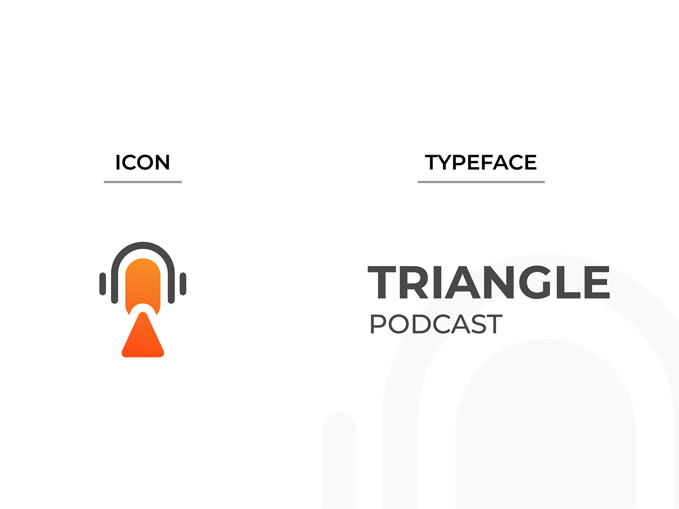
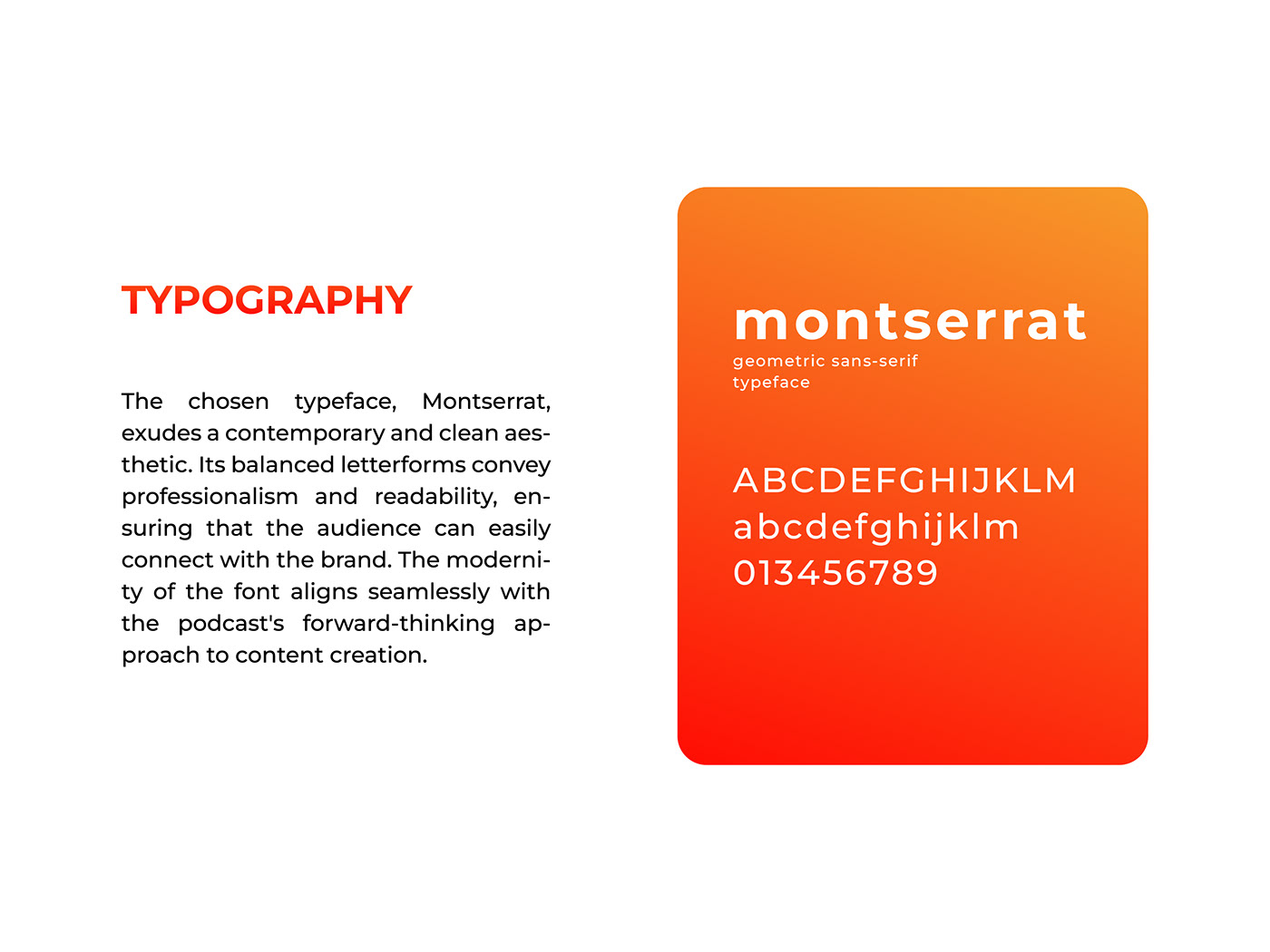
The chosen typeface, Montserrat, exudes a contemporary and clean aesthetic. Its balanced letterforms convey professionalism and readability, ensuring that the audience can easily connect with the brand. The modernity of the font aligns seamlessly with the podcast's forward-thinking approach to content creation.
The chosen typeface, Montserrat, exudes a contemporary and clean aesthetic. Its balanced letterforms convey professionalism and readability, ensuring that the audience can easily connect with the brand. The modernity of the font aligns seamlessly with the podcast's forward-thinking approach to content creation.
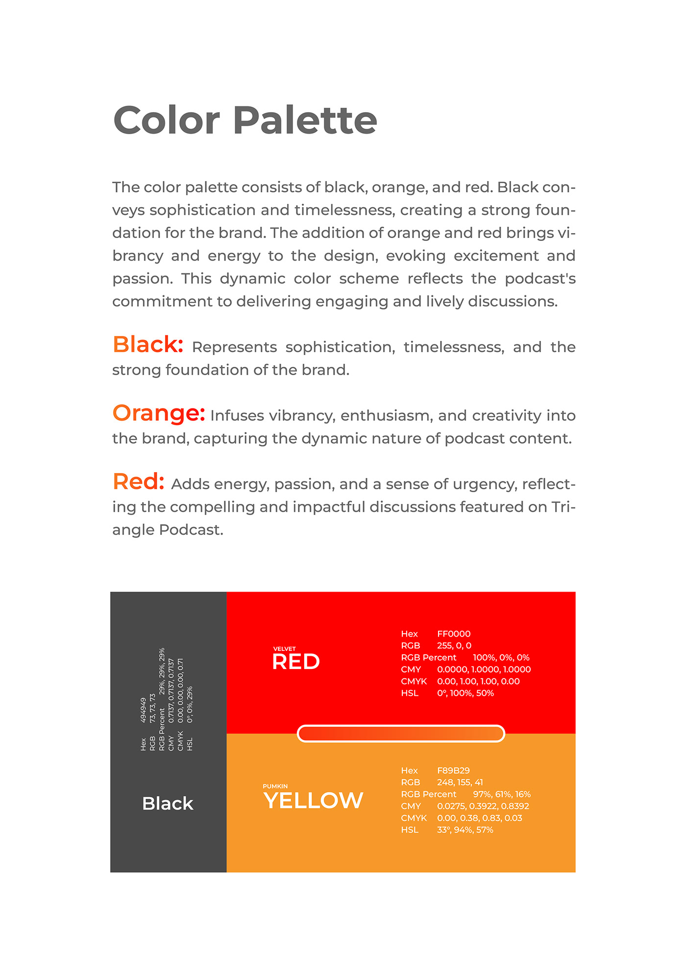
Color Palette:
The color palette consists of black, orange, and red. Black conveys sophistication and timelessness, creating a strong foundation for the brand. The addition of orange and red brings vibrancy and energy to the design, evoking excitement and passion. This dynamic color scheme reflects the podcast's commitment to delivering engaging and lively discussions.
The color palette consists of black, orange, and red. Black conveys sophistication and timelessness, creating a strong foundation for the brand. The addition of orange and red brings vibrancy and energy to the design, evoking excitement and passion. This dynamic color scheme reflects the podcast's commitment to delivering engaging and lively discussions.
Black: Represents sophistication, timelessness, and the strong foundation of the brand.
Orange: Infuses vibrancy, enthusiasm, and creativity into the brand, capturing the dynamic nature of podcast content.
Red:Adds energy, passion, and a sense of urgency, reflecting the compelling and impactful discussions featured on Triangle Podcast.
Overall Impression:
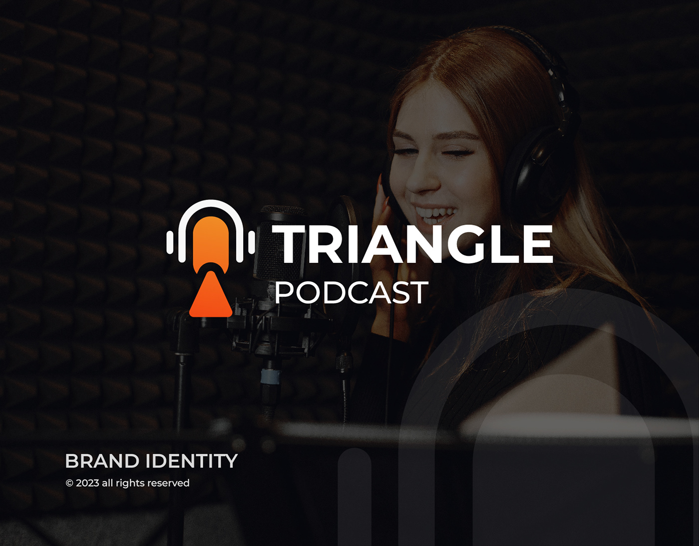
The brand identity design for Triangle Podcast successfully captures the essence of the show. The combination of the sleek logo, modern typography, and vibrant color palette creates a visually appealing and memorable brand presence. The headphone-mic-triangle amalgamation not only signifies the podcast's audio-centric nature but also conveys a deeper connection between technology and the human experience. The choice of Montserrat typeface ensures clarity and readability, enhancing the brand's professionalism. The bold and dynamic color palette adds excitement, making Triangle Podcast stand out in the crowded podcasting landscape. This cohesive brand identity is poised to leave a lasting impression on both current and potential listeners.
The brand identity design for Triangle Podcast successfully captures the essence of the show. The combination of the sleek logo, modern typography, and vibrant color palette creates a visually appealing and memorable brand presence. The headphone-mic-triangle amalgamation not only signifies the podcast's audio-centric nature but also conveys a deeper connection between technology and the human experience. The choice of Montserrat typeface ensures clarity and readability, enhancing the brand's professionalism. The bold and dynamic color palette adds excitement, making Triangle Podcast stand out in the crowded podcasting landscape. This cohesive brand identity is poised to leave a lasting impression on both current and potential listeners.

Thank you for visiting my project.
If you like this project, please click the like button and follow me.
Your logo is your first impression. Let's make it unforgettable.
Contact me today!
whatsapp: +8801936622513


