Client: ReSkin Cosmetics — Service: Packaging Design — Year: 2024 — Creative Direction: Darya Khliustova
ReSkin Cosmetics philosophy is centered around using high quality, natural ingredients and advanced scientific research to create effective and luxurious skincare products that enhance the skin's natural beauty. The brand believes in a holistic approach to skincare, focusing not only on topical treatments, but also on internal wellness and balance. The brand values include a commitment to sustainability and ethical sourcing of ingredients, transparency and cleanness in product ingredients and formulations, and a dedication to creating products that are both effective and enjoyable to use.
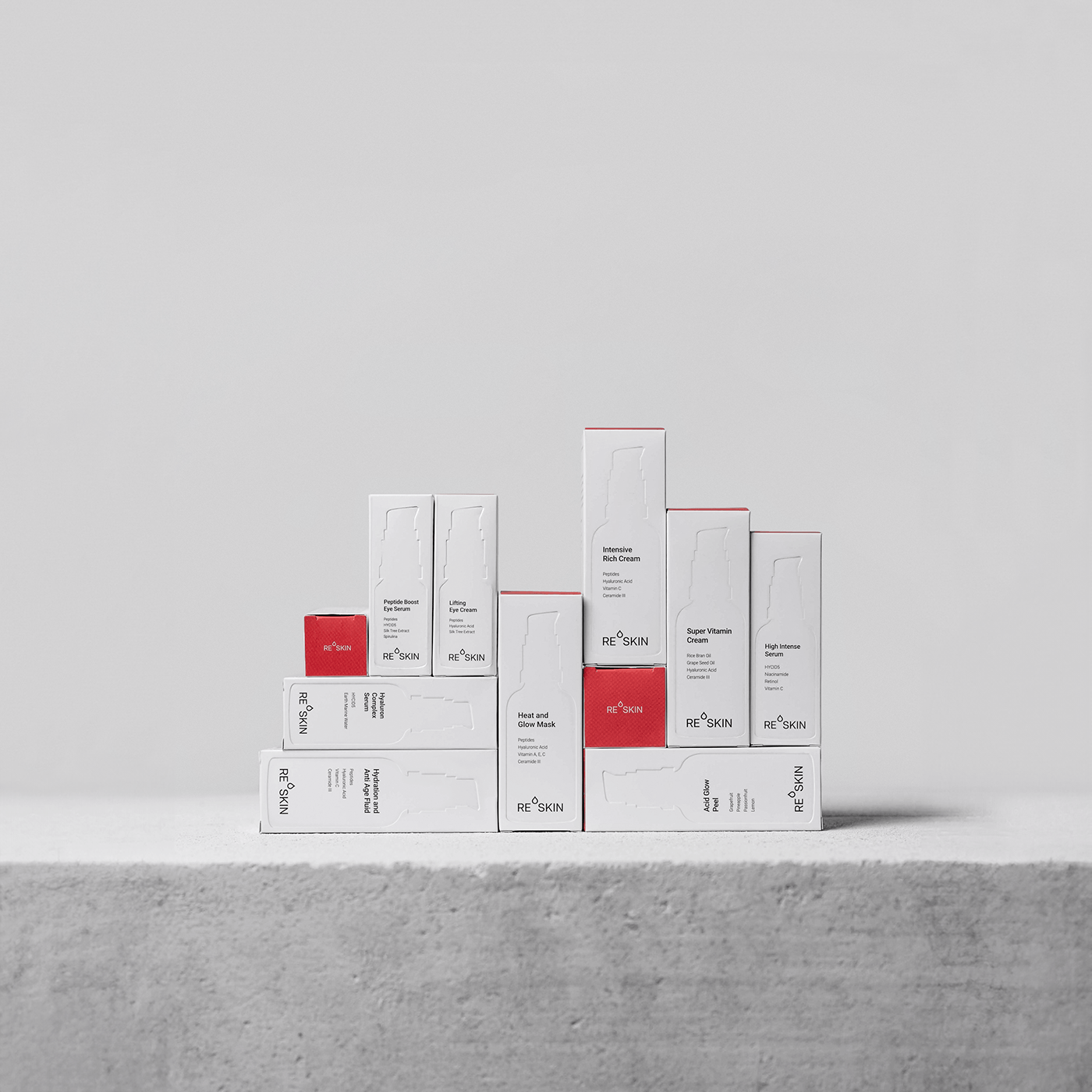
The client approached me with a request to create a box design for 13 brand products. The goal was to create a minimalistic and high-end design that would reflect the brand's values.
Challenges. Since it's a startup, they didn't have a significant budget for packaging, so balancing creativity and budget was essential; they already had established elements they were unwilling to alter, such as their brand identity and bottle design. Therefore, my task was to create only the boxes that would seamlessly complement their existing design.
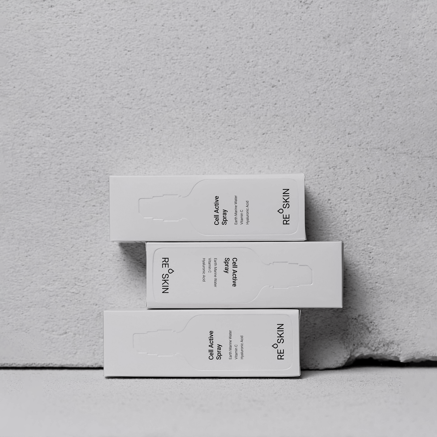
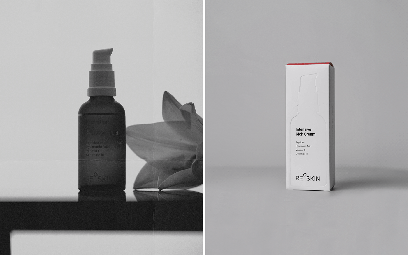
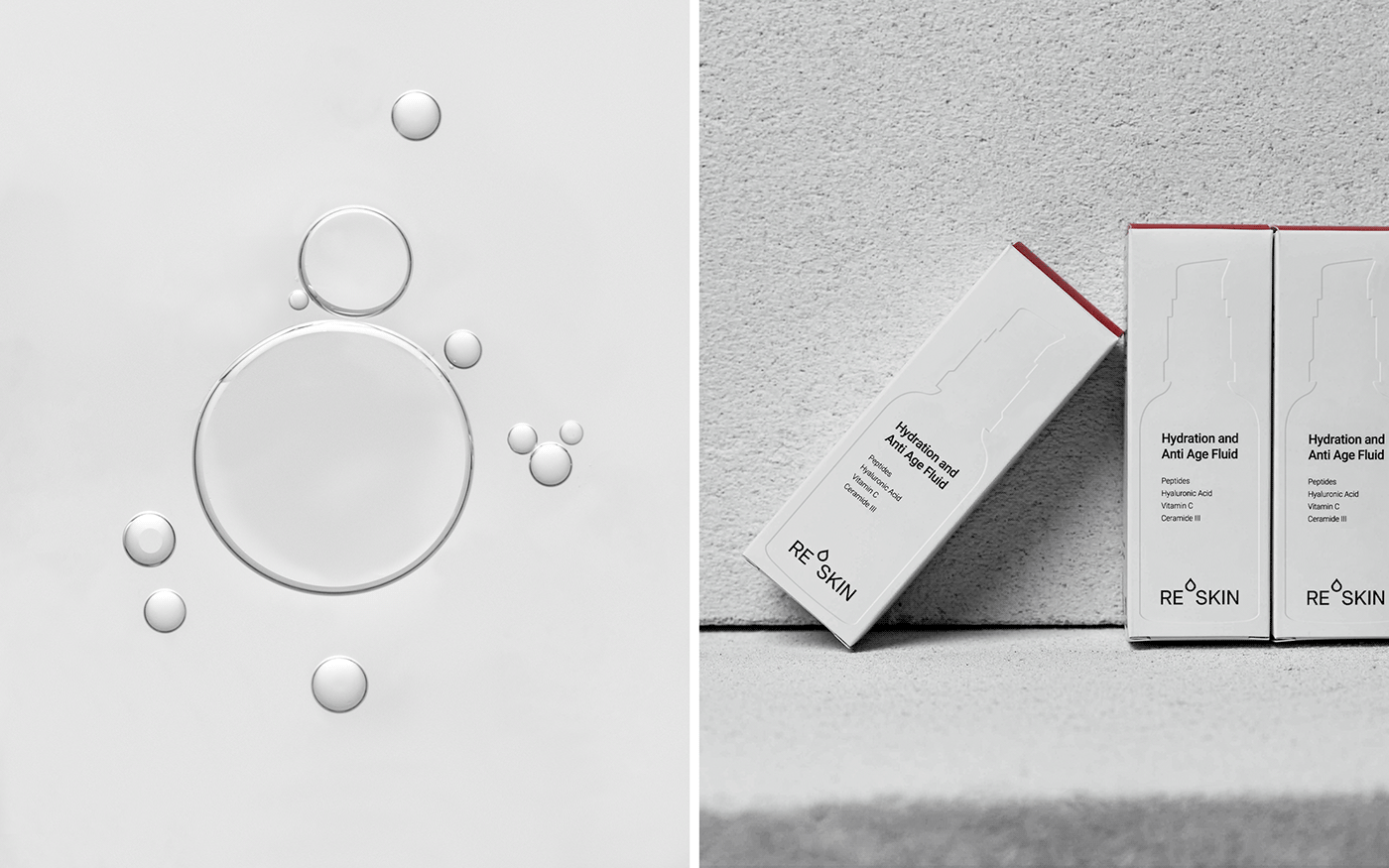
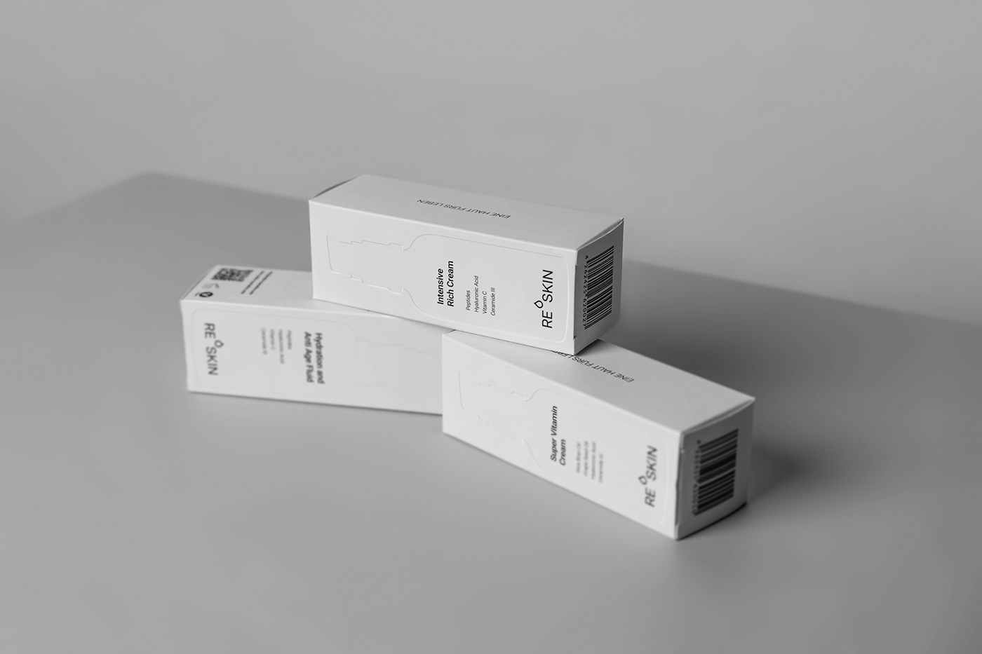
Solutions. The primary concept behind the packaging is to provide a sneak peek at the product through its embossed silhouette on the fronts. Each box showcases the distinctive silhouette of the specific product, be it a cream or cleanser. The information on the front, including the logo, is positioned exactly as it appears on the bottle. This approach serves two purposes: it communicates the brand's transparency and establishes a visual connection between the boxes and existing bottles.
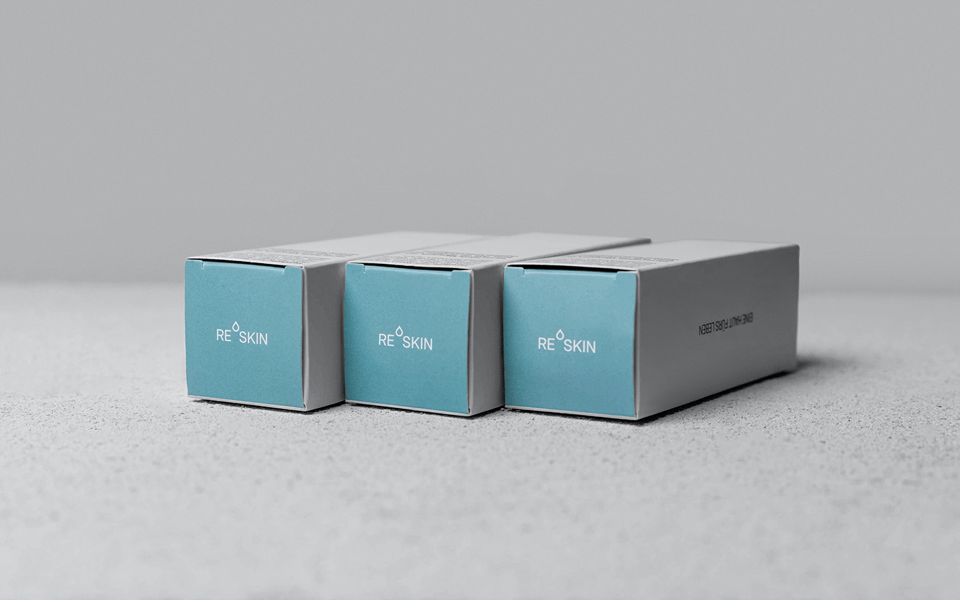
Given the brand's positioning as a clean beauty brand that is transparent about its ingredients and practices, I opted for an almost entirely white packaging design, with addition of a color on the top side for the customers to tell the difference between 2 beauty lines — red (for all skin types) and green (for sensitive skin).
To stay within the budget constraints, I abandoned overly complex and costly ideas. Instead, I opted for good-quality, thick paper and an embossed effect. This decision proved to be both budget-friendly for the client and contributed to a high-end look. The textured and pleasant paper not only enhanced the visual appeal but also provided customers with a tactile and aesthetic experience, elevating their interaction with the product.