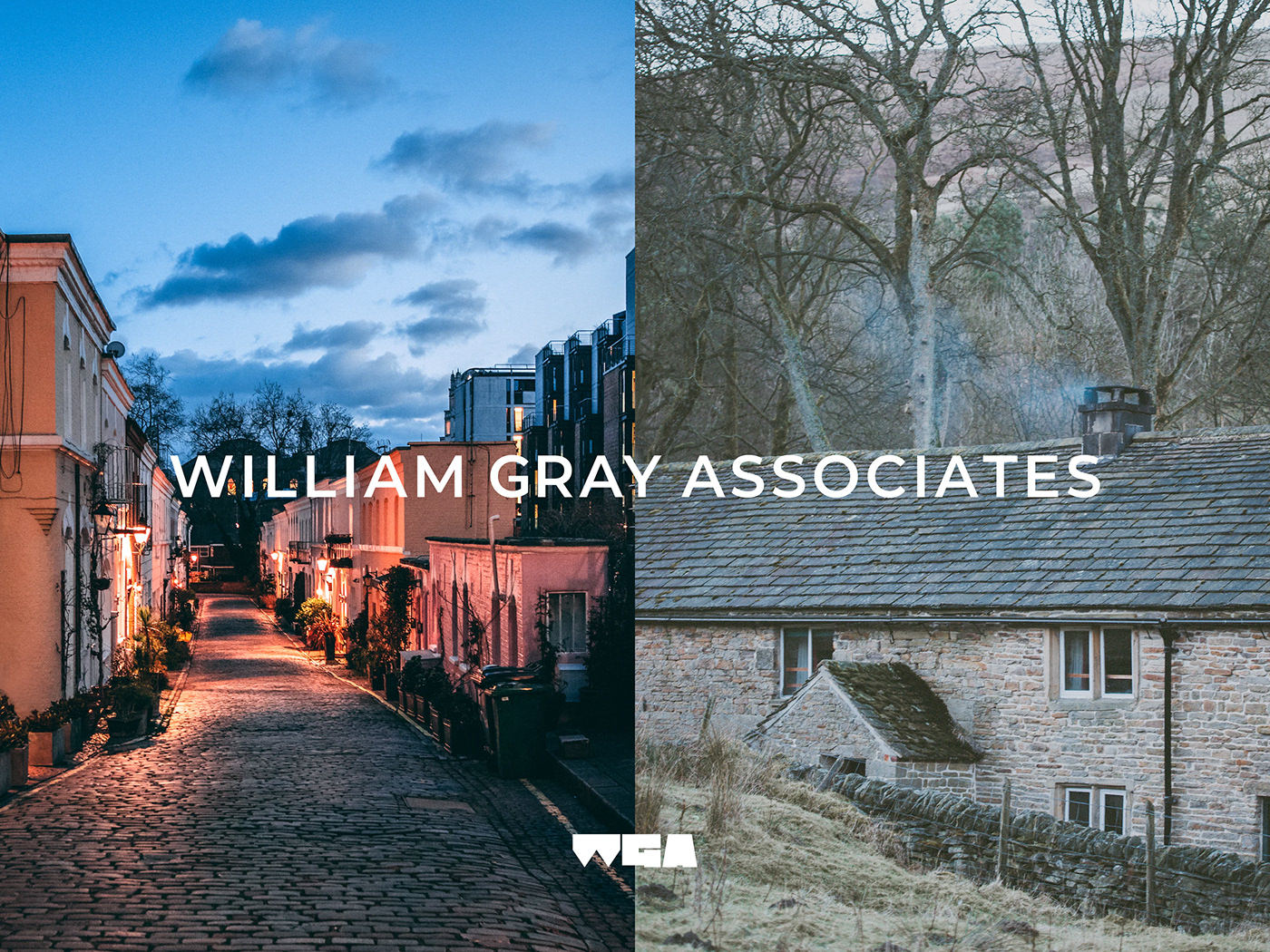
William Gray Associates
The overarching goal for this self initiated project was to improve and elevate their existing identity with a straightforward approach. The visual language is type-centric, a bespoke wordmark for the company name and a bold brutalist-like three-letter acronym logo mark providing an own-able recognisable signifier to standout amongst competitors within the industry. A subdued palette ties the identity together, black and white with a shade of grey. This neutral and versatile colour palette allows the identity to feel modern and timeless yet has the freedom to introduce colour where applicable. Complimenting both word & logo mark throughout all brand applications and touchpoints is the versatile sans serif mori typeface by pangram pangram.
The acronym logo mark of the company initials was developed to visually reinforce the past; the simple shapes evoke the construction types of the projects wga work on and are known for, a homage to architectural impact and significance within the locale as well as being juxtaposed with the present and the modern tools and technologies wga incorporate. This is visually depicted with the tightly kerned letters signifying the precise minimal tolerances that can be achieved during construction. Further shown with two additional variations both as an outline and 8-bar expression.