

Booklet animation:
https://issuu.com/mjwebbdesign/docs/des325_project_2
Project Overview
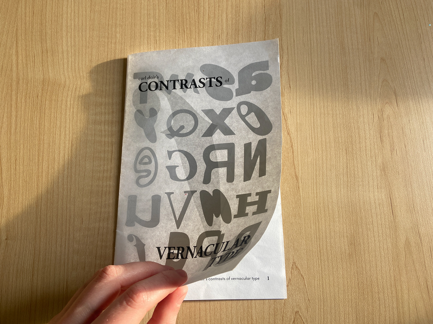
The goal of this project was to create a booklet highlighting four of Carl Dair’s seven contrasts in vernacular type; size, weight, structure and form. Type on signage in San Francisco was photographed, curated, and retouched to produce an alphabet of 26 unique letterforms.
An eight page booklet was created, utilizing a three by four grid system to ensure an even and consistent alignment of text and images. Type was enlarged and boldened to convey importance, and different letter pairings were created to illustrate Dair’s constrasts in typography.

26 letters were taken from over 100 hundred signs, and then graphically reduced into vectors for the booklet.

The original text from Carl Dair was then paired with various letters, and laid out on a grid system.


A serif and sans serif were paired together to demonstrate the contrast of structure.


The final booklet was printed and saddle stitch stapled.


