What's BAND?
BAND is a global educational brand. It's all about bringing together like-minded individuals who work with text and words: professionals, aspiring writers, copywriters, and anyone eager to unleash their creative potential through words.
What's the challenge?
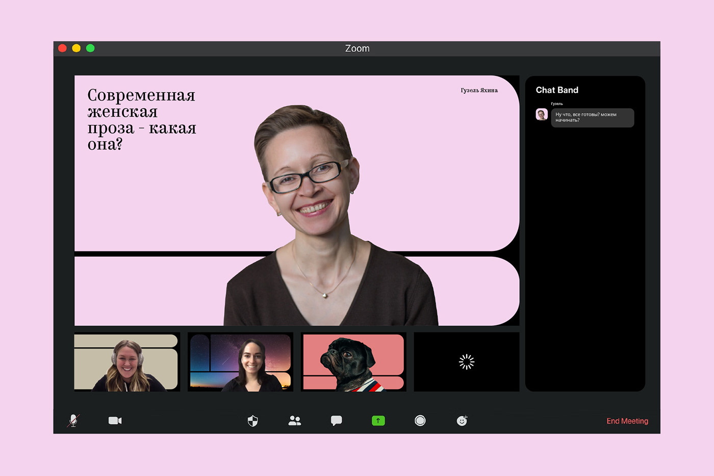
The brand evolved from a school with a few courses into a vast ecosystem, including educational courses, podcasts, lectures with renowned writers, a YouTube channel, magazines featuring the best works of students, and much more. Our task was to create a new identity system that aligned with the brand's grown ambitions. The main challenge was that, by the time of rebranding, a large amount of visual material had been created in different visual styles, and we needed to bring it all together.
Solution
BAND's mission is not only to teach the basics of the profession but also to be a place of attraction for anyone working with words. Here, young authors can find opportunities to collaborate with established writers and publishers. It's a place where new talents are nurtured, given a platform for their creativity, charged up, and supported. Thus, the positioning of brand: «BAND – a place of creative power».
BAND's mission is not only to teach the basics of the profession but also to be a place of attraction for anyone working with words. Here, young authors can find opportunities to collaborate with established writers and publishers. It's a place where new talents are nurtured, given a platform for their creativity, charged up, and supported. Thus, the positioning of brand: «BAND – a place of creative power».
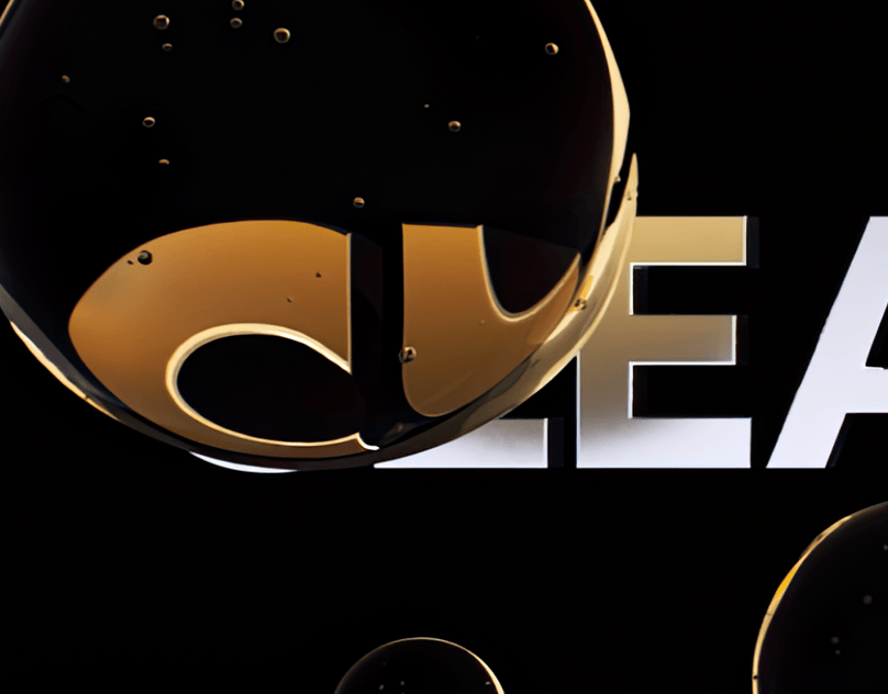
2021 Wunderbar Identity design Web-design
Brand System
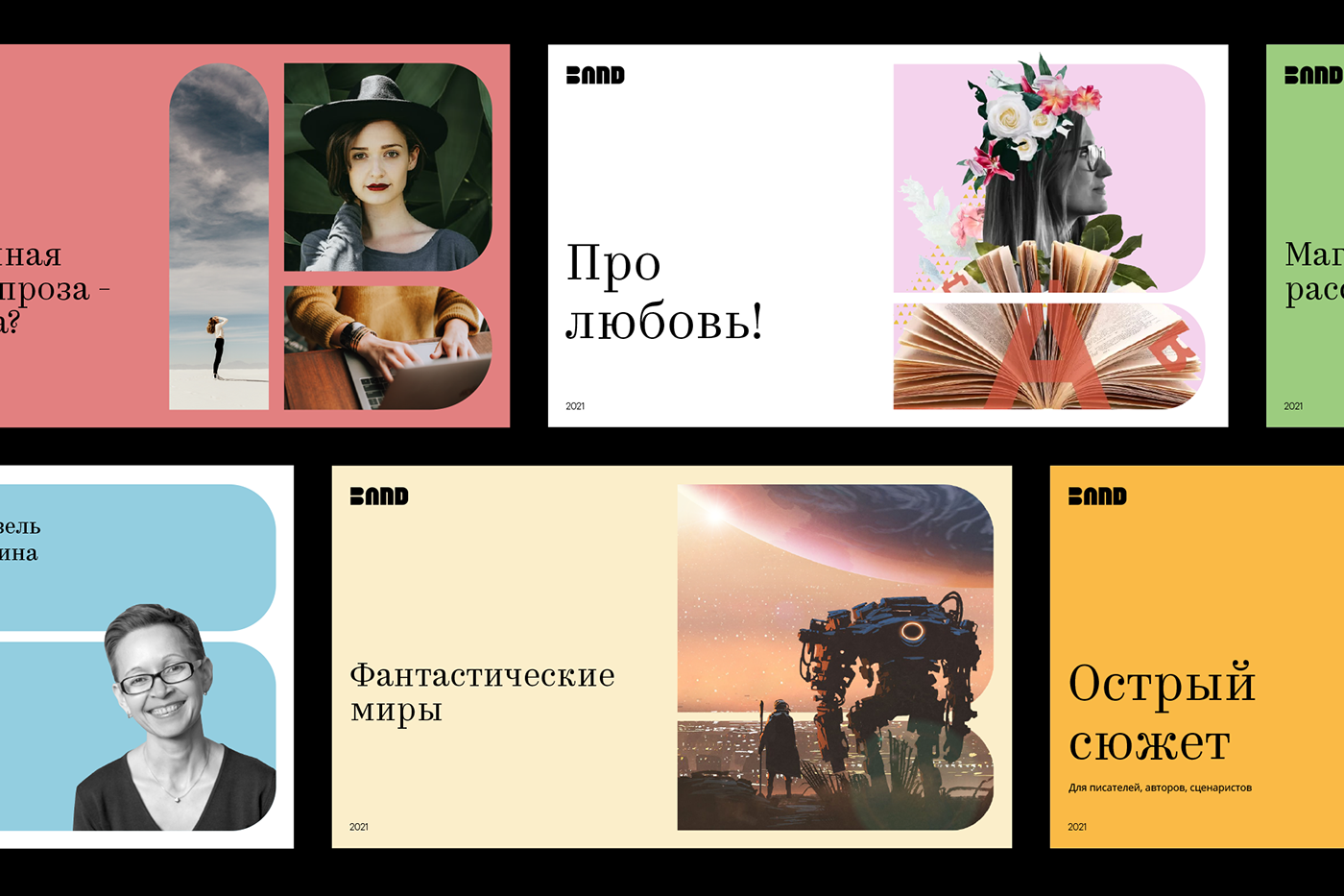
The key-visual and grid are based on an image stack of books which create a shape of window. Through this window we see the worlds that authors create. Through it, like through a portal, creative energy comes to us. Inside this place, people united by common ideas meet and new images are born. This window can be flexible, adapt to different creative styles and different media. It brings everyone together. Window graphics create a basic grid that can change depending on the task.


Typography, color, illustration
Despite being primarily a digital brand, we wanted to maintain the mood associated with reading a classic paper book. Hence, slightly muted colors, as if taken from the shelf of classic books, were chosen. For accents, we selected the Kazimir typeface, an antique font combining traditional and modern elements. Both hand-drawn images and photos can serve as illustrations.


BAND – a place of creative power for everybody who work with text
and word.


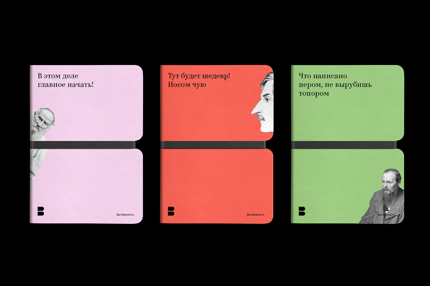
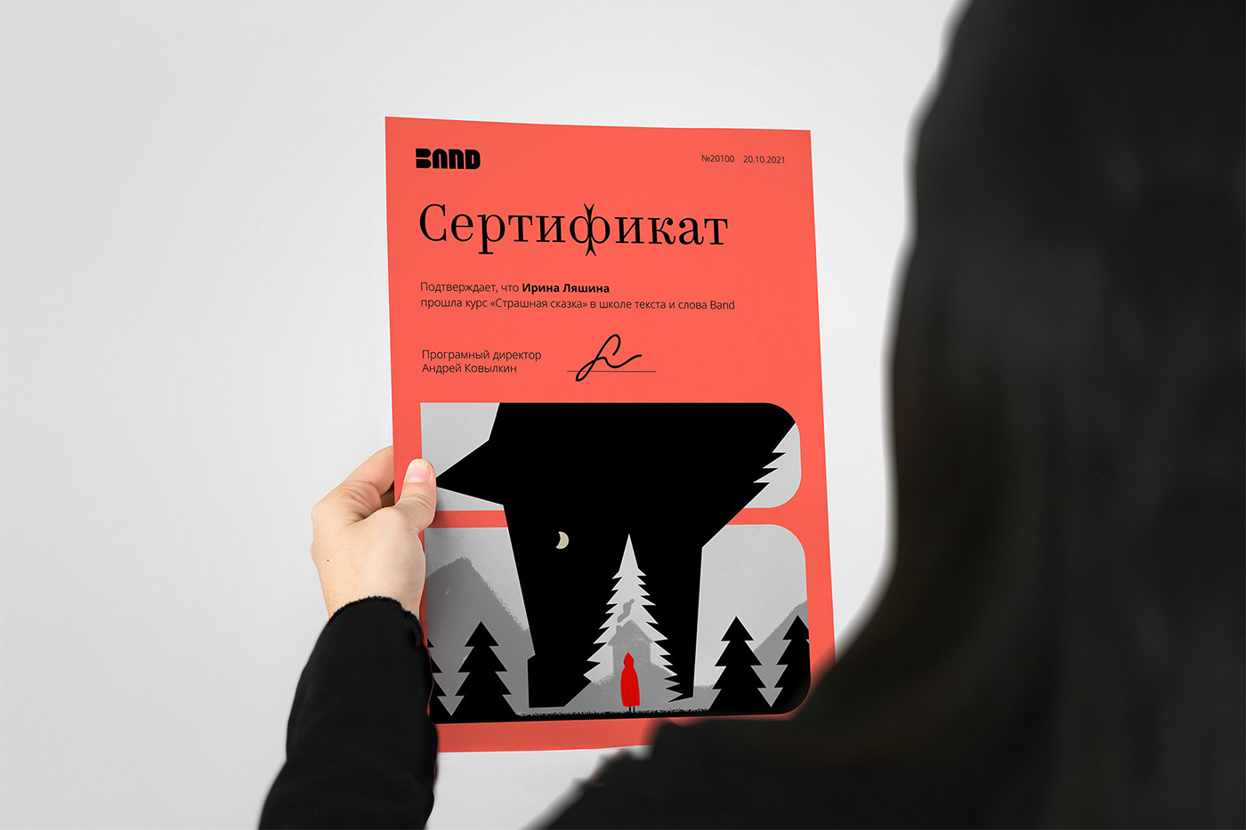
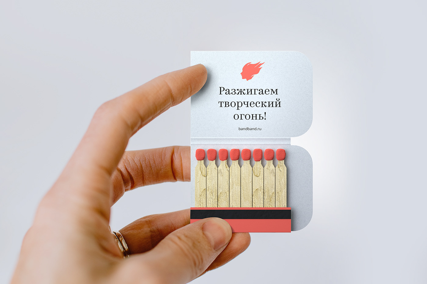
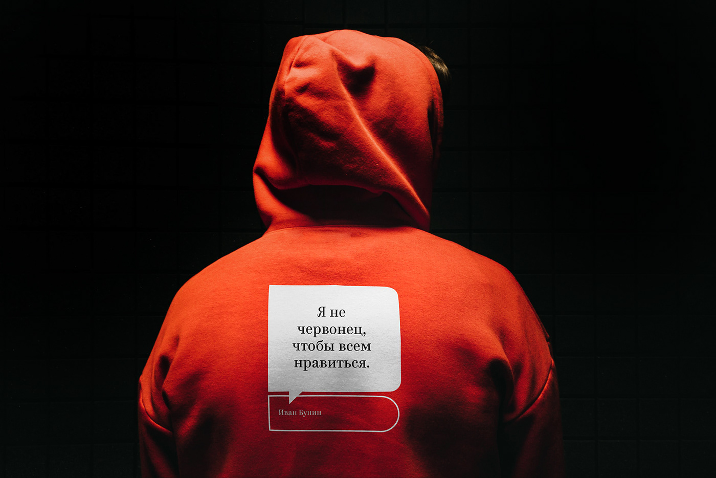
Physical media
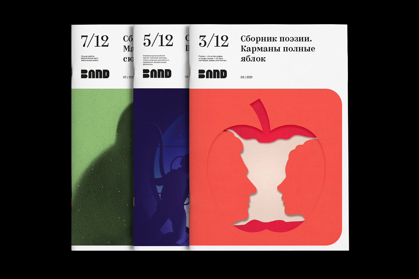
Despite digital origin, we wanted to create a range of media that would accompany all Band-members members in real life. They should support creative impulses and inspire new feats.
Despite digital origin, we wanted to create a range of media that would accompany all Band-members members in real life. They should support creative impulses and inspire new feats.


Client: Bandband.ru
Format: Online school
Format: Online school
Agency: Wunderbar
Art Director: Sasha Kischenko
Identity design: Sasha Kischenko
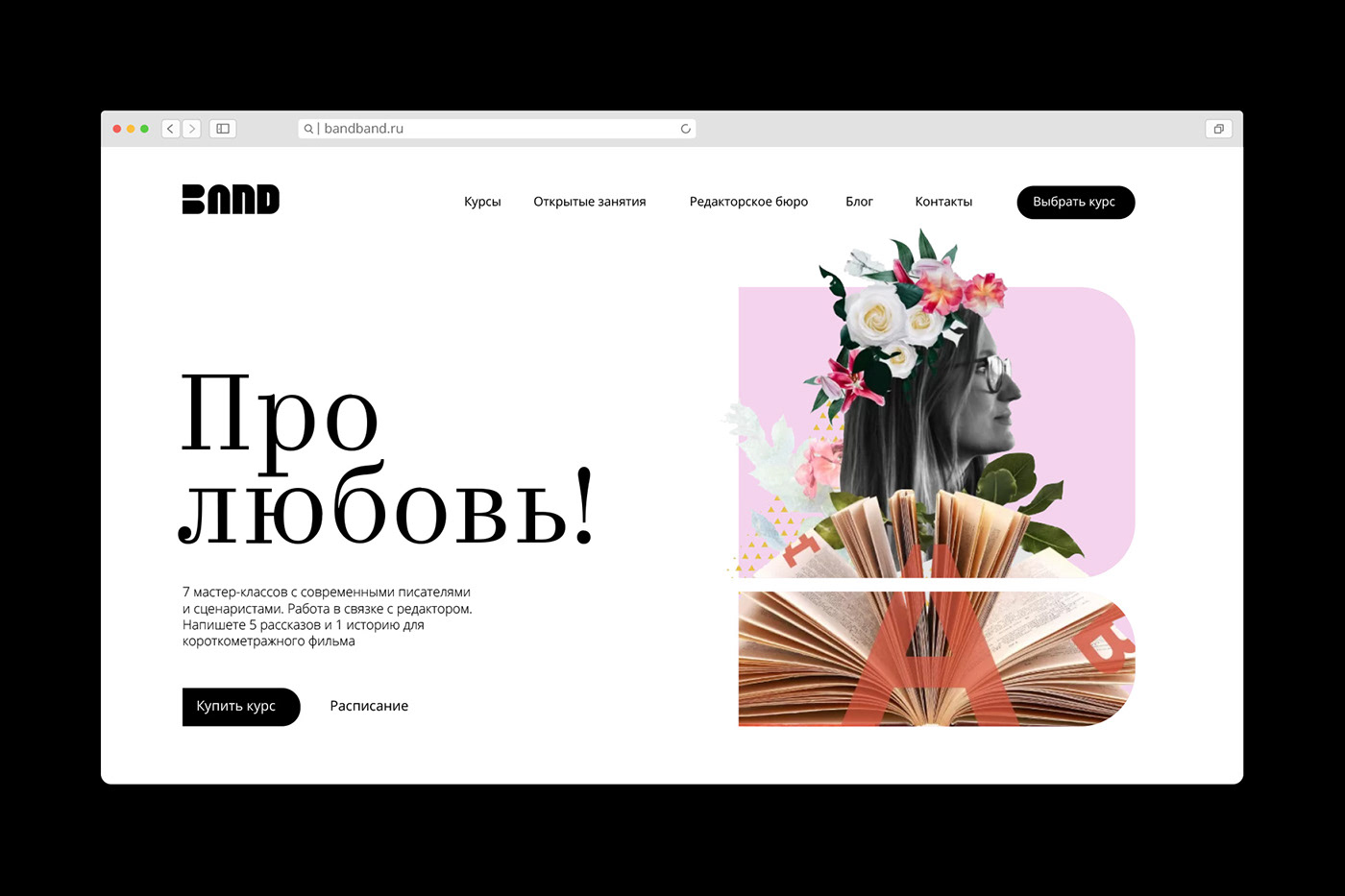
Web design: Alexander Tchernitski, Elena Nazarova
Strategic positioning: Sectret strategis Olga R.
Font design: Type.today
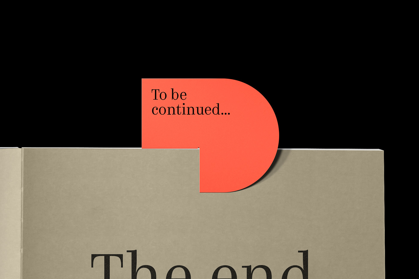
The end.