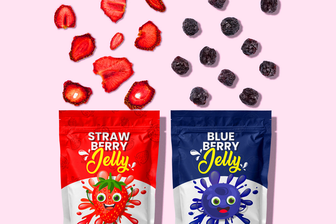
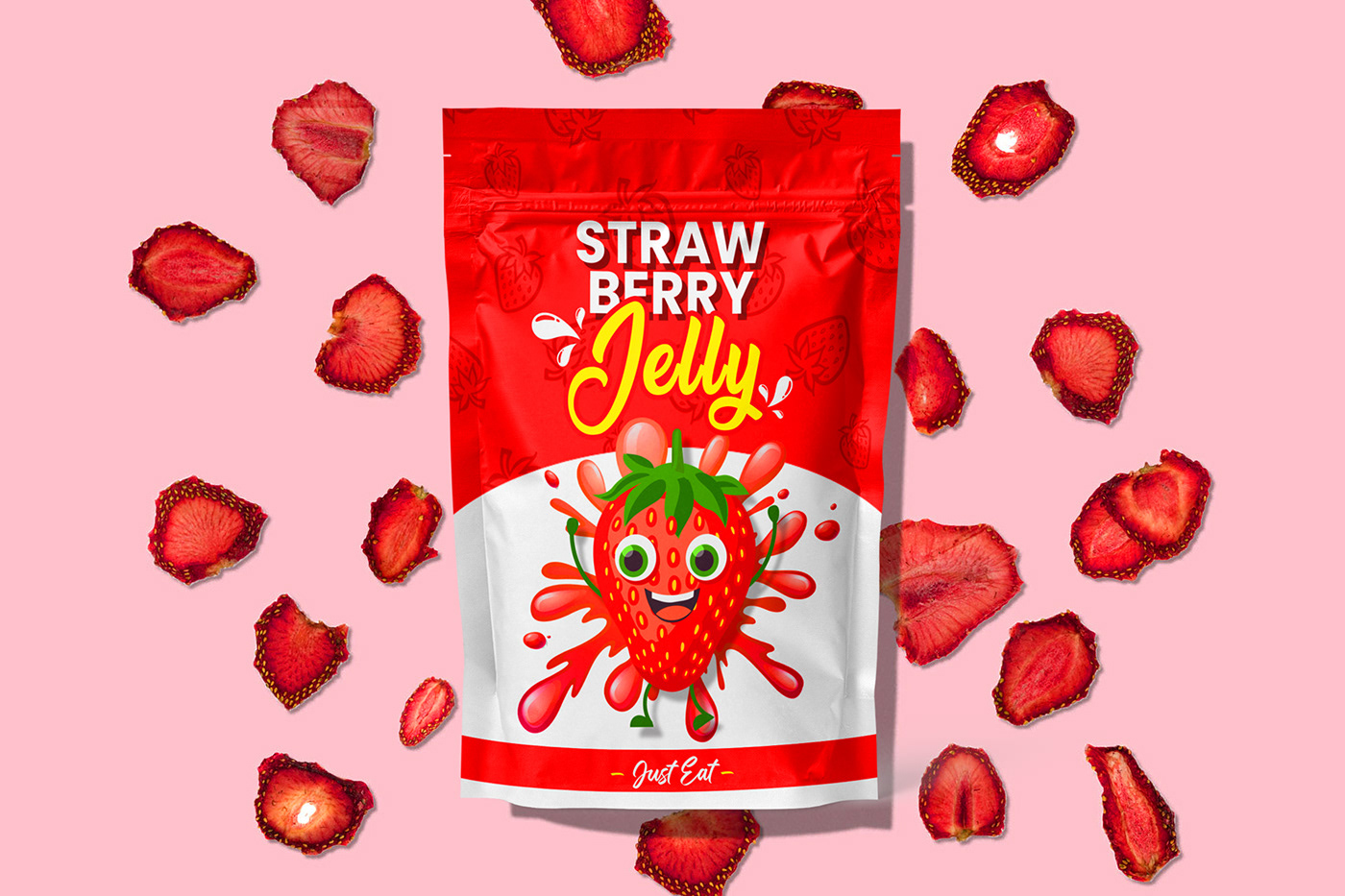
JELLY
The Jelly project was driven by the ambition to redefine the visual identity of a beloved treat – jelly. As a designer, the challenge was not merely to create packaging but to encapsulate the essence of each flavor, ensuring that every design element had a purposeful theory behind it. The color scheme, with vibrant reds representing the lusciousness of strawberry and calming blues embodying the essence of blueberry, plays a pivotal role in this narrative.
The use of rich red hues for the strawberry flavor is a deliberate choice to convey the intense, sweet indulgence associated with biting into a ripe strawberry. In contrast, the calming blues for the blueberry flavor evoke a sense of tranquility, mirroring the refreshing burst of blueberry goodness. Each swirl, gradient, and typography choice is meticulously crafted to create a visual journey that extends beyond the taste buds.
By featuring these designs in your portfolio, you showcase more than just jelly; you present an exploration of flavors through a carefully curated visual experience. The colors and design elements are an intentional representation of the theory behind infusing each jelly variant with a distinct personality, making the Jelly a treat for both the eyes and the taste buds.