Betty's Donuts Branding
As a designer, I believe that the logo I create should create a bridge between today's world trends and the historical texture of the product at the time it emerged. Because when you make a logo that connects the story of a product that has established itself in the world, you create a warm and nostalgic effect in people's subconscious minds. In doing so, you both reflect the essence of the idea and establish a relationship with the place where the story emerged. After all, many of the foods we consume and love now were discovered about 100 years ago. But they are still loved and consumed by people. So when I decided to create a donut brand, I researched how and how the concept of the donut came about.
The story takes us back to the early 1900s. In September 1917, among a group of women who wanted to support American soldiers in the First World War, Margaret Sheldon and Helen Purviance came up with the idea of making doughnuts made with only flour, sugar, baking powder, baking soda, salt, eggs and milk and sprinkled with powdered sugar after frying. Their aim was to remind the soldiers of home and boost morale. These treats were an instant hit and cemented the Armed Forces' relationship with donuts and the girls who served them. And that's how the donut first appeared. When I read the whole story, I was very impressed. The story of these doughnuts, which today can be made in almost any color and look fun, actually contained sadness and the warmth and longing of the family home.
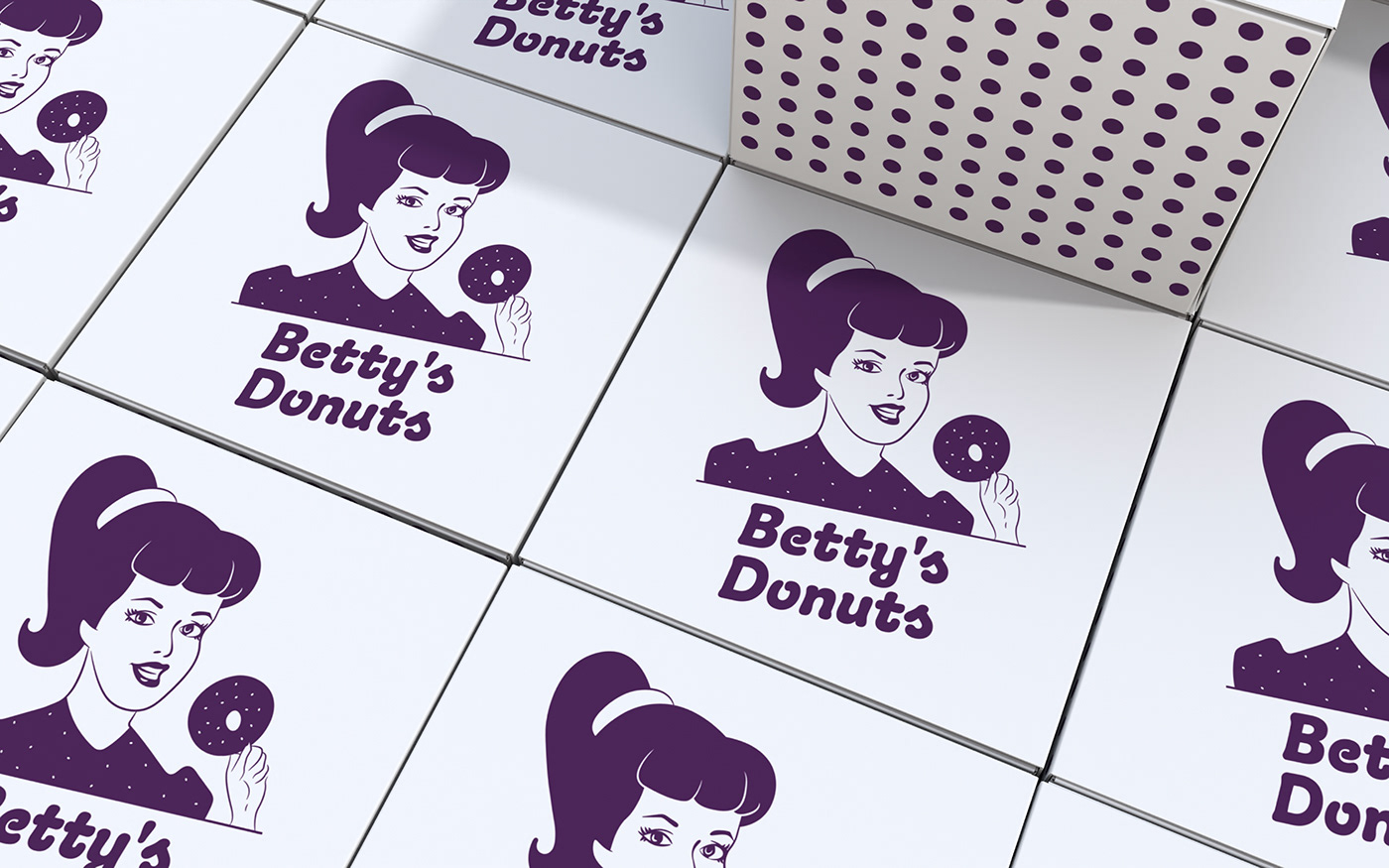
I designed the logo I created inspired by this story. Unlike today's donut works that contain many colors, I preferred a single color. I would like to talk a little about why I made the name, color and the female figure using these preferences. I designed Betty's facial features, hairstyle and outfit in a simple and warm way in accordance with the fashion of the 1920s. While I preferred the polka dot design that reflects one of the women's clothing styles of that period, I also aimed to make it a whole with the round powdered sugar powders on the donut. I chose the name Betty because it is one of the most used female names of the 1920s and it fits the female figure I created. So why did I choose the color purple ? Because purple is a very feminine and attractive color. Besides, we can say that the color purple also represents courage and creativity because of the Purple Heart medal given to military heroes.
This is how Betty's Donuts came into being. Thank you for reading my story of designing the brand.