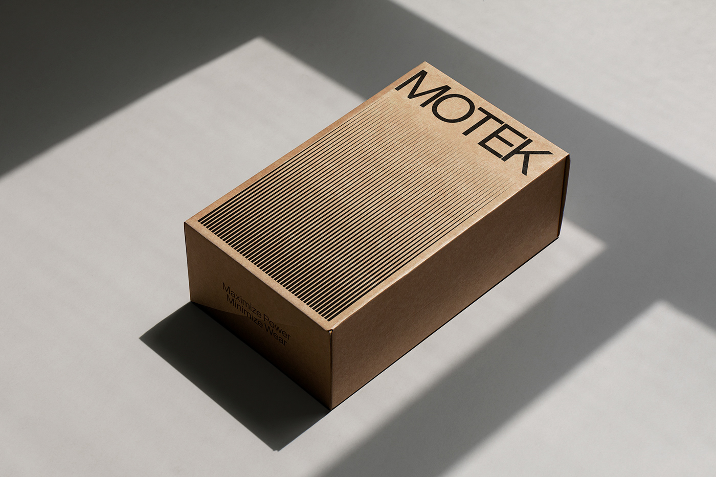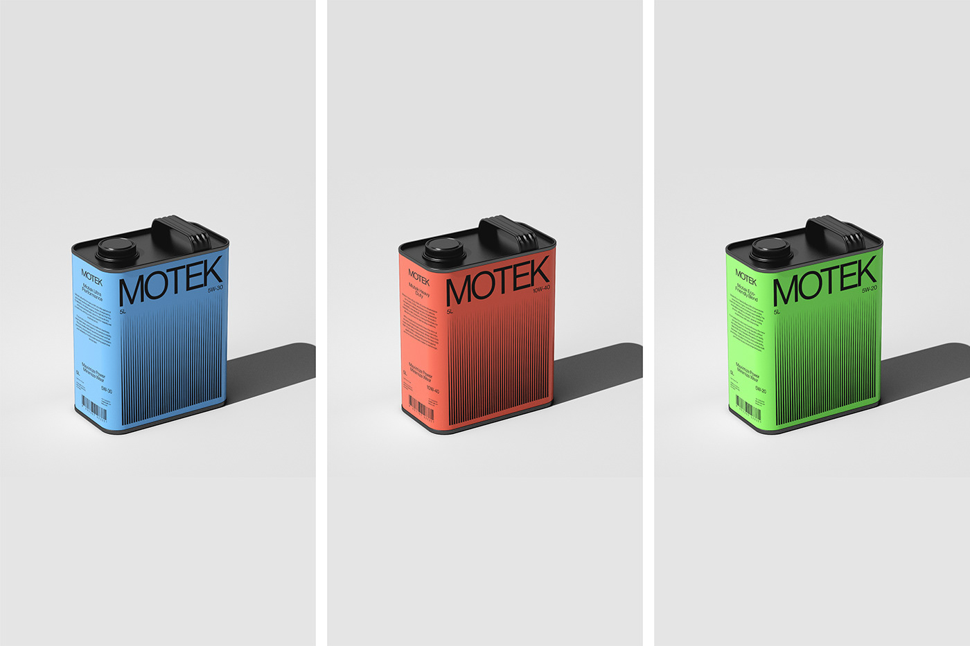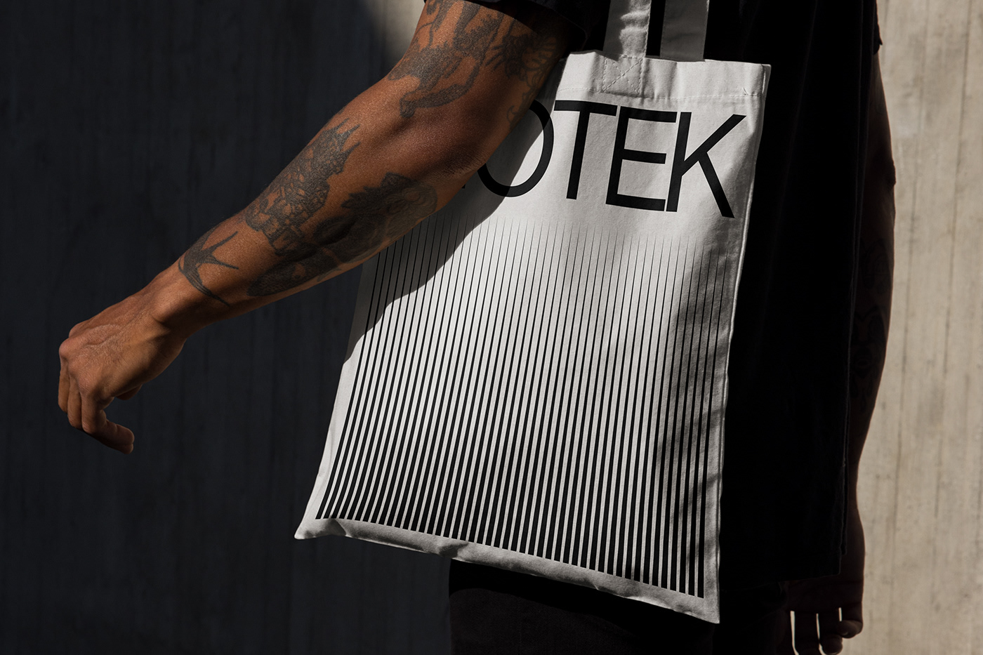
About Motek:
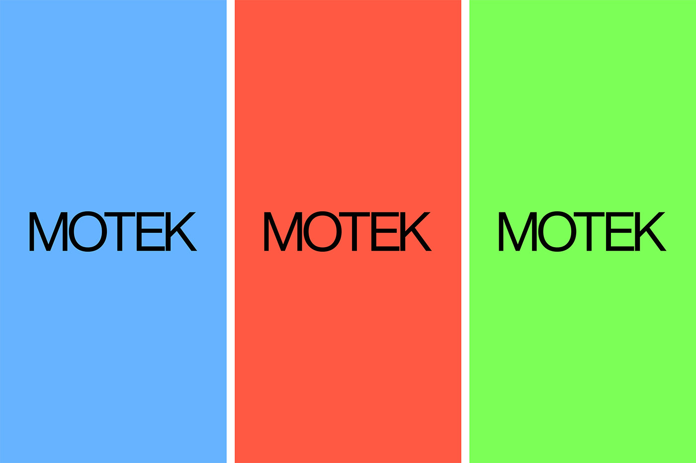
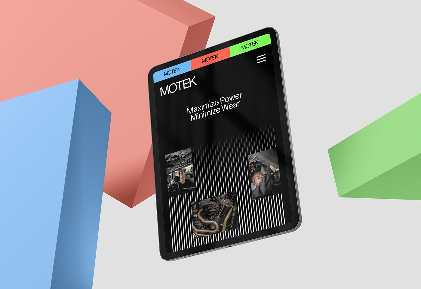
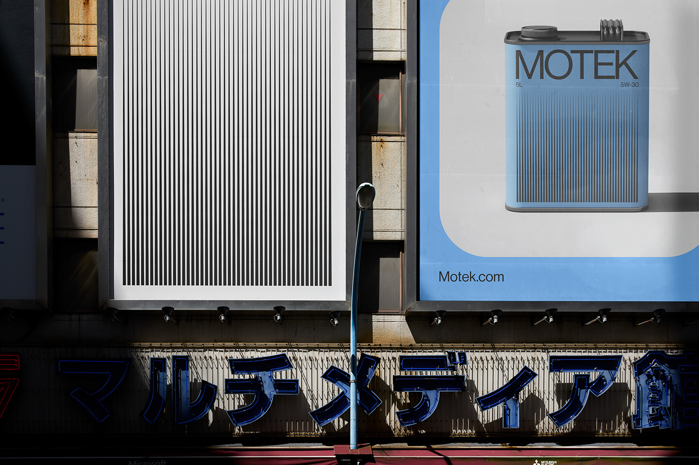
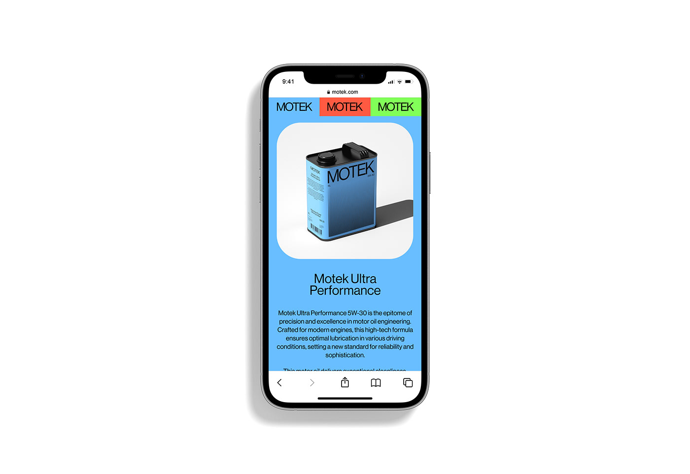
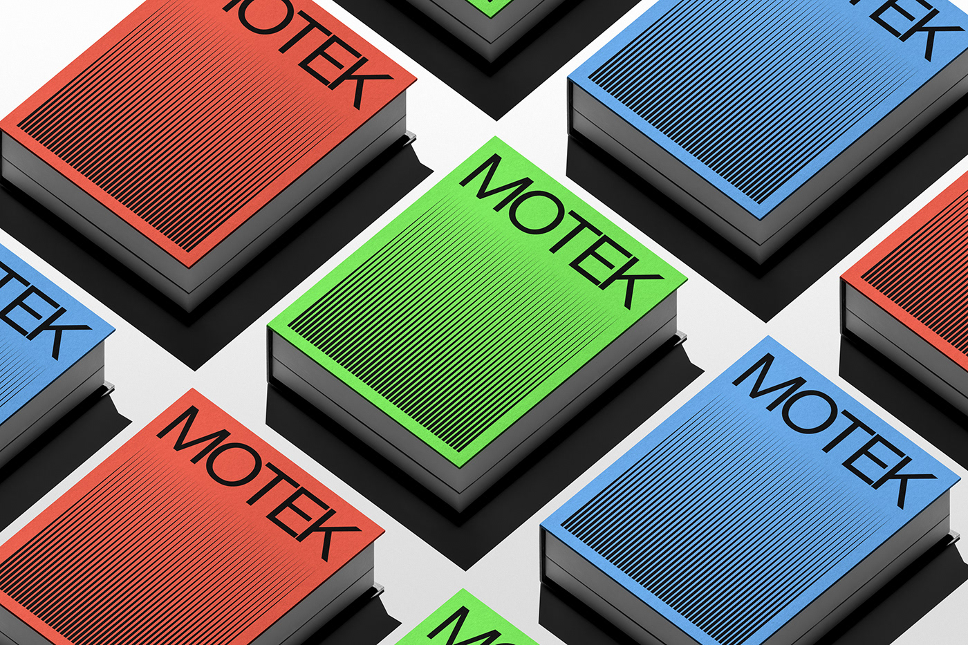
Motek's brand essence revolves around precision and reliability, now encapsulated in "Motek Fluid Refresh." The logo, adorned with deep blues and metallic tones, exudes a modern and trustworthy vibe. Packaging ensures clarity with oil viscosity labels and engaging graphics. Online platforms emphasize Motek's commitment to quality and innovation. Impactful taglines like "Precision Drives Performance" capture the brand's spirit. On social media, Motek maintains an engaging presence, with limited edition promotions adding excitement. In essence, Motek's brand, now centered on "Fluid Refresh," remains concise, modern, and synonymous with reliability in the motor oil market.
Why Hosam.Brands:
Understanding the crucial nexus between brand perception and success, Motek approached Hosam.Brands to revamp their entire brand and visual identity. They wanted to ensure that their brand resonated powerfully with their ethos and stood out in a saturated market.
Scope:
Creative Direction, Brand Identity, Brand Strategy, Logo Design.