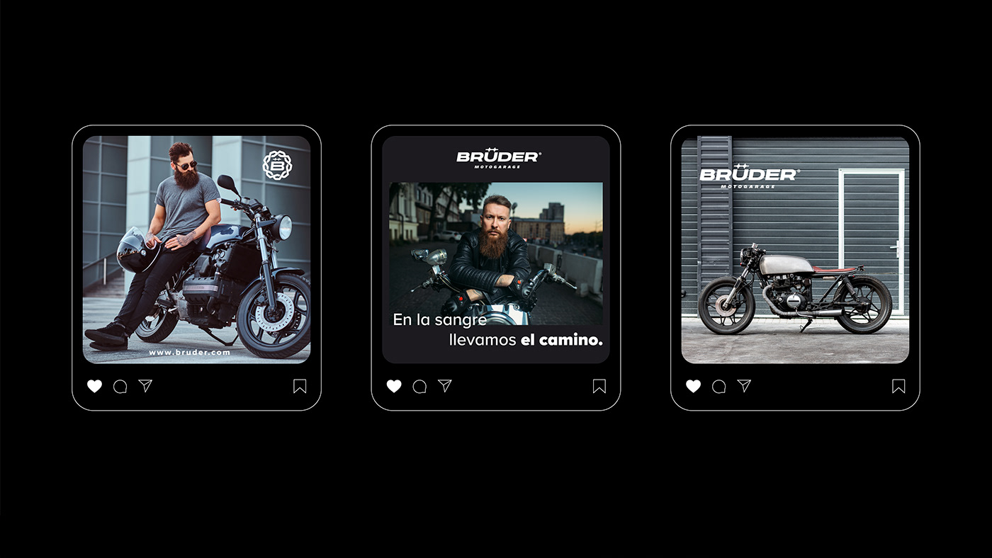
BRüDER - Motogarage
A typography was chosen to reflect uniqueness and quality, without requiring excessive graphic adjustments. The focus is on the design of the umlaut, symbolizing unity through stars, following the concept of "hermanan" (siblinghood).
This concept, derived from the brand's name,
becomes the guiding thread of the trademark.
becomes the guiding thread of the trademark.
The logo represents three prominent qualities:
the strength of a racing team, the idea of "brotherhood" emphasizing the meaning of "Brüder" (brothers in German), and the abstract connection of links as a symbol of mutual dependence. This design aims to reinforce the brand's identity in a compelling way.
the strength of a racing team, the idea of "brotherhood" emphasizing the meaning of "Brüder" (brothers in German), and the abstract connection of links as a symbol of mutual dependence. This design aims to reinforce the brand's identity in a compelling way.