


Dialogue Day/Dzień Dialogu | University's Brief
The aim of this brief was to create a campaign for festival called Dialogue Day. This festival heads for finding and reconcile 2 groups of people with opposite opinions, references etc. In this case, These were groups of Polish and English people. Why them? Because, for me It actually was the closest subject with the finest knowledge about the stereotypes about Poland and their citizen and Vice Versa.

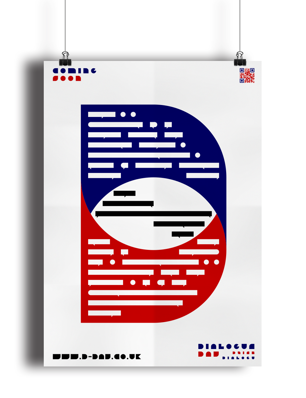
Above: Icon of the project. The two "D" collapsing each other to create the the big spirar "D" with parts which look like the speech ballon. these ballons has the purpose to show the dialogue to come into agreement with each other.


Above: The logos in two variations, in english and in polish. Every variation has their main part in main language and another smalller part in sub-main language. In this way, The logos had to be recognized for both nations, no matter where they live.


Above: The typography was very important part of this project. It wasn't by their look, except the first one ( the shapy) but by their origin. The second font was designed in England and usually used in London Underground. The third was designed in Poland for Polish Road Sights. This method had to bring the both nations closer and to combine them.
Below: There're final poster designs braided into different mock-ups.


Below: This is the "Dictionary of This Day" . This booklet has to help people with lacking knowlegde of opposite languages.


Hope you like it! :) If so, click the button below


