Brand Strategy:
Fruit Pappa is not just an online fruit marketplace; it's a testament to the harmonious blend of experience and modernity. Drawing inspiration from the timeless wisdom of a "Career Dad" passed down through generations, Fruit Pappa infuses this rich legacy with the convenience of contemporary living. The brand narrative revolves around the paternal figure, the "Fruit Pappa," symbolizing unparalleled experience and care in curating the finest quality fruits.
Fruit Pappa is not just an online fruit marketplace; it's a testament to the harmonious blend of experience and modernity. Drawing inspiration from the timeless wisdom of a "Career Dad" passed down through generations, Fruit Pappa infuses this rich legacy with the convenience of contemporary living. The brand narrative revolves around the paternal figure, the "Fruit Pappa," symbolizing unparalleled experience and care in curating the finest quality fruits.
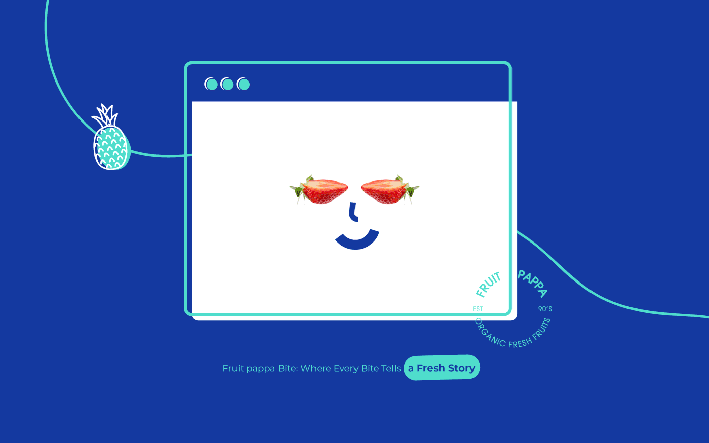
Fruit Pappa's brand essence unfolds through a carefully crafted logo that serves as the visual anchor to the narrative. The harmonious blend of experience and modernity is encapsulated in the design, where the mustache and fruit come together in a seamless fusion. The mustache, an emblem of experience and paternal wisdom, intertwines with the shape of the fruit, representing not only the freshness of our offerings but also the guidance reminiscent of a nurturing "Career Dad."


Fruit Pappa : A Journey Unveiled
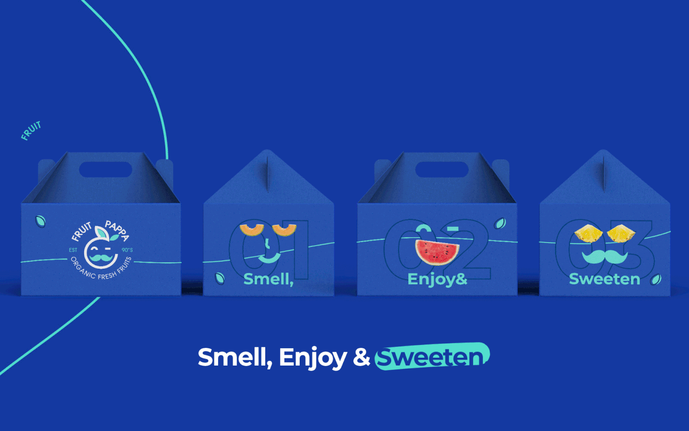
"Smell, enjoy, and sweeten" isn't just a tagline; it's a poetic invitation to embark on a joyous odyssey through the tantalizing world of Fruit Pappa. Our brand journey unfolds like a sensory symphony, each note playing a crucial role in crafting an unforgettable experience as you indulge in our fresh, organic, and quality fruits.
Smell: The Prelude to Freshness
In the opening act of our journey, "Smell" encapsulates the essence of our brand. The user experience (UX) through our platform begins with the invigorating aroma of natural purity and freshness. It's more than a scent; it's an introduction to the pristine quality that defines Fruit Pappa. The visual aesthetics and user interface reflect this aromatic anticipation, guiding you through a journey where each click and swipe resonates with the promise of freshness.
Enjoy: A Symphony of Exquisite Flavors
As you delve deeper into our brand narrative, the second movement, "Enjoy," takes center stage. Here, the user is not just a spectator but an active participant, savoring the exquisite flavors that define Fruit Pappa. The UX design mirrors this enjoyment, creating an interface that not only engages but immerses, ensuring that every interaction is a delightful crescendo of satisfaction. From vivid imagery to seamless navigation, the design elements harmonize to elevate your experience.
Sweeten: Nature's Culmination in Every Bite
The grand finale, "Sweeten," is the culmination of nature's bountiful care. With every delicious bite, you taste the inherent sweetness cultivated by nature itself. The UX design accentuates this sweet climax, offering a seamless and rewarding closure to your journey. It's not just a transaction; it's a symphonic culmination of your exploration, leaving you with a sweet aftertaste that lingers.
Together, "Smell, enjoy, and sweeten" is the melody that underscores every click, swipe, and bite, transforming the act of buying fruits into a harmonious experience. Welcome to the Fruit Pappa, where the senses are engaged, enjoyment is inevitable, and sweetness is savored in every moment.


Visual Identity:
The visual identity of Fruit Pappa retains its distinctive logo featuring a mustache intertwined with the shape of a fruit. This now symbolizes not only experience but also the guidance of a "Career Dad." The color palette of blue and green remains, emphasizing trust, reliability, and the natural vibrancy of the fruits.
The visual identity of Fruit Pappa retains its distinctive logo featuring a mustache intertwined with the shape of a fruit. This now symbolizes not only experience but also the guidance of a "Career Dad." The color palette of blue and green remains, emphasizing trust, reliability, and the natural vibrancy of the fruits.