Logo redesign for Boulderz Climbing Centre. Andrew at Boulderz was looking to revise his existing logo,
not a complete overhaul but rather something that continued on from the original look
and further established the brand.
Vector, Client: Boulderz Climbing Centre


The previous logo needed some tweaks to suit the gym as it evolved and grew. The logo shape was limited in its design application, and the climber needed to be less obviously masculine.
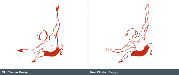
The climber was redrawn to be more unisex and less abstracted. The barrel-shaped back was thinned out, a tank top added, and more definition given to the lines and musculature.

The new logo integrated the climber with the text, and was designed to be more versatile in different contexts, and to work more like a badge or stamp in designs.


