Crossfit Kirkintilloch
logotype & visual identity
BRIEF.
1. Create a logo and visual identity for a startup gym that could be used
business wide for signs, profile pictures, letterheads, business cards, etc.
2. Create and design a poster/flyer to advertise the opening of the gym.
3. Use a circular saw and type & keep to a blue green palette
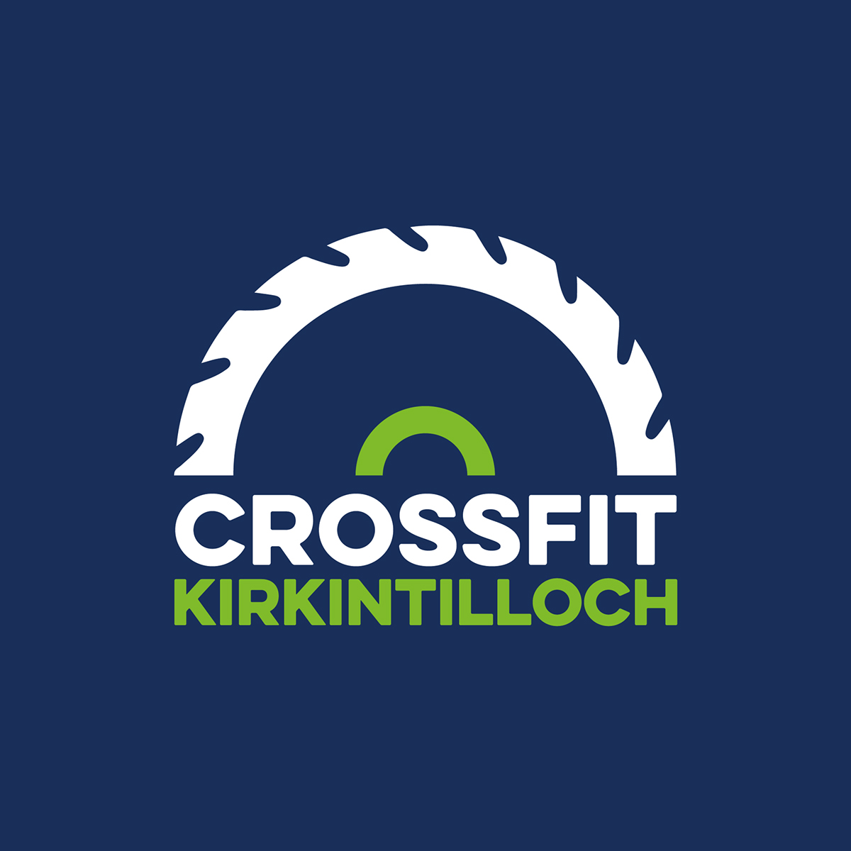
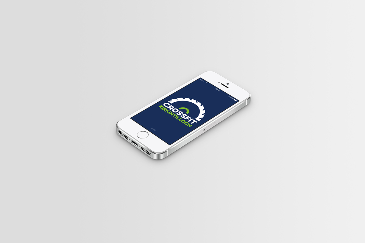
FINAL LOGO
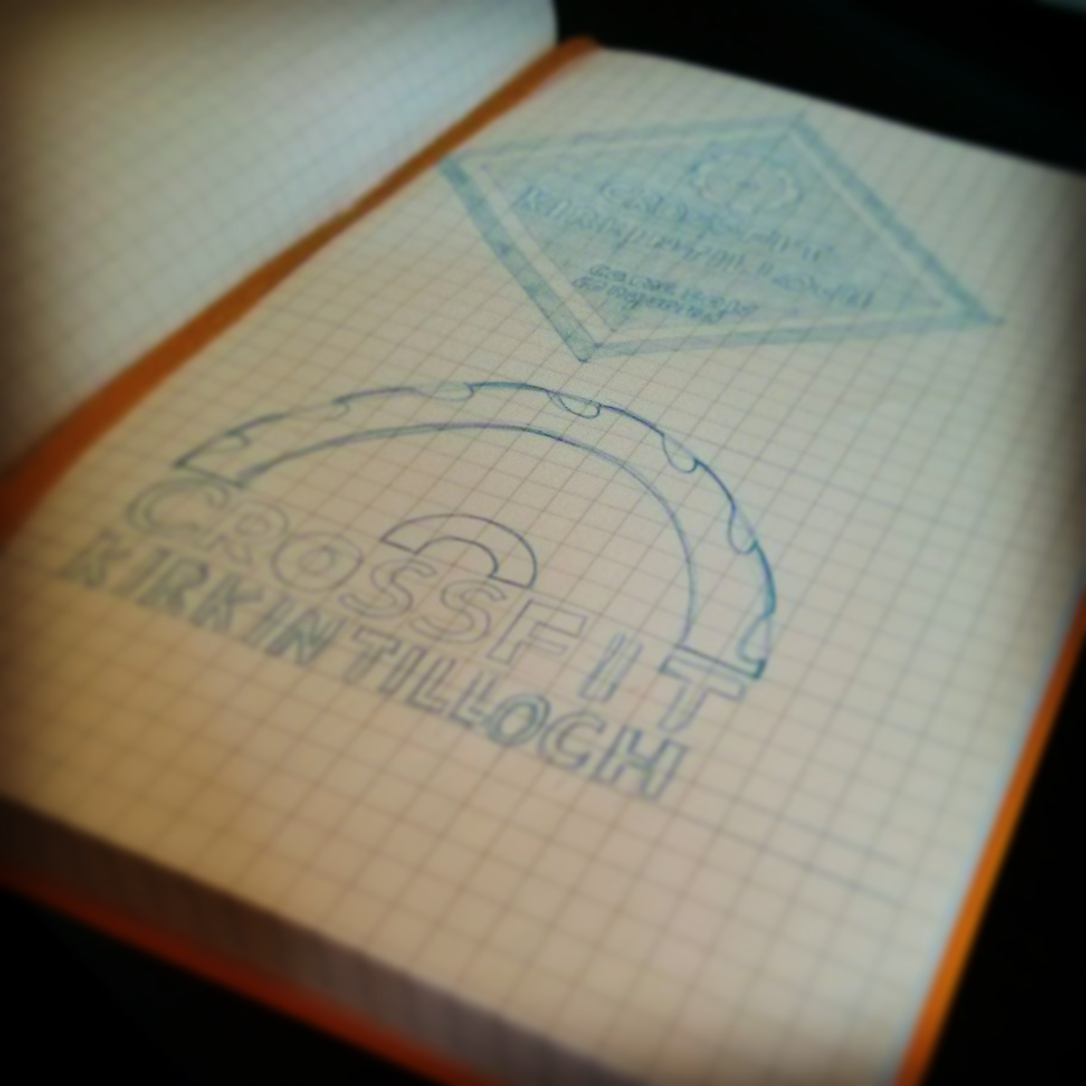
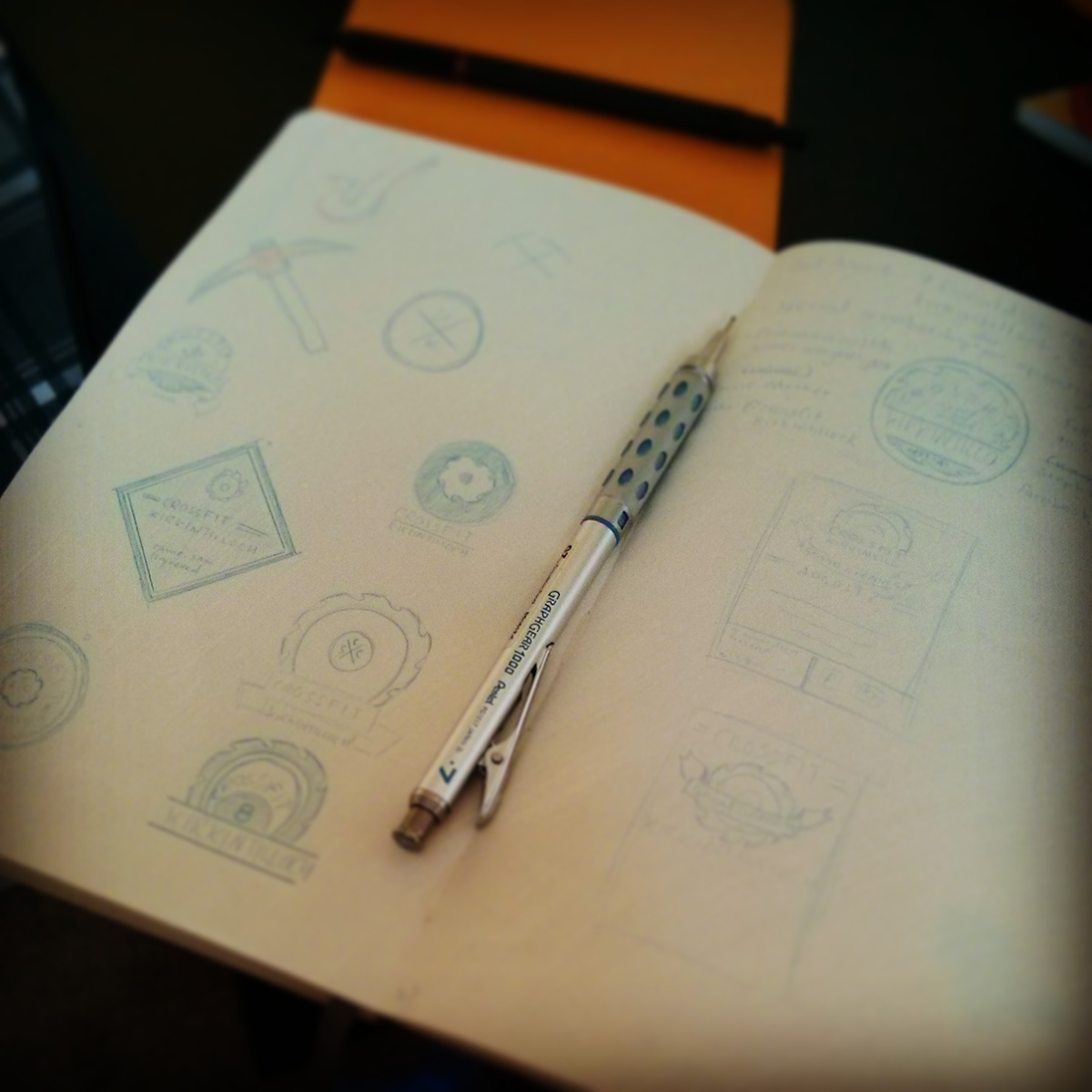
LOGO DRAFTS
For the final logo the grey was changed to white to make it more clear and apparent.

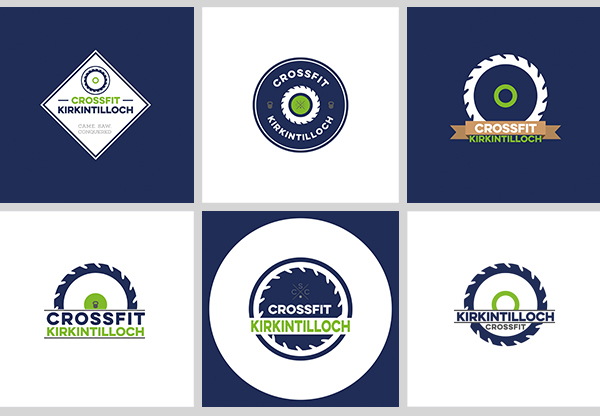
LOGO ALTERNATES
FINAL POSTER

POSTER ALTERNATES
Variations of the poster shown to the client for them to choose one. It was after a style was selected they asked to include free raffle tickets that could tear off the bottom of the poster.

TYPOGRAPHY

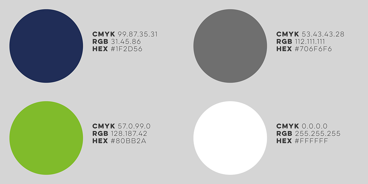
COLOUR PALETTE
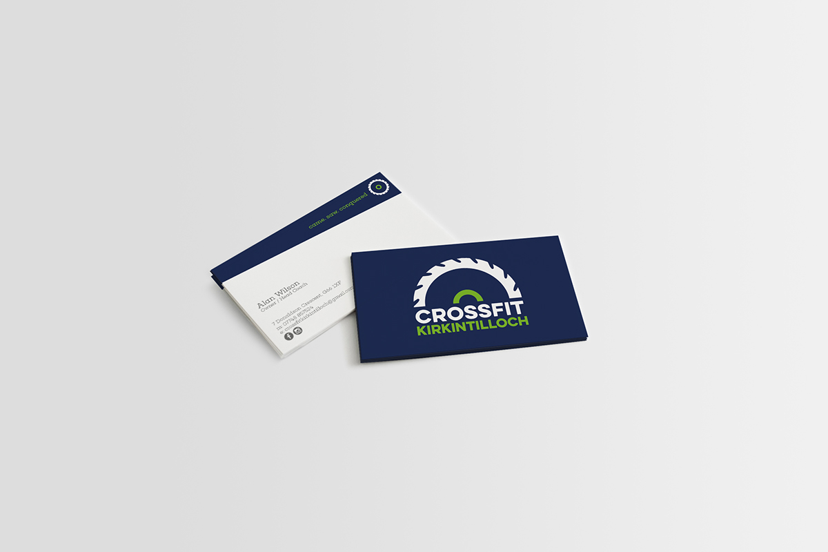
LOGO IN ACTION


SKETCHES & DRAFTS
BACKSTORY
The gym was initially going to be called SAW Crossfit to represent the names of brothers Scott & Alan Wilson. This is where the saw blade icon came from and the slogan "came. SAW. conquered." The name would later change to Crossfit Kirkintilloch but the icon and slogan would stay the same.


thanks for watching


