


Glory Owl
Art direction
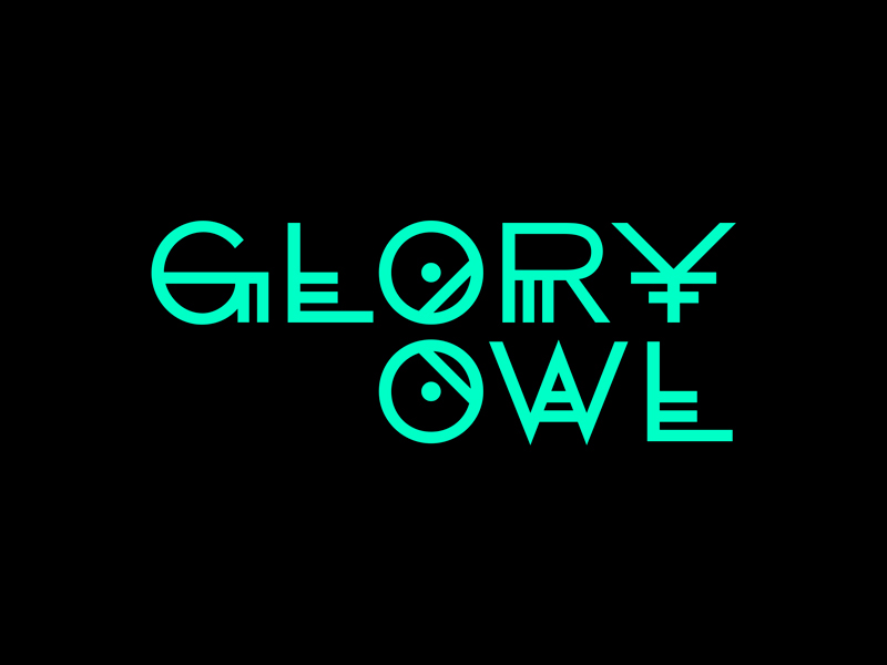
Logotype design
Graphic design
Illustration
Typography
Graphic design
Illustration
Typography
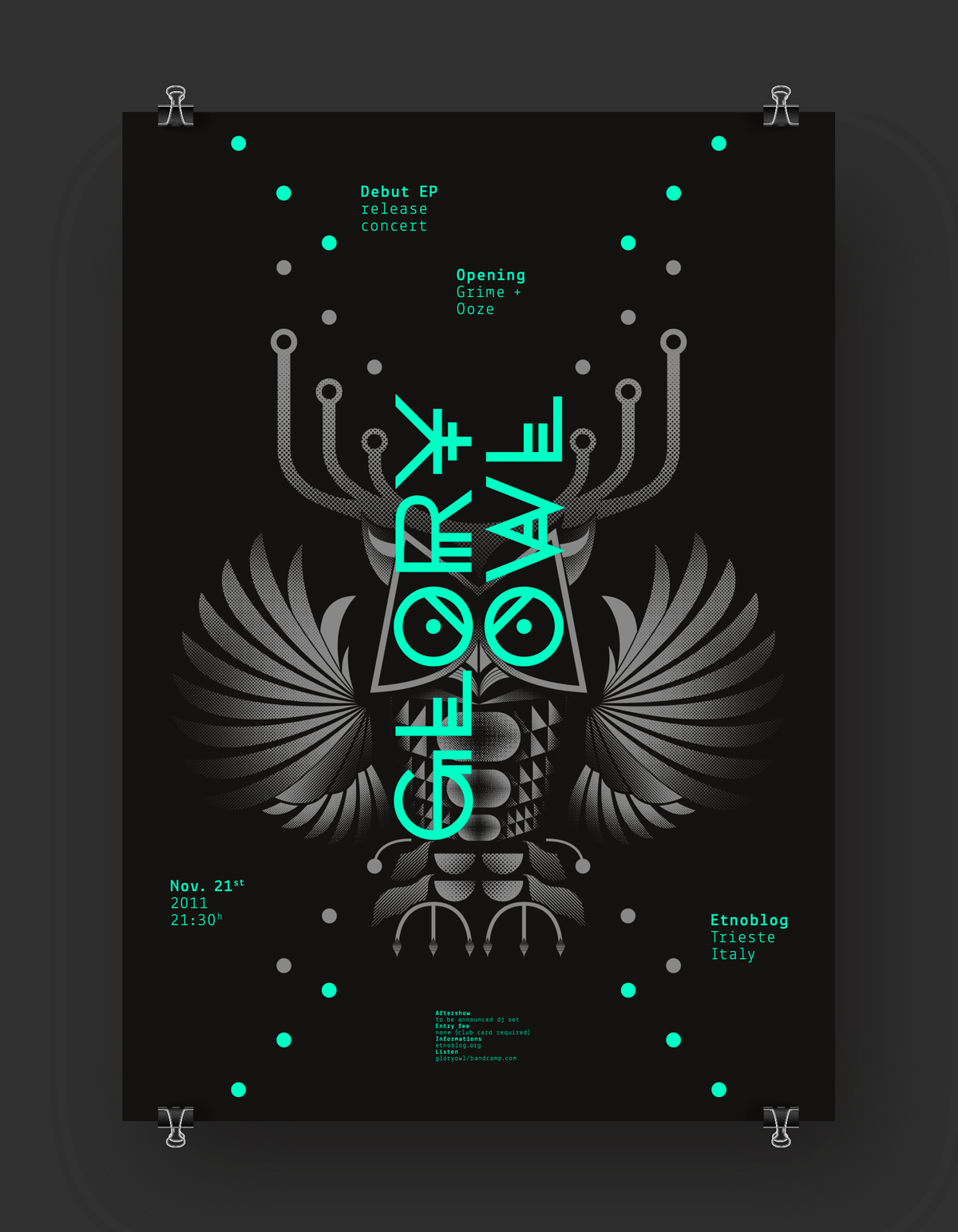
I designed the identity proposal for Glory Owl — a stoner/fuzz band from Trieste (Italy) — with the purpose to comunicate both feelings of sumptuousness and of darkness. Their ‘doom’ musical style is quite obscure and also the band visual style had to be — in my thoughts — quite mystic. An ostentatious illustration of an owl — designed vectorially but enriched with the bitmap filling technique to be printed in a dark-silver ink — is placed behind a green shiny (Pantone or fluo silkscreen varnish) custom designed metal-like typography. The band’s logo — carefully refined — is placed vertically over the illustration, building with the two ‘O’ letters featured in it the eyes of the owl, pretty characterizing of this nightbird. So an impressive murky picture melts with a lucent lettering, creating — in a game of gloom-meets-enchantment — a glorious sight.


Details
Zooming on the poster.


Credits:
Art direction → Aleš Brce
Graphic design → Aleš Brce
Illustration → Aleš Brce
Logotype design → Aleš Brce
Type design → Aleš Brce


