


Established in the year 2000 centered in west Cairo, Merath developments became a strong force to be reckoned with, having many projects come to life, thanks to them.
Being in the field for more than two decades, Merath has a rich history, not only in their field, but with their brand as well.
Logo timeline

Why did merath need the uplift?
Their goal was to look more professional and modern. The 2017 brand did not serve their new goals effectively anymore, thus a monotone hue with a touch of vibrant colour was the way to go. Keeping the Arabic name as is, and making it the hero in respect of the mother tongue of their country of origin which is based in Egypt. However, the descriptor was done in English to appeal to a wider target audience. In addition to having the brand mark in a simple and structured manner to evoke a more architectural and new look.
inspiration

Building blocks make a wall, to a building, to a home.
This inspired us to build the brand on squares as well, and with the respect of our Arabic heritage, no other typographic style fit our needs, than the Geometric Kufic Typography.
Thus reflecting on the strength and stability of Merath.

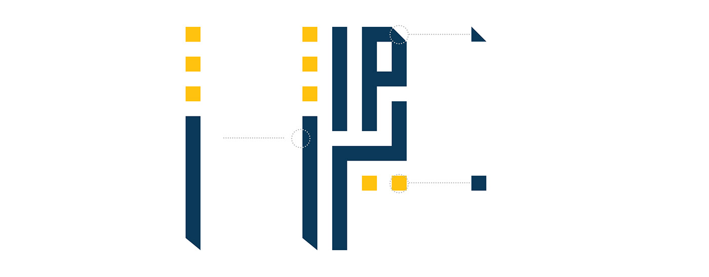
logo breakdown


logo orientations


brand mark

brand colours


brand typeface

brand elements - extraction
Brand elements accentuate the brand even with the absence of the logo. It makes things easier for the potential audience to recognise them from their active competitors.


Simulations


