NUTLAB l Visual Identity
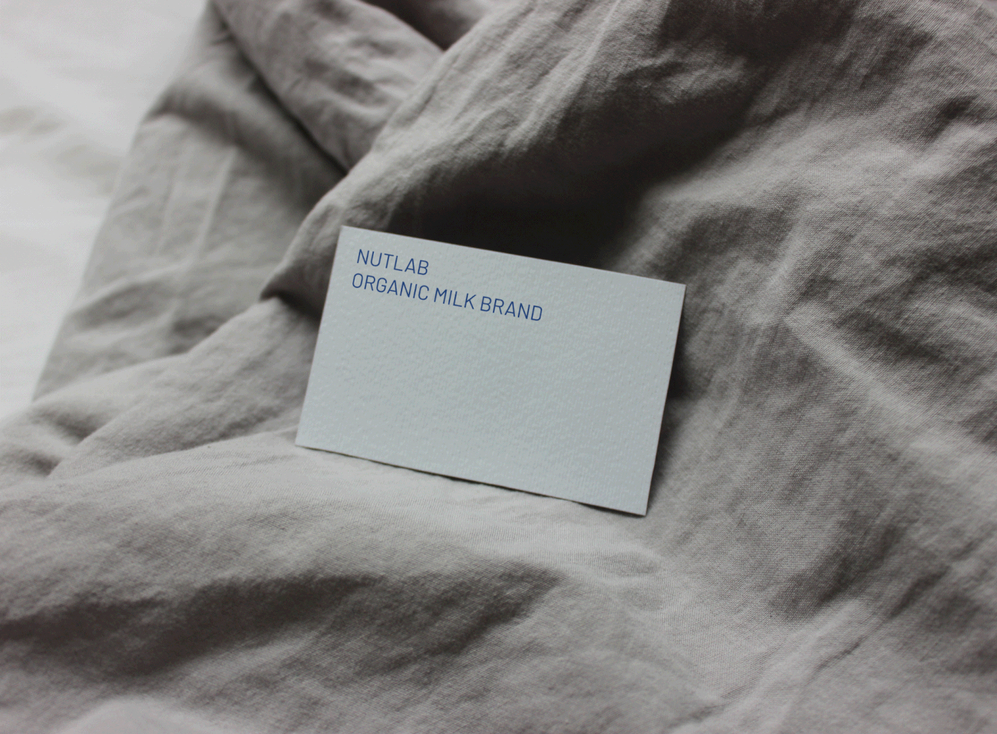
Organic Milk Brand
Young people today tend to have unscientific eating habits, gravitating towards consuming oily fast foods, leading to an increasing prevalence of obesity in Vietnam.
Understanding the challenges of the weight loss process, the difficulty of restraining from flavorful spices during dietary restrictions makes meals less enjoyable. To address this issue, we have established "Nutlab" with the aim of providing nutrition-rich milk products that support weight loss while still delivering delicious flavors for customers."
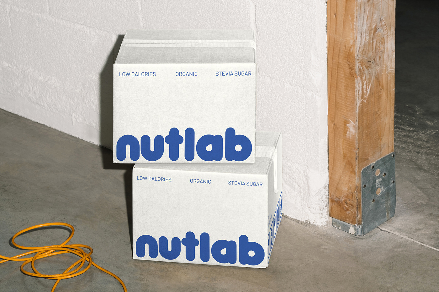
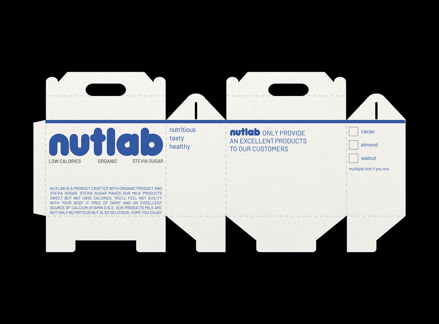
With a commitment to crafting milk from premium nuts like almonds, walnuts, hazelnuts, cocoa, etc., we pledge to exclusively use 100% nuts in our milk, without any additives or other milk blends. Nutlab strives to bring you the finest quality milk product, ensuring a pure and delightful experience.
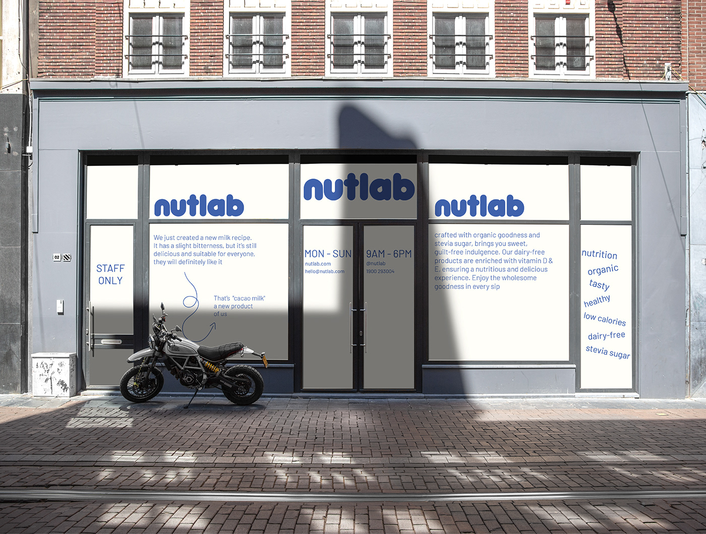
The logo is designed to be as simple as possible. The chosen font for the logo must be used in a friendly manner, with soft curves to avoid sharp edges. The focal point is the image of a milk droplet combined with the shape of an almond inside the letter "a"

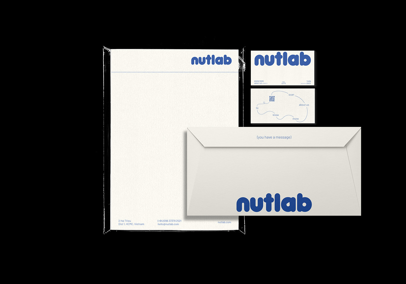
The concept based on Modern, a bit of Science and Friendly. Nutlab wants to express these characteristic through packaging, stationery, merchandise, and media.
We are confident that by incorporating Nutlab's characteristic, we can create a visual identity that effectively communicates the essence of the brand