

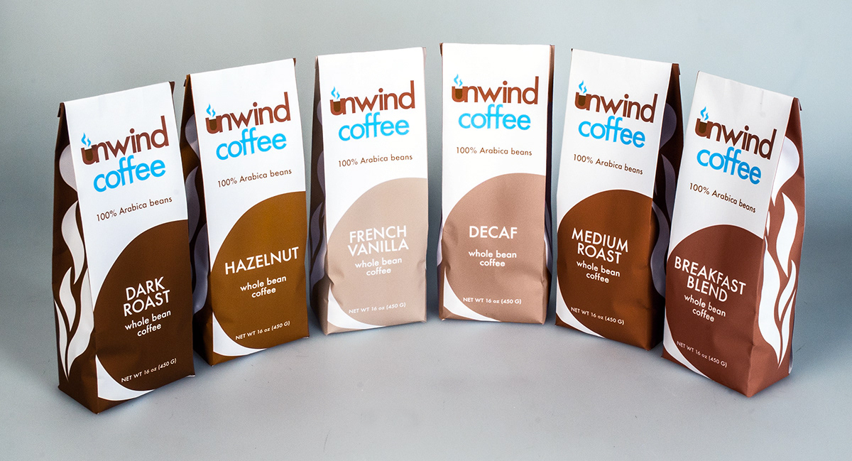
Unwind Coffee was my creation for one of my class' packaging projects. I had to create a coffee or tea brand and the packaging for their product. Unwind Coffee began as a very simple idea, have a coffee brand for everyone. The coffee was for those who drank coffee to relax and those who drank to get energized. Relaxation. Tranquility. Energizing.
The Unwind Coffee logo was created with the intention of looking modern but affordable. The "U" of the logo is "filled up" to mimic a cup of coffee and the lines of steam coming from it. The choice of using blue was brought on to make it unique as well as a color that works well visually with the brown.
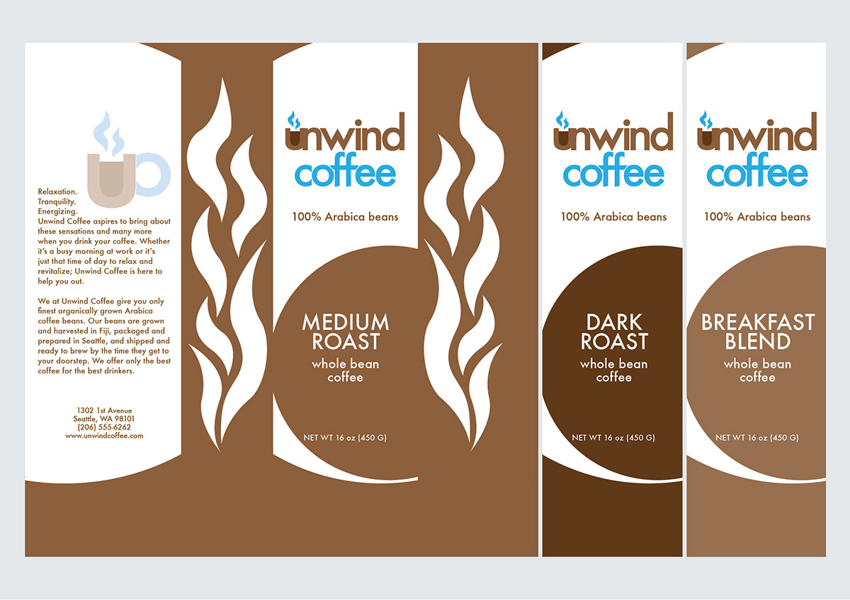
Six flavors were created for the Unwind Coffee packaging. Medium Roast and Dark Roast were the first two I thought about and made. I wanted something that would be very simple but visually engaging and interesting. The packaging began with the flat brown and white colors. to create more interest to the sides, I added the white steam shapes. I also created a symbol (found on the back with the product description) that could be used either alongside or as a substitute for full logo.
The idea was that each flavor would have a different color that would represent it. The Medium Roast was a brown that was neither dark nor light while the Dark Roast was a very dark and rich brown. Breakfast Blend would be lighter in color but still be dark enough to convey that this was a flavor that would be energizing.
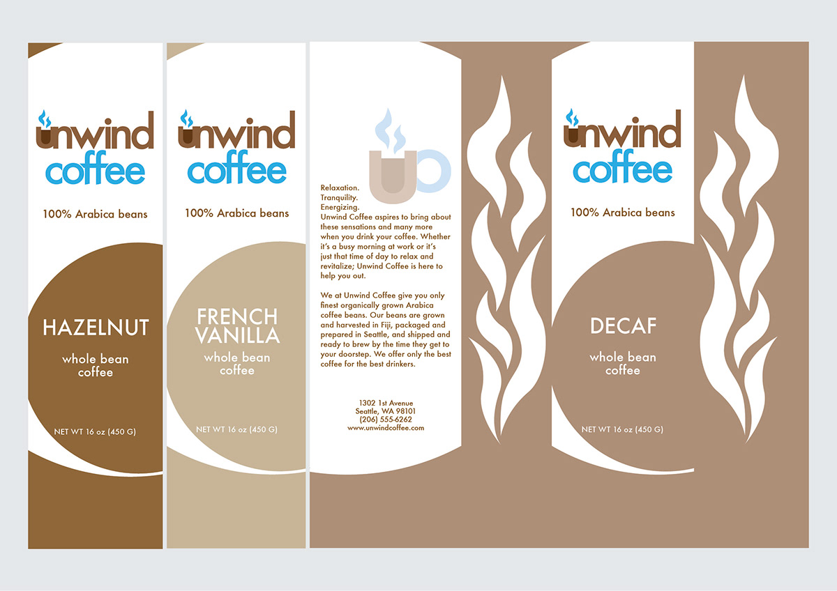
Special flavors like Hazelnut, French Vanilla, and Decaf would be distinctly different while still being similar enough in color to be brown or "brown-ish." Decaf would be significantly lighter, French Vanilla was a milky white color, and Hazelnut was more of a rich yellowish-brown.


