


Rebranding: Trust me, I'm a professional


3 locale companies
You were required to identify three local businesses in your area where you live and share your initial impressions of their logos, along with suggestions for improvement.

First Impression:
Different typography is employed, but the placement of the text underneath doesn't contribute to the logo's appeal. The colors appear dull and uninspiring.
First Idea for a New Design:
Given the global nature of the store, vibrant and cheerful colors could be incorporated. Consider utilizing expressive typography to enhance the overall design.
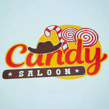
First Impression:
The logo appears very busy, with the yellow ball and hat competing for attention. Additional elements in the background seem out of place and contribute to a cluttered look.
First Idea for a New Design:
Simplify the logo by transforming it into a candy, creating a visually appealing and more focused design.

First Impression:
The branch in the logo diverts attention from the wordmark, making the letters under "bisonder" difficult to discern. The color yellow does not complement the purple/magenta hues.
First Idea for a New Design:
Simplify the design while adding a distinctive twist to reflect the uniqueness of the name "bisonder."
Choosen business/research

I went with the candy saloon business after talking with my teacher. The other 2 weren't the right fit for me. I wanted something that would challenge me.

I did some research on the business. They have different logo's when there is a event in the village. They employed a different typographical color during the Castle Festival in Wijchen. The decision to change the color was excellent, aligning with the festival's theme of PINK.


Here are some pictures on the inside of the shop. It's very colorful on the inside on these pictures. Right know they are renovating it again so the inside will be light pink this time.
Core values
We did a small assignment for this project.We needed to choose 2 Jung archetypes that fit the business.

Jester: Step into a candy store, and you're immediately enveloped in cheerfulness and vibrant colors, creating a joyful atmosphere. As a child, a visit to the candy store was a rewarding and delightful experience, associated with fun, celebration, and humor.
Magician: Getting candy is a rarity, turning it into a special and memorable occasion. A candy store holds unique treasures, offering surprises and unexpected delights that set it apart from other stores, akin to the magic of receiving something extraordinary.


I initially thought creating a saloon-style sign for the logo. However, after seeking feedback and receiving less-than-positive responses, I decided to explore other ideas. During the brainstorming process, I shifted towards sketching candywraps and conceptualized a logo using these confections. To enhance the design, I opted to stretch the font, but faced challenges finding an existing typeface. Ultimately, I took on the task of hand-drawing the font to achieve the desired effect.


I faced some difficulties in sketching the font that matched my vision, I spent considerable time on it without achieving the desired result. Recognizing the need for some help, I asked help from a friend skilled in typography and drawing.


I then made my letter digitally. I tidied it up a bit and then I had already spelled candy saloon.


After creating a candy-shaped design, I initially chose a font from Adobe Fonts, thinking it would't harm if I try it. However, upon further consideration, I found that it didn't meet my expectations. Ultimately, I decided to stick with the hand-drawn font I had created, as it was the best for my vision for the logo.


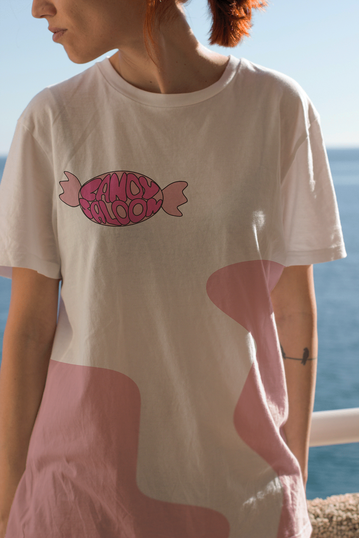
I put the hand drawn font in the candy shaped design and experimented with colors using the Adobe Color Wheel.

In the end, I opted for the pink-colored logo as it aesthetically complemented the interior of the store.
business card


We were tasked with creating three business cards, but I ended up making more due to my dissatisfaction with the final product. Designing the business card with the logo I created was quit hard.

I selected this design because the ruffles resembled the edges of a candy wrapper.
Car+shirt


I opted for consistency in design, using the same design as the business card for the car and shirt. Given the difficulty in creating a design for the business card.
Endwork


These are the final products for my branding project. The project didn't conclude as I expected. It taught me the importance of opting for simpler designs and not making the process unnecessarily harder for myself.


