
No-PSD Responsive Design Rapid Prototype for Power of Youth Micro-Site

I lead a team to design and develop a micro-site for the non-profit BAY-Peace. Initial goals were to showcase a motion graphic video with accompanying article in a modern, responsive, mobile-first way. Final, developed goals were to also include social sharing, a call to action to get involved, and give it an app-like feel through jQuery transitions.
Final micro-site at http://jpost-design.com/BAVC_microsite/
In the prototyping process, I pioneered a No-PSD method using the new Adobe Edge Reflow program to rapidly create responsive prototypes. Through this method, we quickly jumped into developing right in the browser, and skipped the time-consuming task of iterations on iterations of flat PSD mockups to simulate different screen sizes.
Follow the links in the following descriptions to interact with the responsive breakpoints.
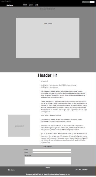
First Layout
First layout - Asymmetrical layout inspired by iPad magazine apps.
Interactive responsive example. Shrink and expand browser window to see responsive breakpoints and liquid layout to reflow.
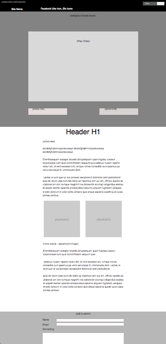
Second Layout
Second Layout - After feedback from the client, they desired something less avant-garde. So we followed a more standard design pattern with centered layout.
We also decided 2 main buttons for calls to action were required above the fold for the goals. Goals were 1) to draw visitors in to learning more about the movement, and 2) direct visitors to a contact form.

Final Site
Final Site - Responsive HTML5 page with semantic tags, jQuery transitions for an app-like feel, PHP contact form, responsive YouTube video, and Social Media sharing with addThis.
Once final assets were delivered, layout was changed on the fly for asymetrical photos of each author.
Final microsite was on BAY-Peace site but was taken offline. I have a hosted copy at http://jpost-design.com/BAVC_microsite/


