Anyone with a driving license sooner or later may have to deal with the Car Accident Statement Form.
This unique document serves as a ‘friendly’ statement between drivers and is used by insurance companies to quickly help resolve controversies regarding car accidents.
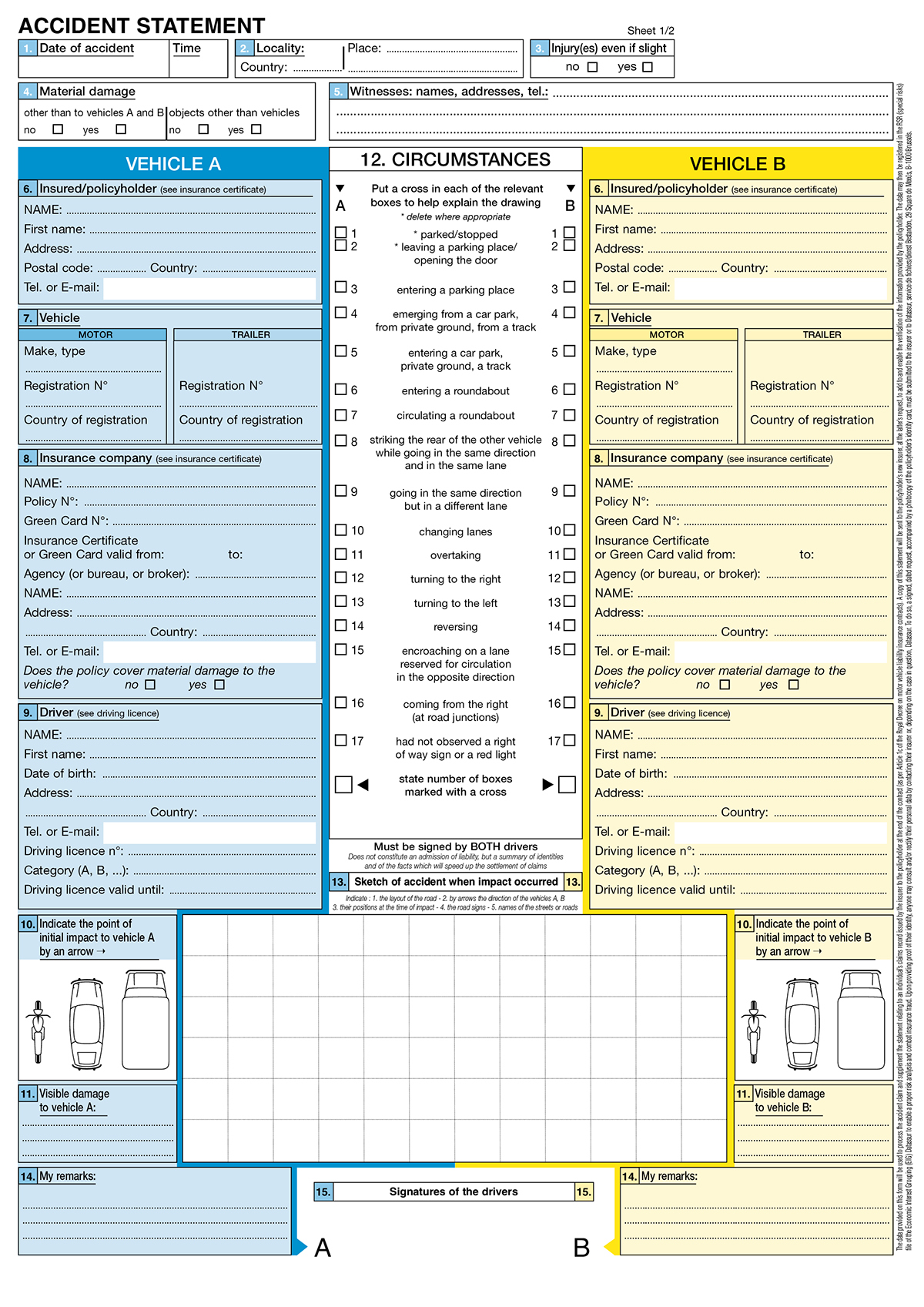
The form is essentially divided into three parts: one part for each driver to individually fill in with his personal details and the details regarding his vehicle (on the left and on the right), and one part in the centre that must be completed with the details regarding the accident, such as the time and specific location, the contact information of eventual witnesses, and the dynamics of the event. A portion of the form, that at the bottom center, is a blank space in which the users are meant to sketch the road layout and the position of the vehicles, to help in explaining the dynamics: this space pushes beyond the central section, overlapping the colored parts on the sides. Above the drawing space, there is a list of actions, and the driver responsible for a specific action is supposed to check the relative check box (and, at the end, calculate the number of boxes he has checked), to give a narrative explanation of the accident. Each copy of the form traces everything written on it onto a second form beneath it, so each driver can have his own copy to send to his respective insurance company.
The division in thirds and the horizontal parallelism of the requirements has a specific purpose: through this means each driver is easily able to keep an eye on the information being written by the other driver, in order to avoid fraud and to ensure a maximum clarity and transparency.
The main problem with this form is that the sequence of the filling-in actions required is not immediately clear, and this may cause a certain discomfort for a person using it for the first time, given as well the probably altered mental state which he or she may be experiencing after a car accident.
In the original form, the users must fill in the white parts, which refer to the accident and its circumstances; the system in its entirety is quite efficient, but the feeling has been that it needed a clearer distinction between the sections and a unified style of navigation. In fact, the form as it appears is somewhat confusing: the fields with the details about the time, place and witnesses, from points 1 to 5, are clustered at the top of the page (occupying its whole length), each one in its own frame and numbered with white numbers in blue boxes: the narrative jumps over to the blue and the yellow sections (one per driver), with the numbering being black on light blue in closed frames, and then again to the white part in the centre, where the numbering is yet again different (black on white for point 12, black on blue for points 13 and 14). The whole structure is overloaded with different styles and elements and shows an excess of linear elements.
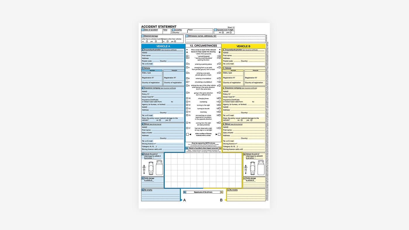
This is what the original form looks like:
The redesign is aimed, in the first place, at reducing the confusing disposition of the elements in the original form: I maintained the division in third, but the left and the right areas are now reserved exclusively for the driver’s personal info, with all the other information placed in the center.
The color coding (that could not be changed since blue-yellow is the only combination which is almost 100% distinguishable by people with color blindness) has been made more prominent: the blank area where the accident should be sketched is wider.


This division into thirds also gave me the idea of adding an extra function to the form.
I decided to design, on the back of the page, a step-by-step guide to the parts that each driver should fill in so that if one of them gets confused, he can fold the third over and just follow the instructions. Often at the time when the form has to be filled out, people can be psychologically upset, having just been in an accident, and the conditions of the environment are often extremely unfavourable (for instance it might be in the middle of a busy street, or somewhere in the dark, or when raining). Thus, any addition that can help diminish/to ease the stress of such a situation could potentially be of great help.
On the back of each page, there is a document called Declaration, which is meant to be filled in further on, in addition to the main page. I condensed the information required by this page in the center column, using the two side-thirds for the guide.


