LUCA Campus Sint-FORM REDESIGN / Lukas Brussels MA Application for International Students

LUCA Campus Sint-Lukas Brussels is an independent art school based in the city of Brussels in Belgium. The school’s official language is Dutch, but it offers several master programs in English, which are therefore open to international students. The application process, as outlined on the school’s website, consists in the required the completion of forms, which must be submitted both on paper and online, and the submission of a series of documents regarding the applicant, most of which must also be submitted both physically and online (some exclusively online). The current application process (as of 2013-2014) involves two main sets of forms: the ‘Master Student Application Form’, which asks the applicant for all of his basic information, and the ‘Application for Master studies Using a Bachelor Degree Awarded Outside the Flemish Community’, which asks again for the applicant’s basic information, and upon which the Assessment Committee will write their decision regarding the applicant. Along with these two forms, the applicant must also submit a series of Diploma Requirements comprising an official copy of the Bachelor Diploma, a list of all the course units, and a "full content description" of each course unit and a list of results, proof of English proficiency (Ielts or Toefl), a Curriculum Vitae, a motivation letter, a master’s project proposal, a portfolio, an example of a thesis (for example a Bachelor Degree thesis) and a copy of a document of personal identification. The requirements for the application immediately appear quite confusing and redundant. One of the main problems, for example, consists in the fact that the applicants are asked to submit the files ‘in paper-form as well as digitally’, but it is not clear, for example, if the portfolio and the thesis exemplary must be both printed and sent by email, a significant difference since often they consist in many pages.

Current application requirements
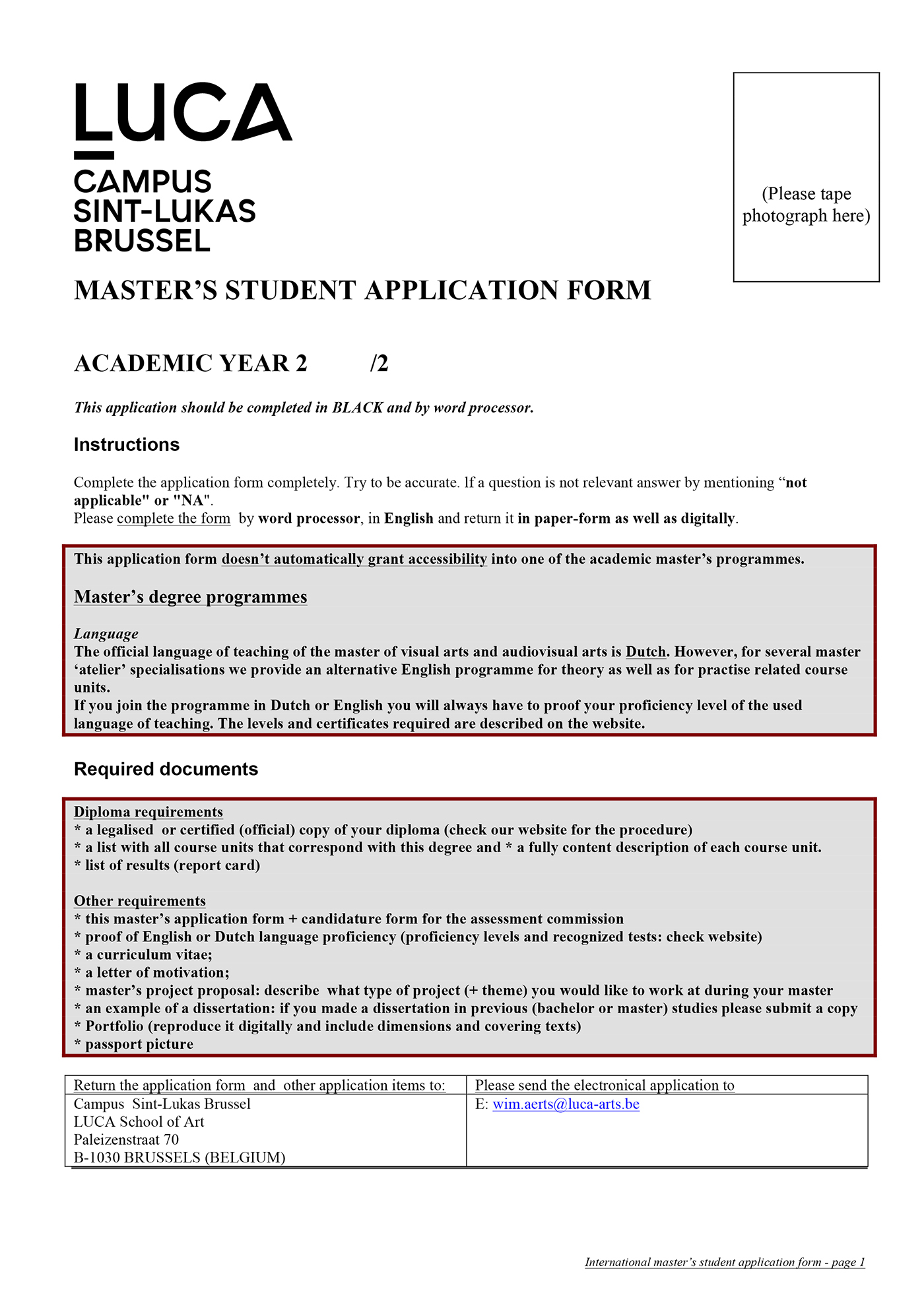
Original form: page 1

Original form: page 2
FORM REDESIGN
The redesign is completely based on hierarchies and navigation, both of which were lacking in the original forms, which utilize an excessively wide range of different weights and sizes of text (i.e., bold, italic and regular, without clear criteria), are overloaded with lines and boxes and do not clearly communicate the immediate priorities.
The new form I am proposing uses a specific number of font weights and sizes for a clear determination of the hierarchical structure. The sections are divided by using spacing and horizontal lines, as well as with different stroke-weights: spacing also divides the body of the document from the navigation guide on the left, in which a colored number system indicates the numbers of the section and the sub-section.
The pages are numbered with a dotted system similar to those used on websites, which allows the user to continuously keep track of the order of the pages and of their total number, and of his/her progress in the application procedure. The first page of the old form required the user to tape his picture (but not to write his name!), and was mainly concerned to list the documents required for the application: this information is of course useful, but a link to the school’s website with an online list could be just as effective, and save space. One of the course director’s* complaints was also that the way the forms are now designed does not allow the school officials and professors to skim through them and immediately see the applicant’s name and the master’s course he is applying for. The first page of the new form therefore asks for this information immediately, followed by the applicant’s contacts.

Form redesign: page 1

Form redesign: page 2
USABILITY TEST: FILLING OUT
To compare the old and the new forms' usability, I carried out a series of tests on what I considered to be the average users of this specific kind of form (students of ages between 22 and 26 years old).
I asked them to first fill in the old form set and, one week later, the new one (so that they would not have the advantage of being asked the same information in a short span of time) and to time their actions. I then analyzed the answers to spot possible mistakes, in order to locate the weaknesses of each page.


USABILITY TEST: EYE TRACKING
For my second group of tests, I decided to map the forms' usability on a different level: I therefore carried out an eye tracking test on two users, by utilizing a Tobii eye tracking device.
This kind of test allows to trace the user's reading pattern, throughout the so called gazing plots, and the main focus points of a layout, through visual heat maps.
By doing so, I obtained clear maps of how a user's eye moves though a document, how many times the eye jumps from a point to another, and what catches the attention the most.


Gaze plot maps


Heat maps


