UX Case Study
How content increased app downloads
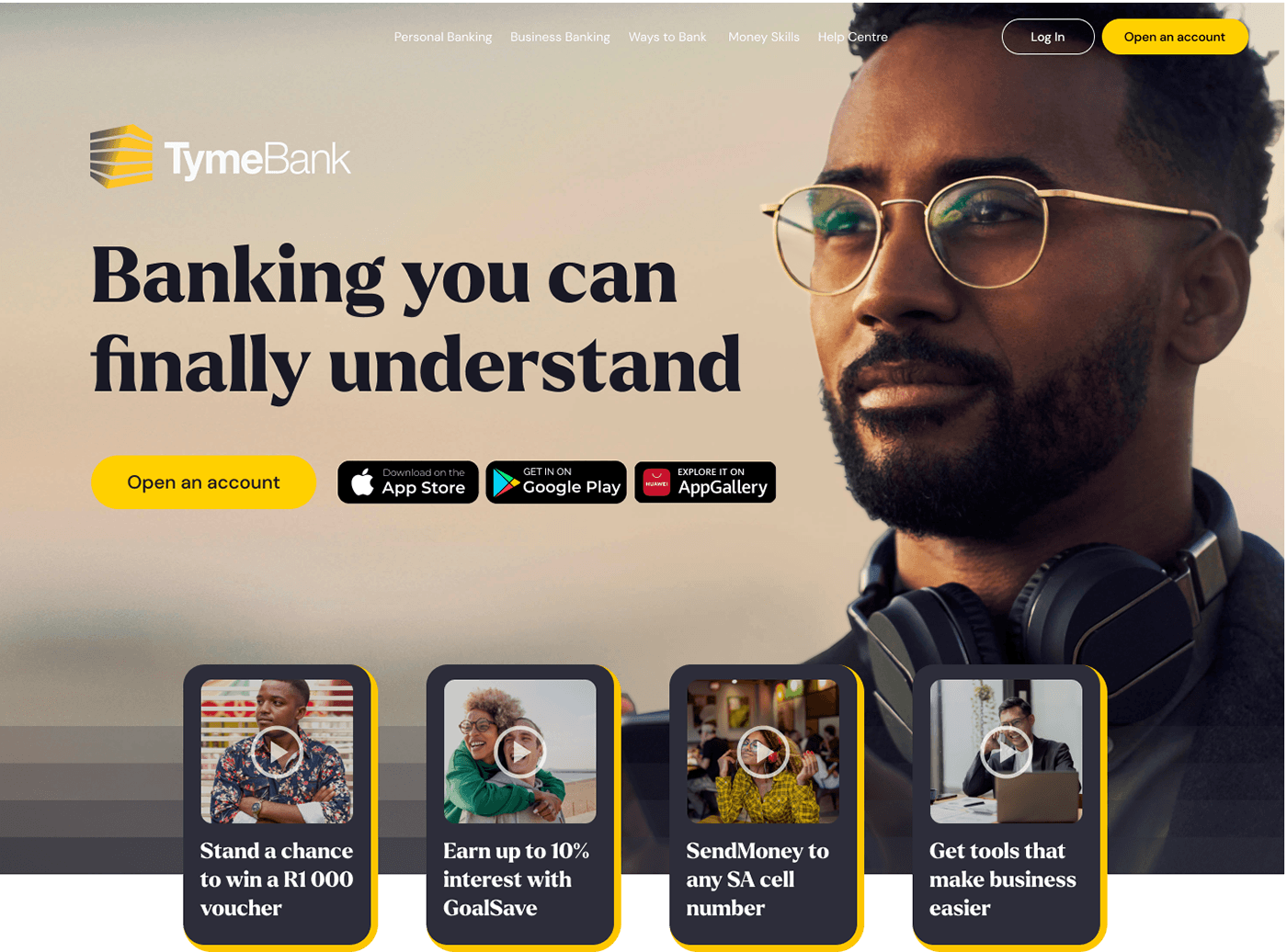
On the TymeBank website - the primary CTA is "Open an account".
This is what the desktop landing page looks like:
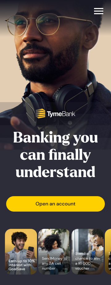
This is what the mobile landing page looks like:
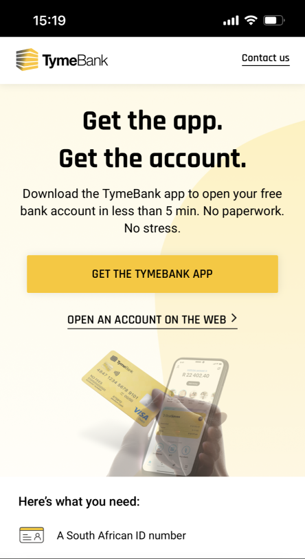
Previously, once the customer clicked or tapped on the CTA, they would be taken to the following webpage:

The corresponding mobile version:
User testing showed that when customers were arriving on this webpage, they didn't see a distinction between the benefit of opening an account on the app VS opening an account on the web.
However, TymeBank's business model has always been an app-first experience. The app delivers a much richer and more comprehensive experience for customers, in comparison to the limited functionalities available on the web version.
The task: How do we convince customers to prioritise downloading the app, and if they do happen to open an account on the web, how do we clearly inform them that the functionalities are limited on the web version?
The solution: Use new copy which gives simple directions, and informs the user in clear terms what they can expect if they were to open an account on the app (access to all functionalities) VS opening an account on the web (limited functionalities).
The result: The new content helped increase app downloads by 150% over the same time span as recorded previously. Customers commented how the clarity and information hierarchy dispelled any confusion.
Here is the new layout:


