


Cape
Woodworking machinery
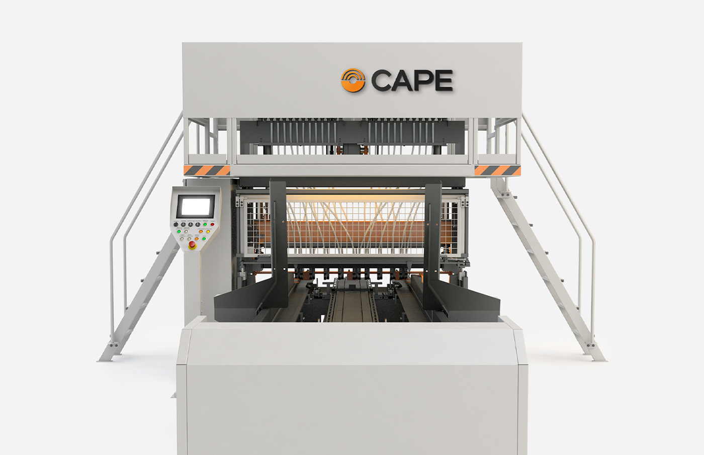
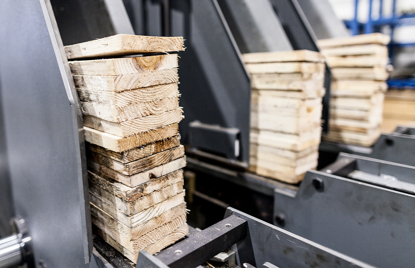
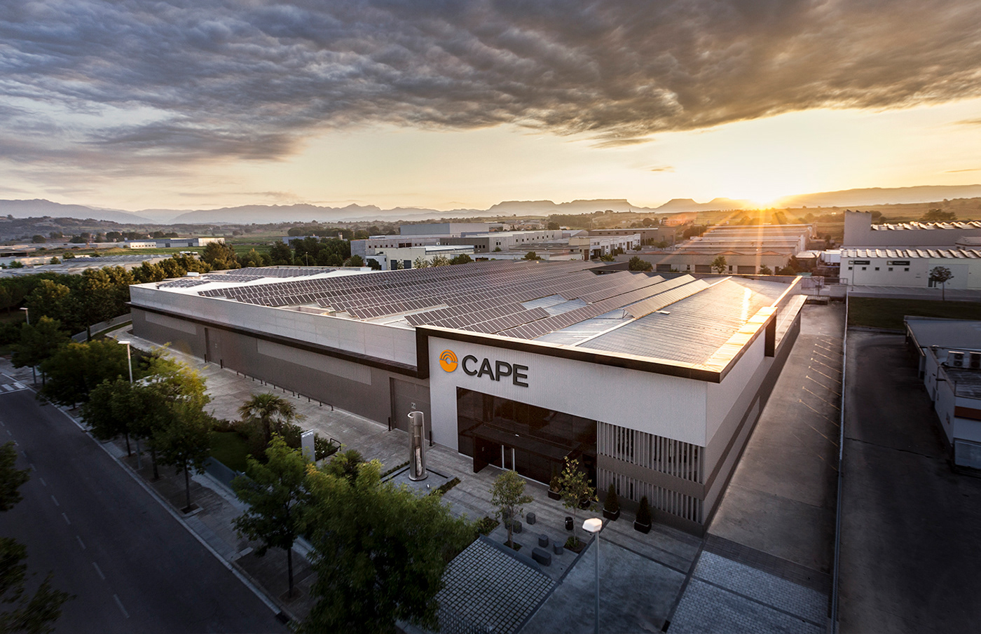
Cape is a pioneering company in the development and manufacture of technology for producing pallets, cable drums and stackers. It is a leader in the sector in Spain and is one of the top manufacturers in the world. Known worldwide in its field, it needed a new corporate image that conveyed safety and innovation, but above all, cutting-edge technology.
Before Suki vs With Suki:

The major change that we propose at Suki involves an external modernisation (of image) of the brand, but also an internal modification with a simplification of its products. Hence, the colours are homogenised and the machines are cleaned of unnecessary elements to achieve a coherent and harmonious image.
The major change that we propose at Suki involves an external modernisation (of image) of the brand, but also an internal modification with a simplification of its products. Hence, the colours are homogenised and the machines are cleaned of unnecessary elements to achieve a coherent and harmonious image.
So we redesigned the brand, simplifying the symbol as much as possible, turning it into a perfect circle and maintaining its essence, but with a more modern and technological feel. We also modified the original typography (more typical of 80's technologies) and replaced it with a more rounded and timeless one.
So we redesigned the brand, simplifying the symbol as much as possible, turning it into a perfect circle and maintaining its essence, but with a more modern and technological feel. We also modified the original typography (more typical of 80's technologies) and replaced it with a more rounded and timeless one.


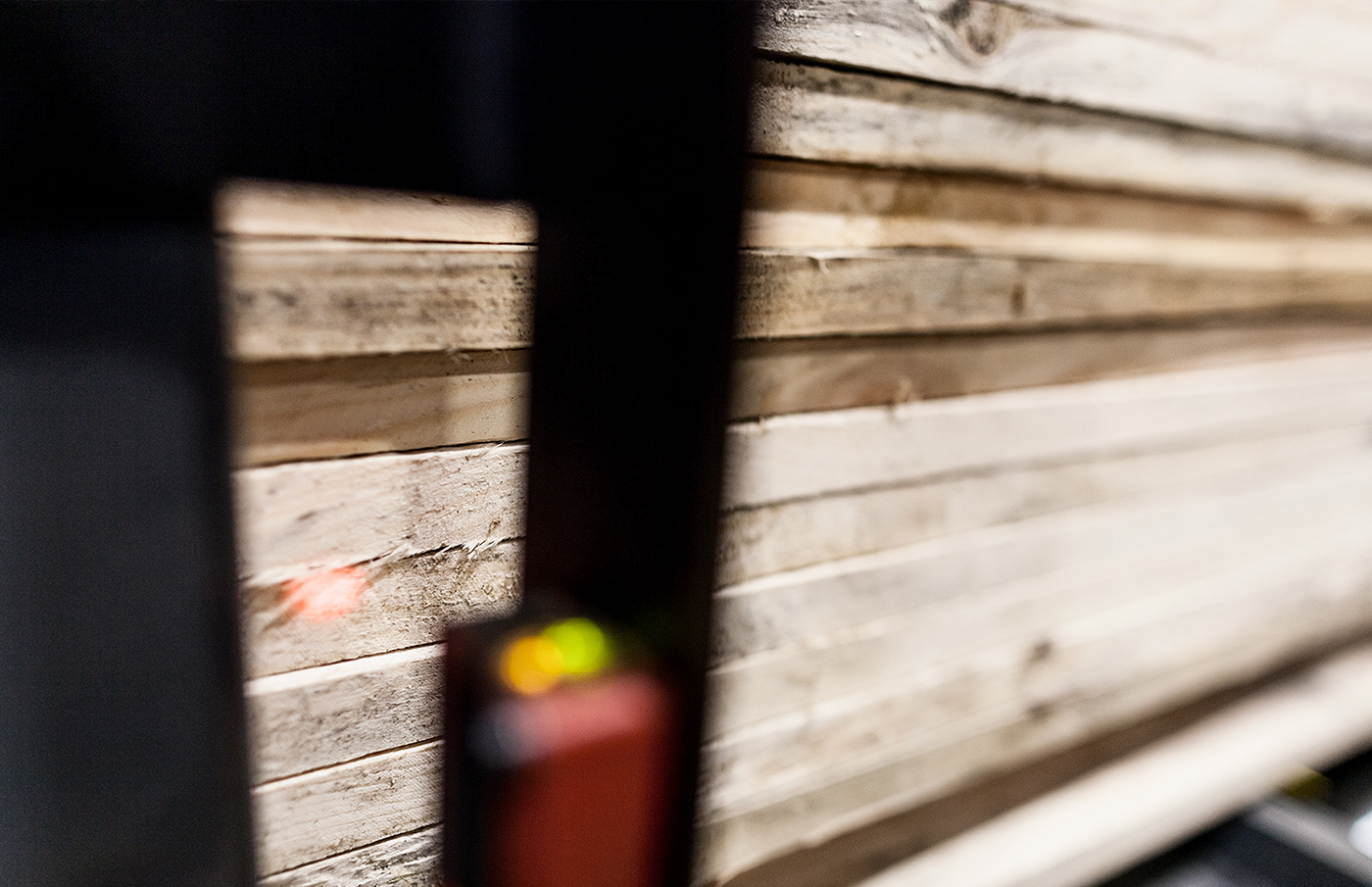

The use of the machinery with working gloves implied the creation of an interface with large buttons and with a clear and understandable iconographic system as fast as possible. Colour coding was also an important component to take into account.
Buttons in inactive state & Navigation buttons:


Alarm & Accept buttons:


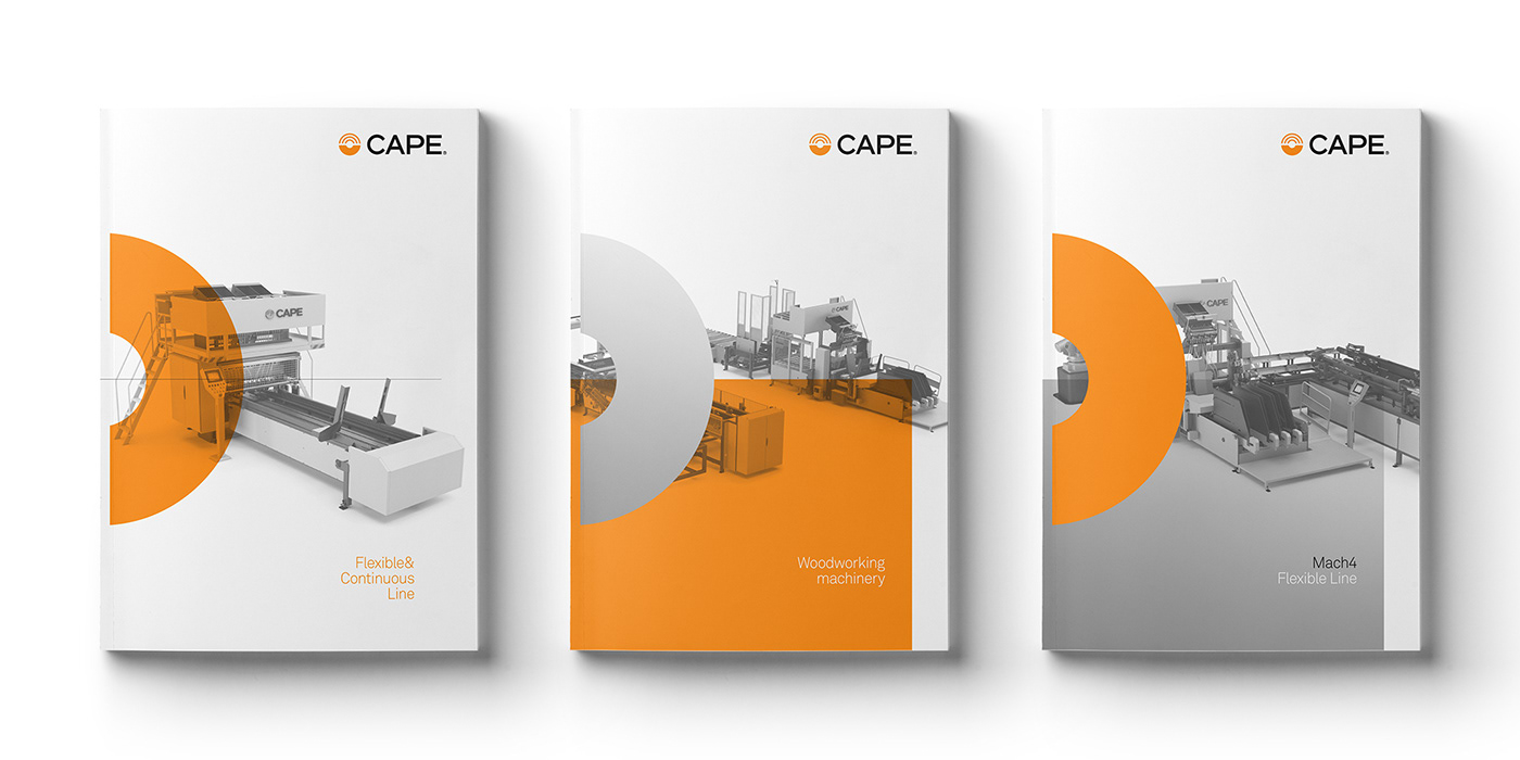
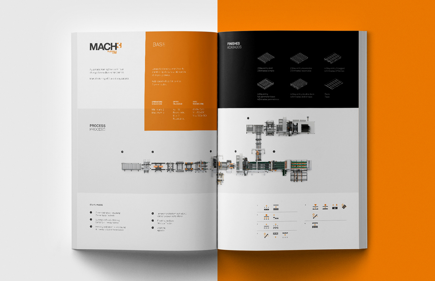
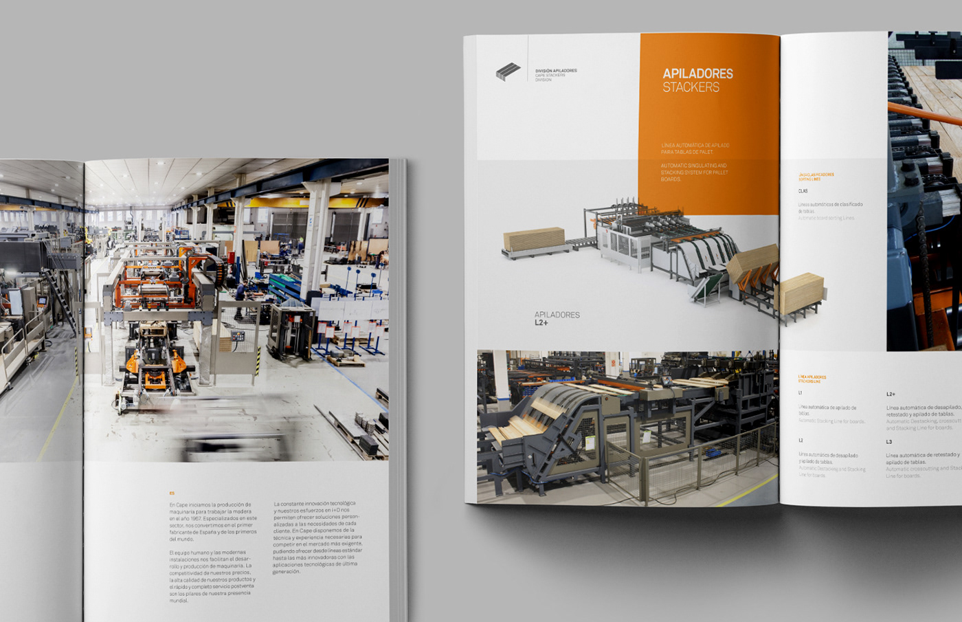
Cape's catalogues are unified in a single graphic line, to give continuity and coherence between its main production lines, for which we have also created a sub-brand: Mach and Tandem.


Tandem & Mach Line logotypes:


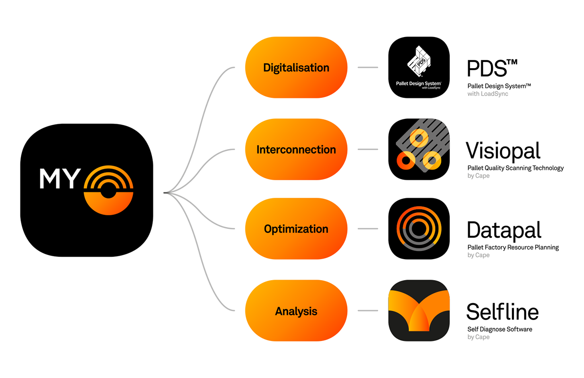
In the digital age, Cape is moving from mass production to mass customisation, and they are forced to be flexible, agile and able to manufacture any pallet model in the shortest possible time, while be
This need gave rise to MyCape, a new 4.0 platform focused on four key concepts: digitalisation, interconnection, optimisation and analysis. Following the same graphic line, we created the image of this new platform and three of its four softwares: Visiopal, Datapal and Selfline.
Industry 4.0 video graphic & Corporate video graphic:


The wide variety of production lines and configurations become the centrepiece of the web project, where we divide the product pages into three main blocks: general characteristics of the line, videos for each of the configurations and breakdown of the line by process and machine.


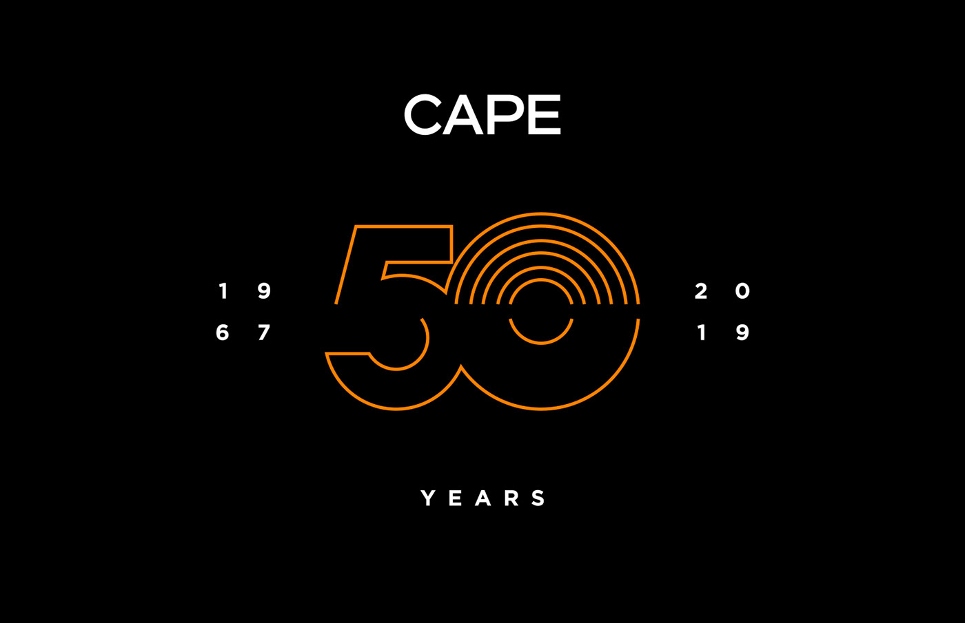
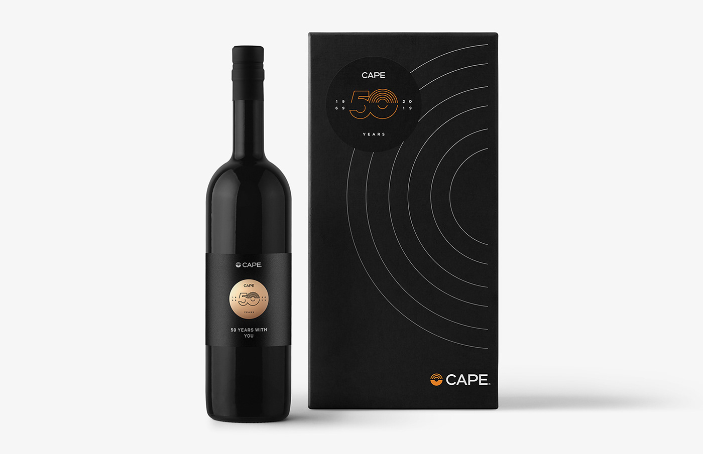
To mark the 50th anniversary, we designed the 50th anniversary seal, which will accompany the brand throughout 2019, and a series of promotional pieces. A coherent design that respects the brand, based on the Cape symbol itself.


Credits
Photography: Ivan Raga
Rendering and 3D: Daniel Palau
Video: Ocre Visual Studio
Rendering and 3D: Daniel Palau
Video: Ocre Visual Studio


