


About
PT The Creams é uma marca brasileira de cosméticos para skincare corporal. Seus produtos tem como principais dores tratar celulites, estrias, foliculites, flacidez, manchas no corpo, entre outras. A marca acredita na beleza em todas as suas formas e tem como missão de celebrar a autenticidade de cada indivíduo. Cada produto é desenvolvido com o intuito de realçar a beleza natural, proporcionando bem-estar e confiança a cada aplicação.
Sendo assim, a marca foi motivada a passar por um processo de rebranding, abraçando a criação de um conceito mais abrangente e que transmitisse sua missão de forma perceptível na comunicação. Enquanto o crescimento iminente se aproximava, buscamos resolver tais motivações em prol de um novo posicionamento:
— A falta de foco na brasilidade da marca, enfatizando os elementos naturais das composições dos produtos;
— A identidade e o nome não condiziam com a essência de realçar a beleza natural;
— Mantínhamos embalagens de fácil reprodução, facilitando a falsificação da marca;
— Possuir uma identidade mais marcante ao entrar no mercado brasileiro, com mais personalidade.
EN The Creams is a Brazilian brand of body skincare cosmetics. Its products aim to address cellulite, stretch marks, folliculitis, sagging skin, body blemishes, among others. The brand believes in beauty in all its forms and nuances and its mission is to celebrate the diversity and authenticity of each individual. Each product is developed with the intention of enhancing natural beauty, providing well-being and confidence with every application.
Therefore, the brand was motivated to undergo a rebranding process, embracing the creation of a more comprehensive concept that would effectively convey its mission in communication. As imminent growth approached, we sought to address these motivations for the sake of a new positioning:
— The lack of focus on the Brazilian essence of the brand, emphasizing the natural elements of product compositions;
— The identity and name did not align with the core essence to enhancing the natural beauty;
— We maintained packaging that was easily replicated, facilitating brand counterfeiting;
— To have a more distinctive identity upon entering the Brazilian market, with more personality.
— The identity and name did not align with the core essence to enhancing the natural beauty;
— We maintained packaging that was easily replicated, facilitating brand counterfeiting;
— To have a more distinctive identity upon entering the Brazilian market, with more personality.
Creative Director: Ana Dias
Art Directors: Ana Dias, Brunna Zenatelli, Daniel Lopes, Larissa Poncio, Laura Fideles
Package Design: Larissa Poncio & Leonardo Xavier
3D Motion, Assembly & Editing: Daniel Lopes
3D Modeling Product: Daniel Lopes
Compositing & Color Grading: Larissa Poncio
3D Design & Rendering: Daniel Lopes & Larissa Poncio
3D Modeling Product: Daniel Lopes
Compositing & Color Grading: Larissa Poncio
3D Design & Rendering: Daniel Lopes & Larissa Poncio
Illustrations: Mariana Wu
Photography: Bob Wolfenson Studio
Our Work
— Estratégia, Naming e Identidade Visual / Naming, Strategy and Visual Identity
— Design de produto e de embalagem / Package and product design
— Ilustração / Illustration
— 3D
— Brand guideline
Concept process
PT Realizamos o primeiro processo: o de naming, com a participação de toda a equipe e a escolha foi guiada principalmente pela ênfase na brasilidade e na beleza natural. Assim, o nome escolhido foi BELEZA BRASILEIRA, que destaca a identidade 100% brasileira e a dedicação em representar a beleza singular do Brasil.
EN We carried out the first process: naming, with the participation of the entire team, and the choice was guided mainly by the emphasis on Brazilian identity and natural beauty. Thus, the chosen name was "BELEZA BRASILEIRA," which highlights the 100% Brazilian identity and dedication to representing the unique beauty of Brazil.

PT Logo em seguida, o grupo de desenvolvimento do projeto foi subdividido em equipes responsáveis por criar propostas de embalagem. No final, optamos por algo simples, porém carregado de significado intrínseco. A forma circular na base do pote e o desenho da tampa foram pensados de maneira similar as formas a letra "B", estabelecendo assim uma correlação visual direta entre o nome da marca e o design da embalagem.
EN Right after that, the project development team was divided into groups responsible for creating packaging proposals. In the end, we opted for something simple yet rich in intrinsic meaning. The circular shape at the base of the container and the design of the lid were conceived in a way similar to the letter "B", establishing a direct visual correlation between the brand name and the packaging design.

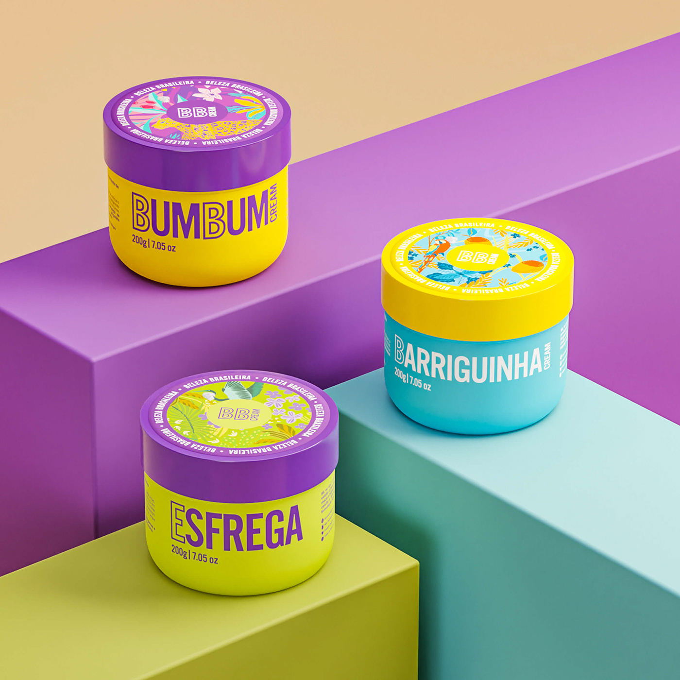
PT Os rótulos foram projetados com uma abordagem mais limpa e minimalista, diferenciados por suas cores características. Decidimos concentrar as informações obrigatórias na parte traseira, proporcionando destaque frontal apenas para os nomes dos produtos. Essa mesma lógica foi aplicada aos cartuchos, onde priorizamos a distribuição das informações pelas outras faces da embalagem, deixando a frente mais limpa, e reduzindo o conteúdo anterior, dando destaque aos ingredientes ativos e disclaimers na diagramação. Um detalhe notável é a ampliação do nome do produto, ocupando o maior espaço na caixa. Essa estratégia foi concebida para compor as prateleiras.
EN The labels were designed with a cleaner and more minimalist approach, differentiated by their characteristic colors. We decided to concentrate mandatory information on the back, giving front prominence only to the product names. The same logic was applied to the cartons, where we prioritized the distribution of information on other sides of the packaging, keeping the front clean and reducing the previous content, highlighting active ingredients and disclaimers in the layout. A notable detail is the enlargement of the product name, occupying the most space on the box. This strategy was devised to enhance shelf presence.


PT Para as ilustrações, buscamos incorporar o conceito da brasilidade, utilizando cores e elementos inspirados na rica fauna e flora do nosso país. Adotando um estilo flat, as cores desempenharam um papel vital ao dar vida e realçar a beleza abundante do Brasil.
EN For the illustrations, we sought to incorporate the concept of 'Brazilian-ness,' using colors and elements inspired by the rich fauna and flora of our country. Embracing a flat style, the colors played a vital role in bringing to life and enhancing the abundant beauty of Brazil.


PT Já havíamos consagrado as cores roxo e amarelo para o Bumbum Cream e, com o objetivo de mantê-las, incorporamos à sua paleta final o verde turquesa e o rosa. Optamos pela onça como o animal representativo do produto, não apenas por sua pelagem amarelada característica, mas também pela sua grandiosidade na fauna. Além disso, para compor a ilustração, utilizamos os ativos do produto, como Arnica, Pimenta e Café.
EN We had already established the colors purple and yellow for the Bumbum Cream, and in order to retain them, we incorporated turquoise green and pink into its final palette. We opted for the jaguar as the representative animal for the product, not only for its characteristic yellowish fur but also for its grandeur in the wildlife. Additionally, to compose the illustration, we used the product's active ingredients such as Arnica, Pepper, and Coffee.


PT Assim como o Bumbum Cream, o Esfrega manteve suas cores características, o lilás e o verde, e acrescentou variações dessas tonalidades, além do amarelo, à sua paleta. A garça, uma ave emblemática do Brasil, especialmente na região Amazônica, foi escolhida como símbolo representativo do produto. Na composição da ilustração, destacam-se os componentes ativos do produto, como a alga fucus e a flor de arroz, acompanhados por folhagens exuberantes, e toques de flores lilás para adicionar nuances de cor.
EN Similar to the Bumbum Cream, the Esfrega maintained its characteristic colors, lilac and green, and added variations of these tones, along with yellow, to its palette. The heron, a symbolic bird of Brazil, especially in the Amazon region, was chosen as the representative symbol of the product. In the composition of the illustration, the active components of the product stand out, such as fucus algae and rice flower, accompanied by lush foliage, and touches of lilac flowers to add color nuances.


PT O Barriguinha Cream já era conhecido por suas cores azul e amarelo, as quais foram mantidas e complementadas por variações dessas tonalidades, além da adição de laranja. Como símbolo representativo, optou-se pela Arara, outra ave da fauna brasileira reconhecida por suas penas nas cores azul e amarela. Para a composição da ilustração, destacou-se a manga, um dos principais componentes do produto, juntamente com a menta e o capim-limão.
EN The Barriguinha Cream was already known for its blue and yellow colors, which were maintained and complemented with variations of these hues, alongside the addition of orange. As a representative symbol, the decision was made to choose the Macaw, another bird from the Brazilian fauna known for its blue and yellow feathers. In the illustration's composition, emphasis was placed on the mango, one of the main components of the product, along with mint and lemongrass.


