


The Bread and Butter of Business being longitudinal health data, it was only a matter of time until we considered partnering up with 3rd parties to integrate health devices in our apps (e.g. Fitbit, Garmin).
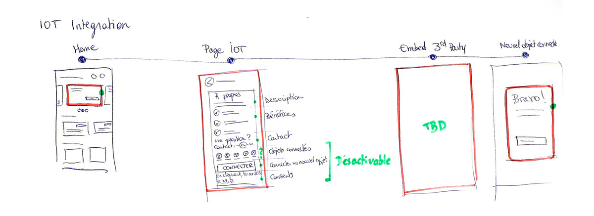
I decided to pull an old time favorite to align on the journey at a high level with the Product and the Tech Team : the hand-drawn flow. I love doing so since it's a quick way to optimize it and prioritize the must haves (green dots) vs. what's would go into later versions. This way, the Product, Tech and Design Teams can progress in parallel with the same understanding of the short, mid and long term goals, which results in optimizing the Time to Market of a functionality.

After benchmarking the different Health Devices providers, the Product Team decided to use Thryve. Above is the flow they offered, starting with a consent page, followed by the list of Health Devices to chose from, ending with the chosen Health Device sign in screen.
Now, we had to embed them in our app. Per usual with 3rd parties, we couldn't tweak much besides some UI components.
It is important to note that the economical issues intensified at Wefight by the time this project was in Discovery, and the only chance for it to pass into Delivery is if it was a quick to implement project. Therefore, everything had to be optimized.
For the 2 first steps of the journey, I decided to use the same base as the VIP Program one, since it came right before the IOT project in the Delivery roadmap.
I then thought it would be easier to redirect the 2 CTAs "Manage my connected devices" and "Connect a device" to the same page "[Un]select a Health Device" passed the consent page. If we had more time in the future, we could easily set implementation rules on this page depending on which CTA it came from (push first or last the devices to connect).

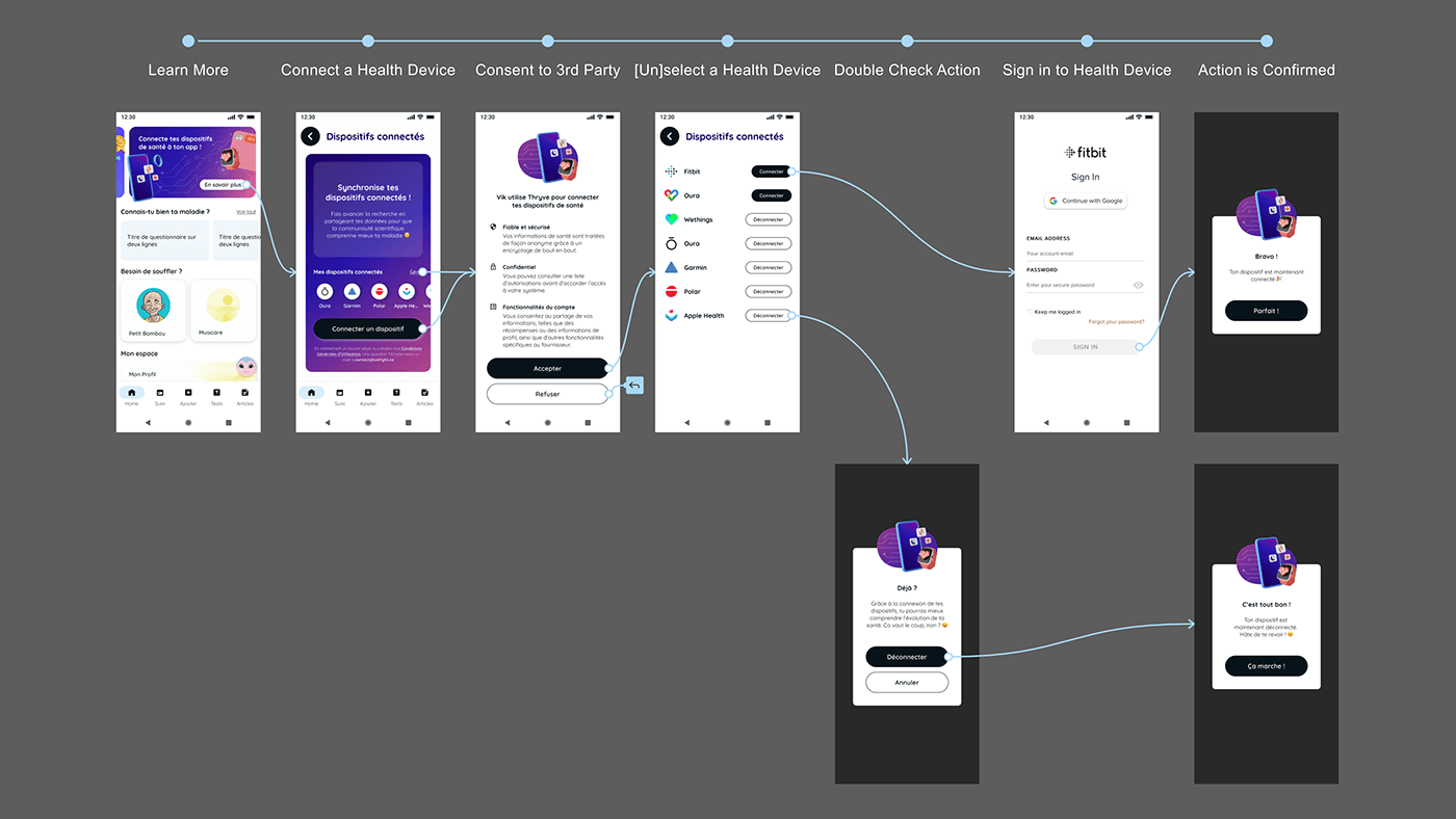
That said, there was one thing I could act on despite the budget restrictions: the assets.I collaborated with Mathilde Artus to brand this service. It was important indeed that it stood out from the Vik color palettes since it was an add-on cross-Viks.
After benchmarking connected devices, it quickly became clear that a blue/purple palette was the way to go. That led to a consistent identity, that you can grasp in the flow below:
Finally, as an extra cautious step to take to decide whether or not it would go to Delivery, we decided to test our users' interest for this functionality, quickly plugging the existing Surveys flow to the carrousel standardized card.


