
Rebranding and Wayfinding (SANParks)
The task at hand involved a rebranding effort for SANParks, a popular travel destination in South Africa. The primary objective was to create fresh logo designs that accurately reflected each park within the SANParks portfolio. Additionally, the project encompassed the creation of innovative icon designs, wayfinding solutions, booklets, pamphlets, posters, and a user-friendly website for the convenience
of their valued clientele.
Project Overview Board
Client: SANParks.
Audience: South African visitors, and International visitors.
Are you ready to embark on a journey where the language of nature has the power to unite us all as one? The Communication Goal of this exciting project is to create a sense of family among individuals from diverse backgrounds. We aim to establish a brand identity that resonates with people of all ethnicities and to communicate this message through captivating imagery rather than words. By doing so, we can create a seamless flow of understanding and appreciation for our parks. Get ready to be swept off your feet by the magic of nature and come together as one big family!

Nature unifies every creature that walks, crawls or slithers on this earth. The main idea behind the
project is to bring people together and create a sense of community by using the language of nature.
This will help SANParks to cater to every guest, irrespective of their main language, and inspire connection and bonding among them. By adopting this approach, SANParks can also increase
its guest numbers and achieve financial sustainability.
The creative concept revolves around the idea of South Africans, who come from diverse
backgrounds, coming together as a family thanks to our shared love of nature. Just like South Africans differ from each other in language, culture and characteristics, the array of SANPARKS also differ from each other, catering to each personality type of our SA citizens. While we don't always understand each other's languages and cultures, we all have a touch point that defeats this communication barrier which is a mutual understanding of nature. The goal of this branding is to make all visitors feel like they're part
of the SANParks family and to encourage everyone to join SANPARKS in their communal effort to
conserve nature. We are stronger together, so let us utilise that mutual understanding through
nature to encourage positive change, family dynamics and growth in our parks.

Brand Manual Rendering

Brand manual flat layouts and mockup
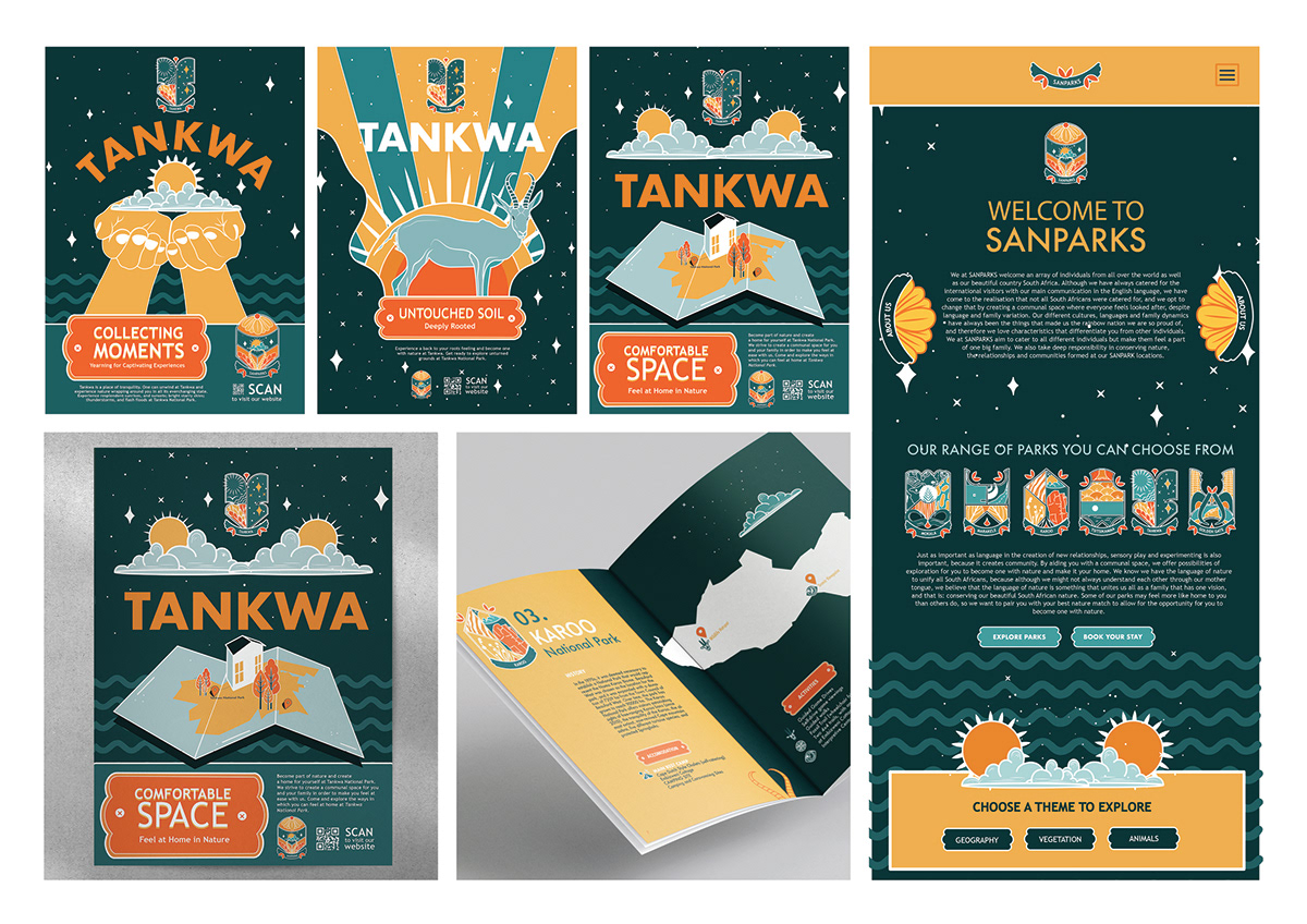
The idea behind the park families is to create a unique identity for each park, based on its values, characteristics, people, setting, and history. To reinforce this identity, each park has a coat of arms that accurately represents its personality. These coats of arms are designed to reflect the different personality types of the park families. The flat vector designs featured in the coat of arms serve to convey the type of family that the park belongs to. The colours used in the designs have been selected in a manner that represents South Africa and aligns with the previous branding of SANParks.

Posters flat layout


Posters renderings

Microsite rendering


