
Orlen Superliga is Poland’s premier handball league. I had the opportunity to work with Dragon Rouge Poland and design a new brand identity for the league.
The logo mark reflects the shapes of the handball and the dynamic action of the players. The logotype features custom letters that express the toughness and intensity of the game.
The logo mark reflects the shapes of the handball and the dynamic action of the players. The logotype features custom letters that express the toughness and intensity of the game.

Drawing from the logotype, Kentype Studio crafted the complete typeset.


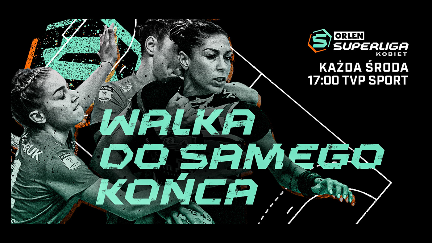
Inverse color palette is used for Women League
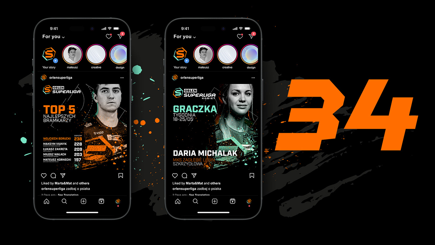


It was a joy to watch the client’s team carry on the project after its release.
Makes me proud :)
Makes me proud :)

