


CENTRO
A Small Newspaper for a Big City
ART DIRECTION | DESIGN CONSULTANT

A short-lived tabloid-size newspaper for Mexico City, focused on presenting easily digestible info/entertainment contents to fast-paced metropolitan commuters and dwellers. It covered all sorts of news with an upbeat and slightly different approach than the rest of the daily offer in an overcrowded media market; originally targeted for young readers interests, through a bolder use of color, along with great photography, big graphics and many navigation elements which helped it a stand out on the newsstand.

The nameplate was originally conceived as a circle, an allegory to the one
used as the mark for “downtown” in the city's street signs

Content promos were surrounding the nameplate, with a keen eye towards street sign imagery

On the original proposed layouts, the stories were ordered into a modular system, giving ample room for placement of photographic stand out narratives, while avoiding getting in the way of a good storytelling.

Establishing a clear dialogue with the reader was paramount to the telling of the stories,
many colorful navigational elements helped guide the eye throughout the pages.

Clear navigation, restrained typographic elements and contrast
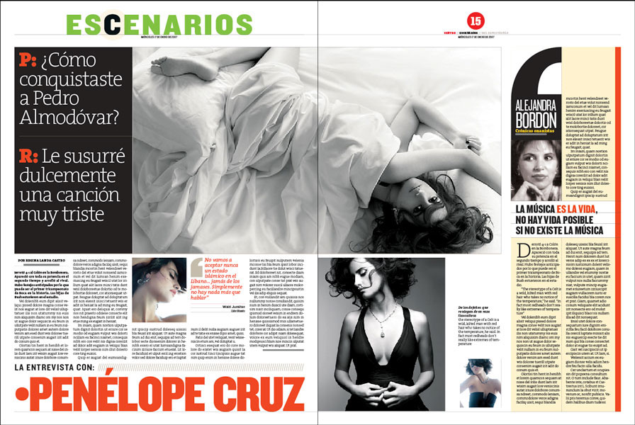
A different narrative: interviews with the top-most question and its answer as a headline
______
Connecting with the reader's eye, typographic “noise” and controlled palettes unique to each section
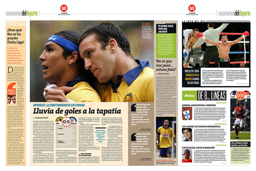
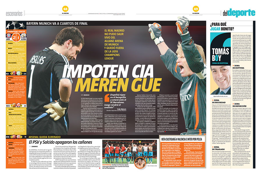
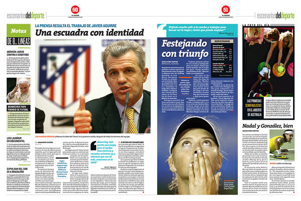
Another proposed layout for sports
Letting the image lead the page elements: one less thing to worry about when laying out the pages
Eight lines of text —max— on each one-paragraph briefs' column package
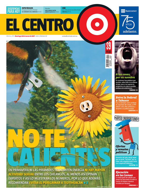
After many revisions, the nameplate had to include the paper's name alongside its icon
Illustrations; Alex Klamroth
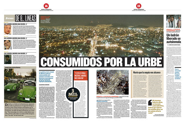
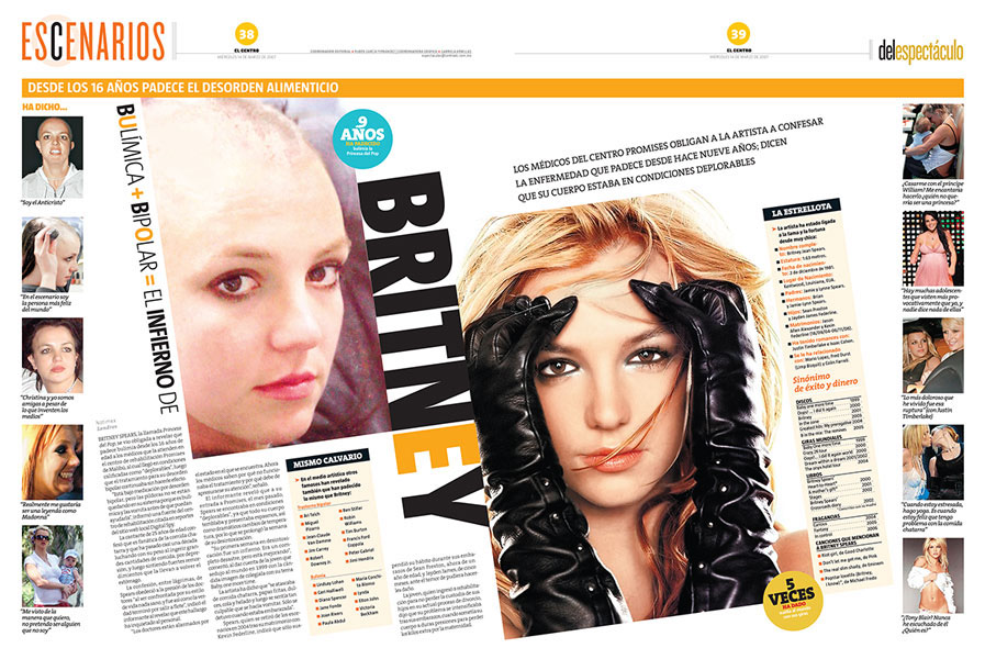
The actual printed pages of the first edition: many things changed with each revision to the design as the project progressed and until the final stages of its live.
More examples of the first edition… the use of the big opening quote mark as key element on columnists pieces luckily survived from the original design.
A great staff that understood the design and its intention helped a lot to keep things fresh all along

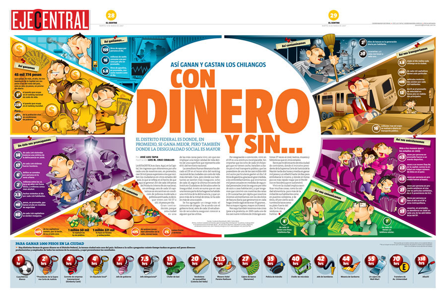
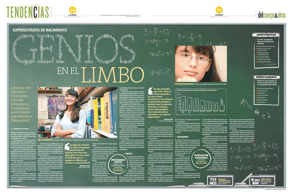
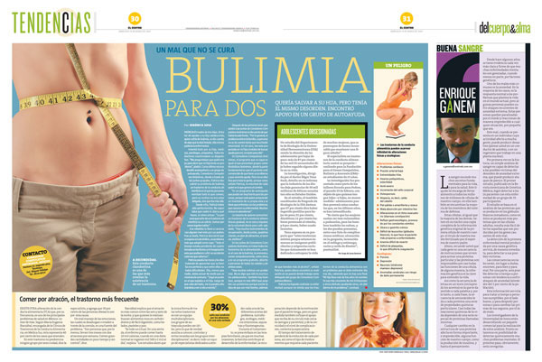
More examples from later editions…
Thanks for watching!


