
Color Management Series
Color Spaces Overview
Version 1.1, Updated November 2023 using the Internet and help from Karl Hendrikse at Otoy (thank you!!)
About This Guide
Important: This guide does not contain specific information about Octane or Cinema 4D - there will be a follow-up to this soon that dives into that.
This is a LONG guide (~7500 words). It kind of has to be to cover all these concepts well enough, but it may be worth downloading the PDF below and settling in by the fireplace with your favorite eReader and a hot cup of tea for this one.
Color management (color spaces in particular), is a particularly tricky concept in computer graphics. There are lots of misconceptions and fuzzy terms thrown around, and for the most part it’s something we just want to set and forget, but knowing more about it can help us troubleshoot why images aren’t appearing the way we think they should. This guide covers background info about what color spaces are and how they work - the better this is understood, the easier it is to transfer this knowledge to not only Octane, but post, photo and video editing, and anything else we find ourselves working in.
Part I covers what color is, and key things to know from a physics, biology, and technology standpoint.
Part II explains what a color space is, and the terms that are used to describe it.
PDF
Part I: Science and Technology Primer
This first part is about the hows and whys of perceiving and displaying color. It’s general, high-level info that helps us understand why our systems are set up the way they are, which then allows us to troubleshoot and predict potential problems. Think of it as our color management backstory.
Short form TL;DR
Physics
Light is radiation that we can see. The range of wavelengths (and combination of those we can perceive is called the visible spectrum which goes from ~390nm to ~700nm. The wavelengths closer to the 390 end appear violet, and the ones up near the 700nm end appear red. Light calculations in physics are done in a linear manner.
Biology
Our best guess is that we can differentiate somewhere between 1-100 million colors, depending on the definition of “a color”. Our eyes and brains perceive light in a nonlinear manner. We can discern more subtleties in shadows than brighter tones, and we can tell the difference between a lot more greens/yellows/reds than we can blues and violets. We get even more sensitive to shadows when there’s less ambient light.
Technology
Average screens today are accurate to about 16 million colors (8-bit). This is enough to look pretty good in most cases, but optimization is still needed to make sure it doesn’t break and cause visual errors, and also keep file sizes low and speed up data transfer.
We want renders we produce to look about the same on every device or application that we intend them to be shown on as they do on our screens. There are several barriers to getting this to happen, and color management exists to try to solve them.

Light, scientifically speaking, is radiation that falls into a particular range of wavelengths that our brains and eyes can perceive. We call this range the visible spectrum. Radiation wavelengths are measured in nanometers. The visible spectrum starts around 700 nanometers and tops out around 390 nanometers (not exactly, but what we perceive at the very ends of the spectrum falls off pretty fast, so these are good values to peg it at).
Wavelengths toward the 700nm end of the spectrum appear to us as reds and oranges, and ones toward the 390 end as blues and violets. Greens are in the middle of the visible spectrum in the ~500nm range.
Calculations
In physics, the calculations that we’d make for altering light values happen in a predictable, mathematically-friendly linear fashion. To simulate this correctly, our software also has to work linearly.
Biology Stuff
So how many colors can we see in total?
There’s a lot of controversy around this because it’s a tough thing to measure. Numbers in the range of 1-100 million distinct colors are thrown around, and these figures use different definitions of the word “color”.
What we need to know now is that yes, there’s an upper limit to the number of colors we can see, and it’s above the basic standard display technology we have right now, but not so far above it that we can’t get realistic looking images if we tailor them to the right environment and don’t push the values too hard.
Non-linear Seeing
Our eyes and brains are NOT set up to perceive the world in a linear fashion.
This is going to be one of the biggest points of contention with color management as we go forward. Our eyes and brains don’t treat all wavelengths the same, and play favorites with light and shadow as well.
Why?

It typically boils down to two reasons - hunger and fear (also a little lust, but this is a family-friendly guide). Most of the things we either want to eat or avoid have traditionally been red, yellow, and green against a mostly green backdrop. A slightly more green or red thing might taste better, or a certain green, yellow, or red might be part of something that could poison us. The better we got at discerning reds, yellow, and greens, the more calories we grabbed and held onto in our intact, non-poisoned or mauled bodies so we could keep on living. Blue and purple stuff mostly just hangs around in the sky where we can’t eat it and it won’t kill us, so there’s no point wasting extra brain cycles processing subtle variations there.
Same thing goes for light and shadow. Dark things in dark places are far more likely to kill us than brighter things in broad daylight, so we can detect subtle changes in shadows far better than we can in brighter tones. Even more important for our survival, when it gets dark out, our sensitivity to these subtle changes in the shadows ramps way up. All this comes into play when setting up color management systems.
Technology Stuff
Light and color in the real world is analog. There are infinite possible combinations of wavelengths and intensities, and therefore effectively infinite possible colors. When we use a computer to describe light, we need to translate it into a digital form, which immediately places hard limits on the number of individual things we can represent, store, and transfer around.
Reproduction Accuracy
Our current bottleneck is the accuracy that we’re after when we go to convert these analog values into digital data. This one thing sets off a chain reaction that creates a ton of other complications and tradeoffs.
The higher the accuracy of our reproductions, the more realistic the results of the calculations are and the better our content looks (to a point). The flipside is that this also requires us to sling around more data. More data leads to more difficult calculations which want faster processors, more temporary memory (RAM/VRAM), more long-term (HDD/SSD) storage requirements, and more bandwidth for both creation and consumption.

This then turns into an exercise in economics. Better accuracy calls for more expensive components, which means slower adoption of the tech, so a compromise point needs to be reached where enough people can afford good enough quality hardware to display good enough results.
Taking all those factors (and more, like compatibility with older hardware) into consideration, a little while back, we settled on two main standards for manufacturers to target when building stuff and creators to create for in the RGB world. One of these standards (sRGB) is for computers, devices, and the like. The other (Rec.709) is for broadcast TV.
Both reproduce about 16 million colors, and share a lot of similarities which helped with adoption . This was kind of the sweet spot for a little while - accurate enough that we get a reasonably realistic looking image most of the time, but still maintaining a small enough data footprint (especially with compression) that we could create affordable tech to produce, manipulate, transport, and display it.
Color Management in Tech
The goal of color management is simple - we want the images we produce to look about the same on every device or application that we intend them to be shown on as they do on our screens while we’re making them.
This is hard because:
· There are different models and systems that we use to think about and describe color, and many of them are implemented in our tech in various ways for various purposes.
· We’re able to calculate a near-infinite number of colors, but our display tech is only able to handle a relatively small number of them at our current level of display technology.
· Different devices have different capabilities and levels of accuracy, and are usually found in certain viewing conditions which affect how our eyes perceive them.
· Backwards compatibility and adoption rate influenced our systems and standards, and while this was probably the right decision, it has created a lot of confusion and the need for guides like this one.
The set of standards and workflows we cobbled together to deal with all this is broadly known as color management.
Part II: Digital Color Management
TL;DR/Glossary
A color (in the digital world) is a unique set of values that produces a mixture of wavelengths in the visible spectrum at a particular luminance.
A color model breaks a color down into a set of properties, each with a scale, that end up producing that particular color. There are many color models intended for many different uses.
A color space is a set of standards used to define how color is handled in our applications both while we’re making stuff, and while targeting devices it’s meant to be seen on. A color space must contain:
· A gamut, which is a set of colors the color space can reproduce. Not how many colors, but which colors.
· A white point which is a particular color in the gamut that represents “white”.
· A transfer function which contains information about how to convert between how the color space itself stores values and physically linear values. This is used for transferring the data between different color spaces, and also to display properly on a target device.
Gamma is a mathematical function close to, but not exactly the same as the transfer functions found in most color spaces today. This term carries a lot of baggage and is misused quite a bit, causing bickering and strife in the comments section.
Display color spaces (display spaces) are lightweight color spaces that typically have a smaller gamut and a non-linear transfer function that optimizes data for speed and efficiency. These spaces are meant for particular classes of displays grouped by the viewing environment the screen is likely to be found in. Common Display Spaces are sRGB (PCs/Devices in brighter ambient light), Rec.709 (TVs in a more dim living room), and DCI-P3 (digital cinema in a blacked out theater).
Working color spaces (working spaces) are data-heavy color spaces meant for our apps to work in. They can have larger gamuts and often use a linear transfer function which forgoes the efficiency gains of a non-linear one in favor of accuracy and preserving data.
Bit Depth is a measure of how much data is used to define any given color. While gamut shows us which colors can be reproduced, bit depth controls how many individual colors can be used at once. Most devices that use our current display spaces standards right now show color in 8-bit (though 10 & 12-bit are gaining traction). Most working spaces in 3D apps do calculations in 32-bit and store files either in 32-bit or 16-bit.
Linear workflow is a production workflow that allows us to import data created in a number of different color spaces (often non-linear), convert it to the editing app’s linear working space using the transfer function, edit it, and then encode the final output to the target color space using the appropriate transfer function.
Tone mapping takes one (often larger) range of values and converts it to another (often smaller) range of values. Most of the time, tone mapping is used to stop visual artifacts like clipping and banding, and preserves the intended look of the scene when it’s converted from a working space to a display space.
Color & color models
A color in the digital world is a unique set of values that produces a mixture of wavelengths in the visible spectrum at a particular luminance. We can get to that color in a number of ways using different color models. For instance, we can define the hue, saturation, and luminance (HSL color model) of a purple, and the computer will convert those values to a signal that produces a particular purple for that one pixel. We can also use an RGB color model and tell our app to use some red, not so much green, and some blue, and it will convert those values to the same signal which produces the same purple as the HSL color model did.
Color spaces
Since we can build hardware and software that can use and display an infinite number of sets of colors, every single device out there could potentially be a moving target for us poor content creators. Without some guidelines and standards in place, our images would look vastly different from device to device, chaos would ensue, and we’d eventually give up and pick a different profession or hobby.
A set of defined standards called color spaces were created to help give hardware/software manufacturers and artists particular ways of handling color so that content can look similar across similar devices. A color space contains information about the colors it can display, what’s considered “white”, and how the data is stored and optimized. This information is used to produce compliant tools and hardware, and also easily transfer data between different color spaces.
In content creation apps, we use what’s called a Working color space to, well, work in and do all our calculations in, and then we target one or more Display color spaces for our final output. If we’re familiar with CG in general, this is kindasorta analogous to a ‘source file’ and an ‘export’ (PSD vs PNG, etc). We’ll explore this a little more after we learn about the components of color spaces.
Common color spaces
sRGB (standard RGB) is the current standard for digital devices. Its limited set of colors compared to other spaces makes it cheap and easy to produce screens that can properly display it, and file sizes and bandwidth are also kept low thanks to compression. sRGB is the default target space for most content meant to be displayed on a PC or device as of this writing.
Rec.709 is meant for general purpose broadcast TV. It’s very similar to sRGB, but there are some differences in how the data is optimized. We can calibrate a large number of monitors to properly display either sRGB or Rec.709, but we need to know which one we’re targeting and set it accordingly.
DCI-P3, Display P3, and Adobe RGB allow for more colors than sRGB or Rec.709. More expensive monitors - and even some TVs and phones - that are available right now are able to display most or all of the colors in these spaces. The final intended targets for these spaces are print (Adobe RGB), digital cinema (DCI-P3), or wide-gamut devices (Display P3).
Rec. 2020/2100 are newer standards meant for newer UHD/HDR TVs. They can display far more colors than most display color spaces out there.
ACES is a set of standards created by the Academy of Motion Picture Arts and Sciences. It stands for Academy Color Encoding System. ACES has a few color spaces meant to standardize working with color across a lot of capture and creation devices for cinema, but it’s becoming more widely adopted among other industries too.
Color Space Components
Next, let’s look at the main components of color spaces.
Gamut
A gamut is a set of colors.
In a color space, the gamut is the set of colors that the space can reproduce. Most display spaces have a smaller gamut to keep the file sizes low, and because the displays the spaces are meant for simply aren’t technologically capable of displaying more colors. Most working spaces have a massive gamut that may even include colors that we can’t even perceive, but are still important to accurate calculations.
Here’s where things get a bit confusing. Gamuts describe a set of all possible colors a space can reproduce. This is not the same as the number of individual values that any one technology can work with - that’s handled by the bit depth (which we’ll get to later). The confusing part is that these two concepts are lumped together for convenience sake, but they are not tied together in any hard and fast way.

Here’s a quick example: Let’s say our gamut is grayscale - this color space can only handle a mixture of black and white to produce grays. This analog range of grays from black to white is the gamut - the color space could potentially produce any gray we want: a lightish gray, a darker gray, mid gray, a teeny tiny bit lighter than mid gray, etc. There are an infinite number of grays that this space can produce.
When we use this color space in a digital environment (which we 3D people tend to do), we have to choose how accurate our values will be. Depending on the accuracy, the images will look more or less detailed, and take up more or less space, or any of the other tradeoffs we explored in the reproduction accuracy section above.
What’s important to know here is that the gamut does not change, regardless of the accuracy we decide on (handled by bit depth). There are still infinite possible values in the gamut, but it has some boundaries to show the limits of what it can handle. In this case pure black is one boundary, pure white is the other - it can handle infinite values, but it can’t produce, say, an orange or a purple.
Gamuts in modern color spaces don’t just have black and white values to worry about - they also have to deal with red, green, and blue components as well. Visualizing a grayscale is super easy - visualizing every color we can possibly see is another matter. This is where the lovely folks at CIE come to the rescue.
CIE Color Chromaticity Diagram
So, how do we represent a large gamut that we have no hope of displaying in its entirety in a meaningful way? In an ideal world, we’d have a three-dimensional diagram that shows all the possible hues and saturations on the X/Y axis, and all the luminance values in Z. That way, using a set of X, Y, and Z coordinates, we can find any color in the diagram. This has been tried, and it’s always confusing - Google Image Search “3D color space diagram” to see.
It’s much easier to see and compare gamuts in a standardized 2D diagram, even if it means massively simplifying it. In 1931, CIE created a diagram that we still use today to do just this. It gets around the difficulty of 3D by ignoring luminance values and only displaying hues and saturations (awkwardly called “chromaticities”). When we’re visualizing and comparing, we don’t really need to see the luminance values as much as the chromaticities, so the tradeoff is worth it.
Here’s how it works:

The visible spectrum is a linear range of wavelengths. It goes from ~390 nm to ~700 nm. 390 appears to us as violet, 700 appears to us as red. The CIE diagram takes that line and bends it into a triangular-ish horseshoe-looking curve with reds being in the lower right, greens being in the upper left, and blues being in the bottom left. This conveniently maps to the red, green, and blue receptors in our eyes that we use to determine color. It’s not a perfect triangle because - as we remember from part I of this guide - biology is nonlinear. There’s no “reddest red” or “greenest green” we can see - these are arbitrary points, so it makes sense to give it a little bend so there’s a range that we can map our digital color space gamuts to which do have these exact boundaries (we’ll see this soon). The shape is not an equilateral triangle for the same reason - we can discern a lot more greens and yellows than we can blues and violets, so it’s distorted in this way to let us plot more points in areas we can see better.
The inside of the horseshoe is then blended together to represent all the possible chromaticities visible to the eye. In additive color science, the more evenly R, G, and B contributions are added, the more desaturated the chromaticity gets until it becomes something approaching white.
So now we have an XY grid and an overlay of hues and saturations that we can plot points on. The scale goes from 0 to 1 on both X and Y, which allows us to choose values like 0.3388223, 0.2883357 and get extremely precise so we can individually define colors within the gamut at any level of accuracy we need.
Next up, let’s see how we represent the gamuts of our color spaces in the CG world using this diagram.
Primaries
“Chromaticity” is just as obnoxious of a word to type as it is to say, so going forward, we’re going to refer to these as “colors” instead. A color is a chromaticity at a particular luminance value, so let’s just pretend we’re also taking luminance into account in the rest of this section.
In a color space gamut triangle, there IS a reddest red, greenest green, and bluest blue, and they are plotted on the XY grid to define the boundaries of a triangle that contains all the colors the gamut can use. These three points are called primaries. The further the primaries are from one another, the larger the gamut is, meaning there’s a larger selection of possible colors to pull from.
Again, this doesn’t tell us how many individual colors there are (bit depth does) - it gives us a set area that contains all the colors this color space can potentially access. Display tech that uses a wide gamut like HDR screens or cinema projectors have the potential to reproduce colors that sRGB displays simply can not.
In most color spaces, the primaries are plotted inside the visible area to minimize the amount of data needed to work with the space. This is particularly important with color spaces meant to be displayed - no point in wasting bandwidth sending data to millions of viewers colors that they can’t even view, right?
In some color spaces, though, some or all of the primaries are actually located outside the visible area so that its sharp triangle can cover more (or all in the case of AP0 as seen above) of the colors our eyes can perceive. These color spaces are more meant as unrestricted working environments that handle data we can’t display (but can now calculate with a high level of precision) with the goal of eventually exporting the results to other color spaces that we can display.
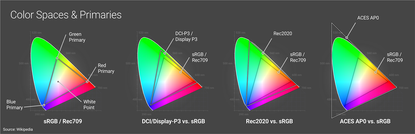
In the diagram above on the left side we can see the red, green, and blue primaries for the sRGB/Rec709 color spaces. These three primaries form the gamut, meaning any of the colors contained within it are accessible when using this color space, and anything outside of the triangle can not be displayed while using this space.
sRGB and Rec709 share the same primaries and gamut - they’re different for other reasons we’ll cover soon. We can also see how DCI-P3/Display P3 and Rec2020 gamuts have their primaries spaced further away, creating a larger (or wider) gamut, allowing for more possible colors compared to sRGB. Finally there’s ACES AP0 (a working color space) which has primaries outside of the visible area so it can cover it in its entirety.
White Point
In order for a gamut to be reproduced properly on a number of devices or applications or converted to another space, a white point needs to be agreed upon and described in a color space.
This is simply a set of coordinates within the gamut that acts as another constant for color calculations and conversion to and from other color spaces. There’s quite a bit more to it when grading or color correcting, but for the sake of keeping this guide to a reasonable length (ha, ha.), we just need to know it exists and that it’s one of the three things that every color space must have, along with a gamut and a transfer function.
Bit Depth
The more data we use when doing light and color calculations, the more realistic the scene looks (smoother gradients and fewer artifacts). All of this data needs to be stored, either temporarily in RAM/VRAM or more permanently in files. In digital systems, a bit is the most basic unit of information when talking about data. The number of bits used to describe color data is referred to as bit depth.
In the pro CG world, we refer to bit depth in terms of bits per channel (bpc) rather than bits per pixel (bpp). This is a whole other sidebar conversation that may be worth researching for curiosity’s sake, but isn’t super relevant to this guide since bpp rarely (if ever) comes up when talking about color spaces.
Bit depth is not explicitly specified in a color space, but we need to choose one to work in. Because of the nature of how the values are stored, there are only a few bit depths we need to worry about.
8-bit (256 values per channel, or ~16.8M colors) is the current lowest common denominator and what we see in sRGB PNGs and JPGs. Newer display spaces like Rec.2020 have wider gamuts, and need larger bit depths to store the extra data so it looks ok to our eyes. 10-bit (1,024 values per channel or ~1 billion possible RGB colors) and 12-bit (4,096 values per channel or ~69 billion possible RGB colors) are becoming more popular as more displays come out that can handle these standards. According to some estimations, 10-bit is close enough to seamlessly blend even the most subtle shades our eyes can distinguish, and 12-bit is more than enough.
12-bit color may be more than enough for our eyes to distinguish, but in order to properly simulate reality, we need to work with some values that we can’t discern for the sake of accuracy so the final product still looks right when we convert it to something we can.
32-bit (4 billion values per channel) and 16-bit (65,536 values per channel) are the two standards here. Most creation apps work in 32-bit, and then store data for transfer in EXR files as either 32-bit to maintain as much data integrity as possible, or 16-bit to save some space if the higher accuracy isn’t needed for storage or moving the data to a different app.
Transfer Functions / Gamma
To avoid confusion, let’s get this out of the way first: What many of us (individuals as well as hardware/software manufacturers) have been calling “gamma” is technically defined as a transfer function in color space terminology, and really isn’t gamma. We’ll untangle this more soon, but first we need a little background info.
What is a transfer function?
A transfer function is a function (mathematical formula) used to determine how the actual bits are written (encoded) to create a chunk of data - usually a file. Data can be encoded linearly or nonlinearly - each has advantages and disadvantages. Regardless of how the data is encoded, it always needs to be converted back to physically linear values so it can be displayed or used in calculations. This transferring of data back and forth between linear and nonlinear values is where the function gets its name.
It’s not compression. Compression algos like RLE, ZIP, and PIZ are applied after the encoding process (regardless of how it’s encoded) to temporarily reduce the file size for storage.
It’s not ‘correction’. It doesn’t compensate for anything. We’ll get into this more in the next section.
Linear vs. nonlinear transfer functions
Our eyes are more sensitive to shadows than highlights, so it would make sense to preserve the accuracy of more of the shadow data at the expense of some of the highlight data. This is true in both linear and nonlinear transfer functions, just in different ways.
Our high bit depth (16- and 32-bit) working spaces store color data as floating point values. Because of the nature of floats, It’s very easy for our creation apps to transfer it to physically linear values to do calculations on data stored this way. Floats also work in a way that allow us to favor shadow data over highlight data by representing the shadows more accurately. These color spaces are said to have linear transfer functions.
8-bit display spaces store color as integers because there’s no standard 8-bit float format (and there probably never needs to be one). Integers don’t play nearly as nicely with our creation apps - they need to be converted to floats for calculations, and then back to integers again for output. Because of the way integers are stored compared to floats, and because we’re taking trillions of values and converting them down to just a few million, we need to make hard and fast decisions as to which values are kept and which are discarded. If we did this linearly, we’d be losing a lot of important shadow data and keeping a lot of highlight data that our eyes can’t discern very well. Instead, we use curved nonlinear transfer functions which store more shadow data at the expense of highlight data. When we go to transfer it back to physically linear values, it still looks good enough-ish to our eyes (assuming we use our tools well).
Newer display spaces will likely continue to use nonlinear transfer functions as their 8-bit counterparts to maintain backwards compatibility with hardware currently on the market. Rec.2020, for example, specifies the same transfer function as Rec.709.
History lesson
As promised, let’s talk about gamma. Back in ye olden dayes, the standard technology for a TV - and eventually a PC monitor - was a CRT display. CRTs do not reproduce light signals in a linear fashion because that’s how the tech works (Wikipedia for more on this).
We learned fairly quickly that If we just sent a linear signal, the CRT would produce a dark, muddy image due to limitations of the technology. To compensate, the analog signals we sent out were encoded using a simple gamma curve. This curve boosted the signal in the darker areas to compensate for the CRTs shortcomings - it was correcting the tech, not our eyes - and produced a more linear image that better mimicked reality and looked ‘right’ to us.
For a long time all the signals sent over the air, through cable, and eventually through VGA cables were encoded like this. Eventually we got better tech, though. Newer LCD/LED monitors no longer needed this compensation, but we couldn’t very well switch mid-stream and suddenly start sending signals encoded linearly, so we had to put something in place to make the two types of technology compatible.
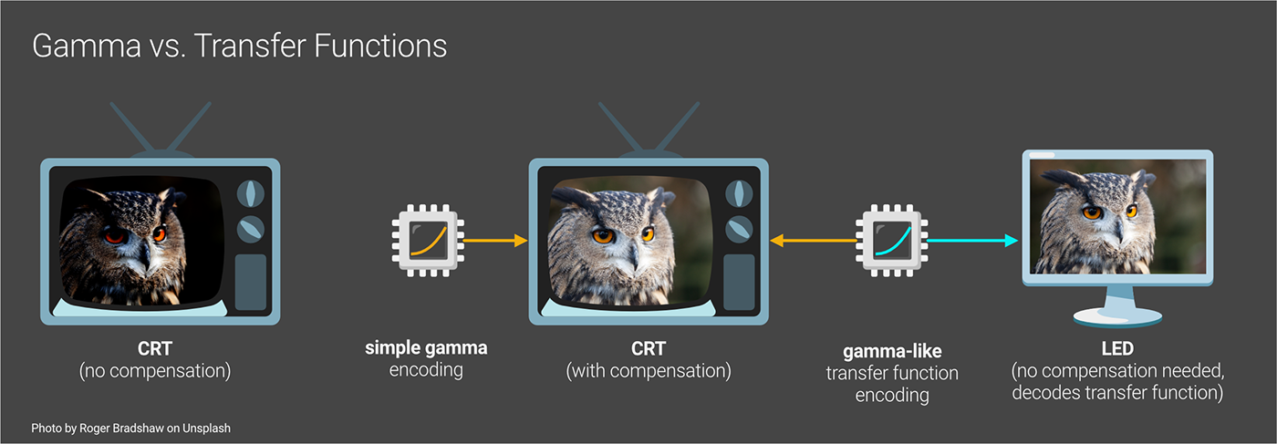
The color management standards we developed to transfer nonlinear signals back to linear had to be based on these gamma curves. They weren’t exact because newer tech had some other challenges that had to be worked around, so we tweaked the transfer functions to cater to that, while leaving it close enough for backwards compatibility.
These particular gamma curves (and the transfer functions based on them) - by sheer coincidence - loosely follow the non-linear way our eyes see. We realized that because of this, we could ALSO use it as a form of data optimization. If we used these curves while encoding the digital signals to trash some highlight data to allow for the storage of more shadow data, we wouldn’t be wasting any of our precious (and very limited) bits on stuff we couldn’t really see well anyway. This led to better image quality and less data to store and sling around over our archaic modems and spinny disks, and it would still work if someone plugged in an old CRT. Win-win!
In the digital color management world, each color space has to define a transfer function. We ended up settling on one linear and three nonlinear ones.
Why three?
Viewing environments
There was a lot of info being thrown at us earlier, so we may have missed this, but our eyes and brains don’t just see nonlinearly, they actually adjust how we see color depending on whether it’s dark or light out. Again, we don’t want our friendly neighborhood bear up in our grylls because we can’t see it coming at night, so we get even more sensitive to darks when the ambient light goes down.
Because we’re encoding signals to either keep or trash data depending on how our eyes see, it makes sense that this data should be optimized for how sensitive our eyes get in different conditions. We need to preserve a lot more shadow detail at the expense of brighter tones in situations where our eyes are far more sensitive to shadows (blacked-out theaters) than we do in environments with good ambient light (offices). We developed three main standards for different environments and the color spaces that are likely to be used in them.

sRGB is meant for bright viewing conditions and has a transfer function with the least extreme curve which is roughly Gamma 2.2. It still favors shadows when deciding what to discard, but because our eyes are adjusted for good lighting, we’ll notice lost highlight detail more than in lower ambient light.
Rec.709 is meant for a living room with somewhat more dim light, and has a curve kind of in the middle which is roughly Gamma 2.4. It needs to preserve more shadow detail at the expense of more highlights because our eyes are a little more sensitive to shadows in the lower ambient light.
DCI-P3 (meant for blacked out theaters) has the most extreme curve at roughly Gamma 2.6 because our eyes are super sensitive with nearly no ambient light, so it needs to preserve far more shadow data and less highlight data to look “right”.
Most other display spaces (color spaces meant mostly for viewing) usually use a transfer function close to one of these three for convenience.
Linear sRGB is color space that shares the same gamut and white point as sRGB, but has a linear transfer function (equivalent to Gamma 1) rather than a 2.2-ish one. It’s used as a low-overhead working space (because of its small gamut) in some apps.
ACES 2065-1 is a wide-gamut working space that covers all the chromaticities we can see, and also has a linear transfer function
So what’s the deal with Gamma now?
People (and companies) still use the term “gamma” to mean “transfer function”, even though nearly every modern color space uses a gamma-like transfer function instead. It annoys the hell out of colorists and graders and leads to semantic battles on the Internet because:
1. Transfer functions are based on simple gamma functions, so often they’re really close.
2. If simple gamma is used instead of a transfer function (in most color spaces), the colors will not transfer properly to linear values and shift a bit. This causes all kinds of problems if accuracy is necessary (like in the case of a brand color or importing footage for grading), but it isn’t that noticeable if we’re just trying to use a concrete texture on a floor in a game engine or something.
3. Most monitors and tools will use the proper color space transfer function, but some of them still label it “gamma” because of the continued confusion about the terms. Some cheaper monitors may still use simple gamma, and sometimes it’s hard to tell what’s doing what.
4. It’s difficult to explain this topic quickly or well (author note: seriously), and even people and companies who think they fully understand may not, or still munge the terms for one reason or another.
5. The Wikipedia entries were written by nerds and not targeted at us cool graphics people, so even though the information is good, it’s spread out across multiple entries and only really consumable by other nerds.
6. Fighting on the Internet is fun (?)
Net-net: Pretty much every capture and creation device - especially professional ones - will use the proper transfer function for the color space rather than a simple gamma curve (unless, like Adobe RGB, the proper transfer function IS a simple gamma curve). If given a choice, always use the named color space transfer function option (like sRGB or rec.709) over the simple gamma one (2.2, 2.4, etc.).
Also avoid discussing this topic in forums or on Reddit - it won’t end well.
Color Space Conversion
As creators, we often need to use more than one color space.
In the 3D world, we’ll often take images or footage that has already been converted to a display color space (like color/albedo/diffuse texture maps for example), convert that to our working color space, use them in materials or environments, and then either push the whole thing unchanged to a post app, or export it to a display color space for consumption (usually sRGB).
In order to convert between color spaces, all three of main components of a color space need to be addressed - the gamut, the transfer function, and the white point.
The white point is kind of its own topic, but if it hasn’t been changed around for creative purposes and the standard one for a color space is used (D65, for instance), then conversion to a different color space is fairly straightforward.
Linear Workflow

[Note on the illustration above: the color values don’t actually get brighter when converting to a linear space, it’s just that our tech is limited and our eyes are nonlinear, so sometimes it appears that way depending on how the app handles it. That’s why we need a preview window like a Live Viewer or Renderview to convert the values to the target display space while we’re working in the working space so we can see what we’re going to get on export.]
Most of the color spaces meant specifically as working spaces for content capture or creation use a linear transfer function. Linear transfer functions do not remap or alter the data - they store every value that the bit depth allows for. This is ideal for a working color space because the integrity of the data is maintained and it’s easier for the app to do proper light calculations.
Most (all?) of the color spaces meant for display use a non-linear transfer function for efficiency.
When using graphics tools, a linear workflow involves:
1. Importing source images or footage encoded in a non-linear color space and reversing (decoding) the transfer functions so they become linear...
2. Working with linear data in our working color space to produce correct calculations…
3. Previewing the data non-linearly in the final target space while working so we know what to expect…
4. Exporting to a target color space by encoding the data with the proper transfer function.
In the 3D world, this means:
· Making sure that our app knows what color space the imported images/footage is using - this ensures it uses the right transfer function. Sometimes automatic detection works, sometimes the files come with metadata that say what the color space is, but most of the time we should really manually set this.
· Setting up our tools so the Working Space is linear, but we can still view it in the way it’s meant to finally be consumed (also called a display transform).
· Picking the right color space when we go to export (also called an output transform). Most of the time this is sRGB if we’re directly outputting, or linear sRGB or ACES if we’re pushing to post, but sometimes we want to target something else.
Tone Mapping/Gamut Mapping

When we take a smaller gamut image (sRGB), and feed that into our creation tools that use a larger gamut, (assuming our monitors and tools are set up properly and the correct transfer function was used), we shouldn’t see any difference. Larger gamut working spaces can handle anything the smaller display gamuts can.
After we add things in our creation tools and do all our fancy light calculations in the giant working space, we may end up with values outside of the gamut of the original source files. This in and of itself is fine (and expected) - that’s why we have large gamut spaces. The problem arises when we want to take that much larger set of data and display it on something that’s not capable of reproducing all of the colors we just created. If we tried this without any processing, what we’d end up with is a mess. Blown highlights, lost shadows, splotchy color blocks, banding and other unpleasantries would destroy the intention of the image.
This is where tone mapping comes in. In the simplest of terms, tone mapping is a process that maps one set of colors to another. In the Color Management world, it’s mainly used to solve this exact problem we just laid out. There’s some distinction between tone mapping and gamut mapping in some circles, but in 3D tools, they’re usually bundled into the term “tone mapping”.
Good tone mapping will do its best to preserve the intention of what we just created. It looks at the original values in the working space, takes the out-of-gamut colors, and maps them to values inside the gamut of the target working space in a way that’s visually acceptable (no crunchy artifacts) and represents as best as possible what we were trying to achieve in the larger space (bright things should appear bright compared to other stuff around it, etc). This process is applied during the conversion between one space and another.
Tone mapping can also be (and even kind of has to be) used creatively to some extent. There’s no scientifically “correct” way to do this process because of the number of acceptable outcomes and subjective nature of the whole thing. For example, ACES’ sRGB tone mapping algo has a particular flavor to it. ACES was conceived of by the Academy of Motion Picture Arts and Sciences, so it would make sense that they’d aim for a more ‘cinematic’ look. A bunch of boffins were probably tasked with quantifying this look at some point, and their programmers did their best to achieve it when deciding what gets mapped to what. Other tone mapping algorithms like AgX and Filmic exist to get other feels and handle certain decisions in a different way (super hot reds saturate to white through pink instead of through orange like they do in ACES for example).
Tone mapping is not defined by the color space, and therefore we often have the choice of which to use when exporting or viewing files in a different color space (also known as output transform and display transforms).
Wrap Up
Hopefully by now the basics of color management make sense. This information can be used at a general level with any app or render engine. The next guide in this series (coming soon) will be about how this is applied to Octane and Cinema 4D.
Author Notes
OG036 Color Management: Color Space Overview, version 1.1, Last modified November 2023.
Changelog from 1.0: Reworded Bit Depth and Transfer Function sections for clarity.
This guide originally appeared on https://be.net/scottbenson and https://help.otoy.com/hc/en-us/articles/212549326-OctaneRender-for-CINEMA-4D-Cheatsheet
All rights reserved.
The written guide may be distributed freely and can be used for personal or professional training, but not modified or sold. The assets distributed within this guide are either generated specifically for this guide and released as cc0, or sourced from cc0 sites, so they may be used for any reason, personal or commercial. The emoji font used here is

